
Before the first launch of Macintosh computers in 1984, Steve Jobs had his team redesign the computer's packaging 50 times. Was he being fussy? The packaging is usually discarded soon after opening, in the end. Was he careless with how he allocates resources?
Far from it! Jobs' obsession with the packaging design was very pragmatic. He simply realized that first impressions matter.
As Apple's angel investor and the first chairman, Mike Markkula, put it in The Apple Marketing Philosophy:
"We may have the best product, the highest quality, the most useful software, etc; if we present them in a slipshod manner, they will be perceived as slipshod."
People do judge books by their cover. Both Markkula and Jobs appreciated the importance of this insight. The rest is history.
First impressions matter, and they influence customer experience.
The rule also applies to SaaS. Software as a service does not come in a box you open and get excited over the texture and the sounds the packaging makes. But your company website and the first-time user experience with your product create the first impression that is often unshakeable.
User onboarding could well be the most important stage of a user journey.
In this article, we'll delve a little deeper into user onboarding design, zooming in on product onboarding. We'll answer the questions:
- What is user onboarding, and how does it differ from product onboarding?
- Why is user onboarding so important?
- What are the pros and cons of some popular app onboarding patterns?
- Why do you fail to provide the best onboarding experience?
- What are the 3 warning signs you need to work on your onboarding flow?
- How to use surveys to design a better user onboarding experience?
Read on:
What is user onboarding?
User onboarding is a stage in the user journey where users experience the product for the first time.
The user onboarding experience goes beyond product tours. It starts on your website and spans multiple channels. Every initial user touchpoint contributes to the experience - from websites, through sales demos, to product onboarding.
User onboarding is not only about introducing a product to users and helping them discover its real value (experience the aha moments). The end goal of user onboarding is about enabling the habit formation. Getting users hooked so that they become regular, engaged users starts with onboarding.
Is product onboarding the same as user onboarding?
These terms overlap. Product onboarding is part of user onboarding. While user onboarding encompasses different touchpoints, product onboarding is about the first-time experience users have with the product.
User/product onboarding may arguably be the most crucial point in the user journey - one that deserves the amount of attention Steve Jobs gave the computer boxes. ;) In the case of feature-rich products, product onboarding is a must.
Why is onboarding design so important?
Effective onboarding design improves app experience, quickens product adoption, and increases customer lifetime value.
How? It clarifies how to use a product and helps users discover the real value proposition of products and leads them to the aha moments - the moments of realization of how valuable a product is for them.
If done right, it increases user activation and engagement - the metrics that influence conversion rates and increase CLTV (customer lifetime value). Onboarding that is poorly designed does the contrary - it leads to user churn.
Especially with feature-rich platforms, user onboarding has a direct influence on user retention rates. It's not uncommon for users to drop off after their first experience with the product: According to Google Play Store's study, 77% of users drop off within the first 3 days of using an app. The number rises to 90% within the first month after sign-up.
Take a look at the graph penned by Justinmind:
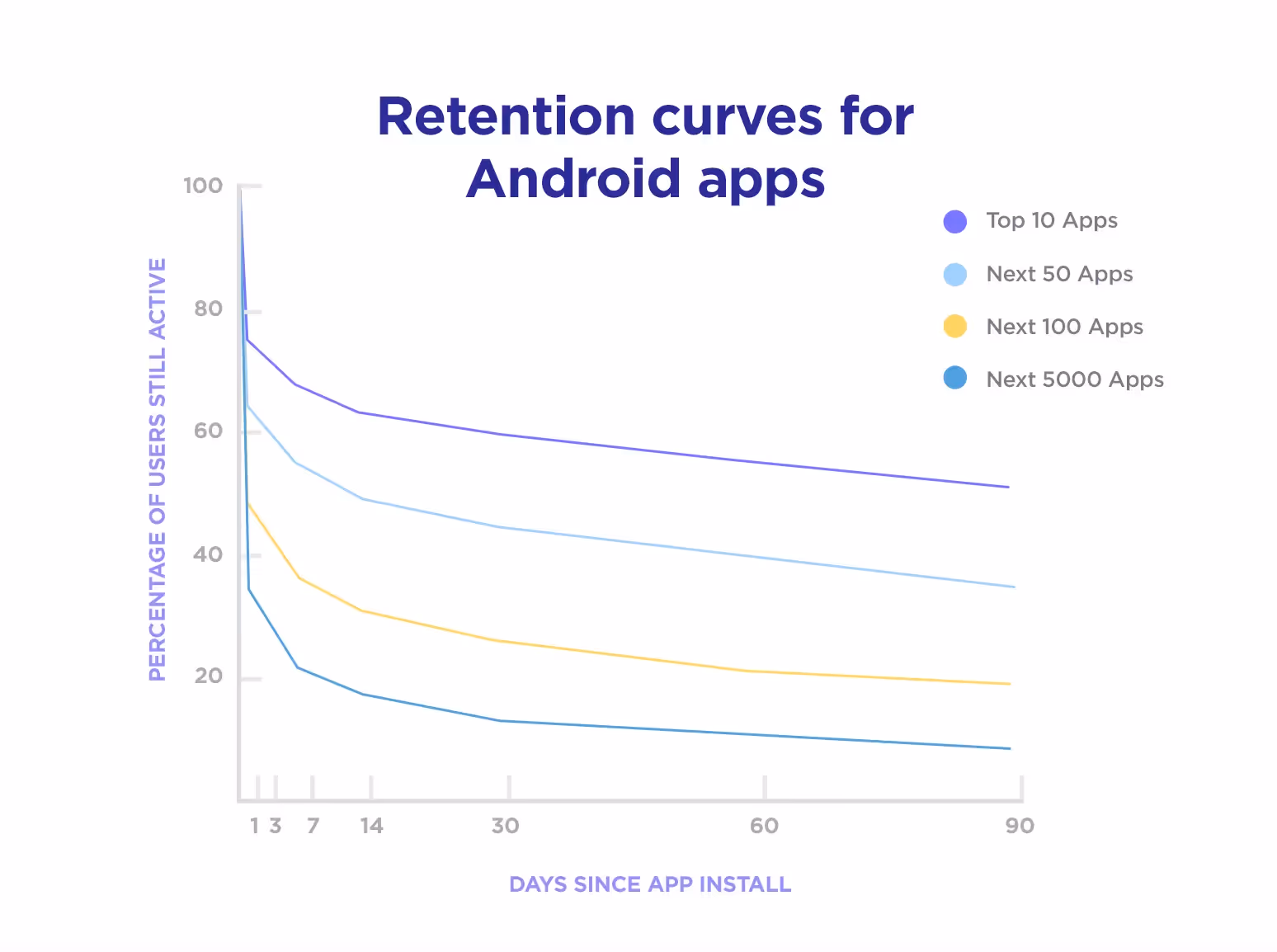
As they rightly point out—markets are so saturated with apps that users no longer want to take the time to learn an app. Insufficient onboarding makes them feel lost at sea due to the complexity of a product. A too long and detailed one, on the other hand, makes users feel impatient—they've signed up to have jobs done, not to plod away at lengthy manuals.
A product tour, hotspots, or… ?
There are a number of product onboarding patterns designers use to design onboarding flows. It's a good practice not to rely on one but to mix them in a way that's the most optimal given the personas you cater to:
1. Product tours
Product tours are probably the most common way of introducing apps to users. They usually come in the form of tooltips that point the new users' attention to key product features and are displayed when users are only beginning to use a tool.
Pros:
- They are quick to implement.
- They usually do a great job of giving the users a general idea of what they can accomplish with the product.
Cons:
- If too long, they are usually skipped. So, they can be rather ineffective.
Pro tips:
1. Be selective. Keep the number of steps low.
5 would be too many. To design them the right way, you need to know your user personas really well. Only then can you tell where their "aha" moments lie.
2. Add a progress bar to keep users motivated.
3. Focus on the jobs to be done rather than the features. (The users are more likely to complete the tours then.)
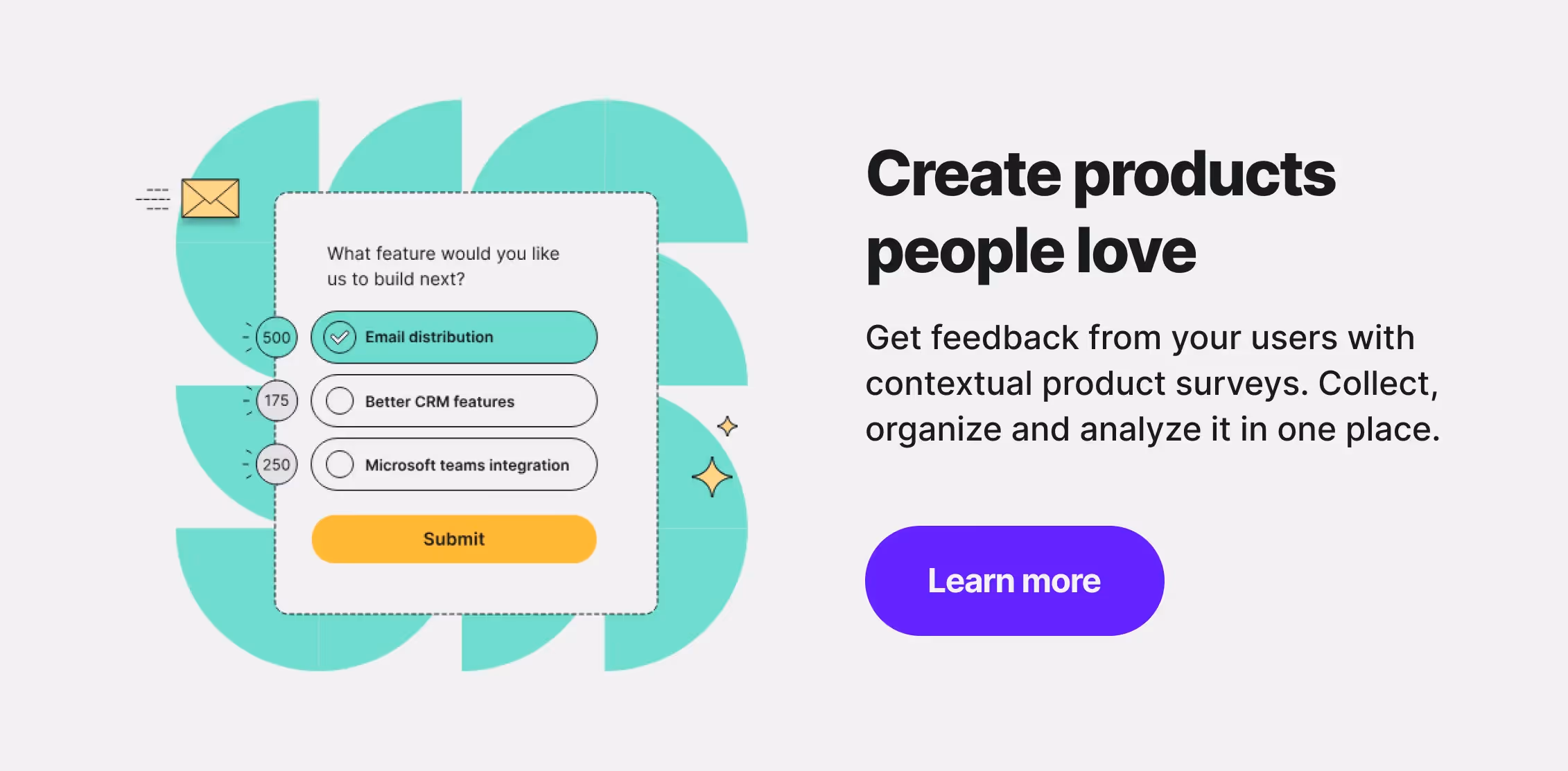
If you're unsure of how to prioritize the jobs to be done, use our Value Proposition survey template:
2. Hotspots
Hotspots are the interactive elements in your app that blink, pointing at a feature users should be aware of. Use them to point to important features in your app—the ones that will bring users closer to their 'aha' moments.
Pros:
- They let you navigate users through the app.
- Hotspots are hard to ignore, which makes them very effective at attracting users' attention.
- They are interactive, which boosts user engagement.
- They let you reduce cognitive load as you introduce your product to users gradually, step-by-step.
Cons:
- If you overuse them, hotspots can be rather annoying. Be careful with them so that they don't get in the way of a good user experience.
- Using them can be cost-effective, as they can allow you to bypass potential glitches in the user flow without investing in coding.
Pro tips:
1. They are noticeable but optional. If you want to use this pattern, consider combining it with another one that will help you pass on the most important information.
2. Use a Single Ease Question survey during your user testing sessions or trigger it in the live version of your app. The survey will help you identify the places in your app that call for a hotspot.
3. Persona-based onboarding
A less popular but highly effective user onboarding pattern is self-segmentation (or persona-based onboarding if you wish.)
Do you recall using Netflix or Pinterest for the first time? The apps asked you to choose the content you'd be most interested in. Thanks to this self-segmentation, you can enjoy the personalized experience of using the apps.
Persona-based onboarding flows are less popular than product walkthroughs as they are more time-consuming to implement. But the time and effort put into designing them pay off.
Pros:
- They have the potential to shorten the time to conversion even by 76% (ProdPad's - a product management software's - success story.)
- They let you customize the experience and shorten the time to the aha moments.
- They make users hooked as they provide a more immersive experience.
- They work best with feature-rich products that cater to various personas and cover multiple use cases.
Cons:
- They take time to design and require in-depth knowledge of who your personas are.
- They are time-consuming to design and more costly.
Pro tips:
1. Do a thorough user persona research to build them.
Feel free to use our user persona survey template to kickstart the user research process:
2. When you design a persona-based onboarding flow, keep it short. Don't overwhelm the users with the choices.
3. Keep testing and refining the flow.
Use our in-product NPS survey to put your onboarding design to test:
3 signs you need to fix your new users’ experience
If you're reading this article, you may have a hunch that your user flow is not optimal. It's one of the signs. ;) Should you need more proof than your intuition (and - most likely - user churn), the following metrics will shed more light on the first-time user experience you offer:
1. Time to first value (TTFV) is long
To be activated, users need to discover the product's value. Identify the features that reveal the biggest value to which personas and track the time they need to start finding the value.
Suppose you're offering a freemium version of the product or even a short-term and relatively inexpensive subscription. In that case, you must reduce the time to the first value to a minimum.
Otherwise, you'll keep seeing customers churn. No matter how much better your value proposition is than your competition offers.
Users expect to see the value and to see it fast!
2. Unsatisfactory user activation rate
User activation rate is one of the most important metrics you should track. It directly impacts the retention rate and the customer lifetime value.
Why? Activated users are those who discovered the value proposition of your digital product and are likely to become paid users.
The low activation rate stems from a poor value proposition (your digital product lacks some essential features) or an unsatisfactory user experience. You may have a great value proposition, but maybe your product's design makes it difficult for the users to discover it?
This is a common problem. But it's time to look into your onboarding design.
Our user activation rate survey will help you collect user feedback to discover the areas that need improvement. Feel free to check it out:
3. You'd rather have higher user engagement
Like user activation rate, user engagement rate impacts your product's ROI. Engaged users are more likely to become activated. They have a greater lifetime value and longer lifecycle. They are also more likely to become your brand ambassadors and recommend your app.
Similar to user activation, low user engagement rates may have something to do with the UX of your onboarding flow. If it's low, take a closer look at the way it's designed.
6 surveys that can help you improve your onboarding design
Poor metrics are unquestionable warning signs. If you're not happy with yours, keep reading. Below, we're putting together a short list of surveys that can help you fix your user onboarding process.
1. User persona survey
To design a good onboarding flow, you need to know your user personas' jobs well. If you've never done proper persona research, take a step back and do it before guess working on the changes.
2. User activation survey
Our user activation survey is a type of survey that asks about users' satisfaction with the product, the extent to which they think it helps them accomplish tasks, and their perceived difficulty with locating features. Use it if you suspect some of your product's features may be hard to find.
3. Customer onboarding survey
The survey will let you assess general new users' satisfaction with your product, elicit feedback on its usefulness, and tell you if they think it is difficult to use.
The answers to the open-ended questions will tell you which moments in a product are unclear to users.
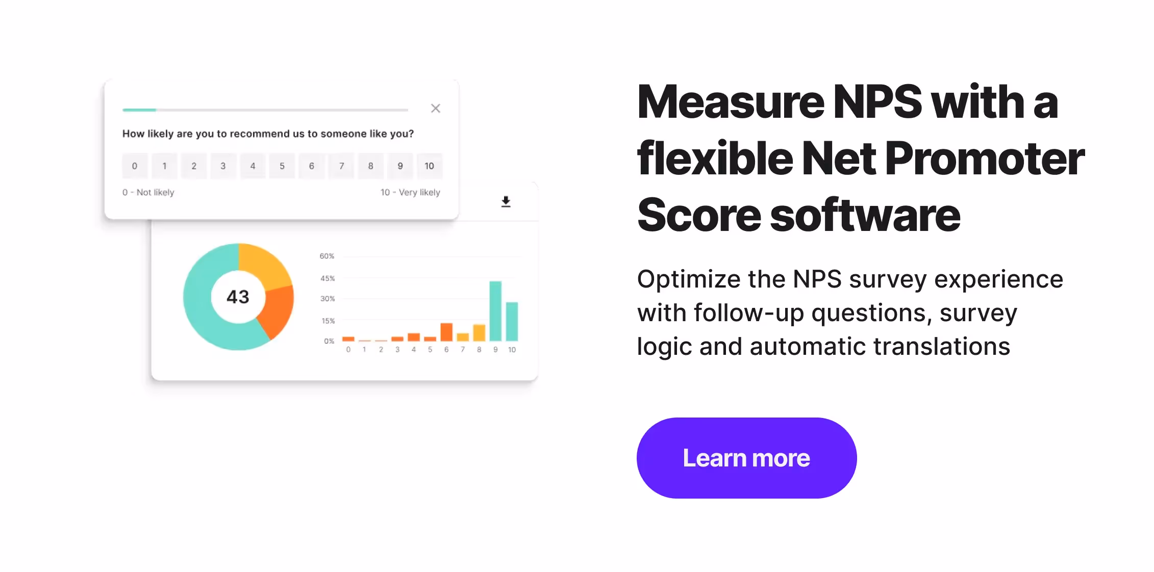
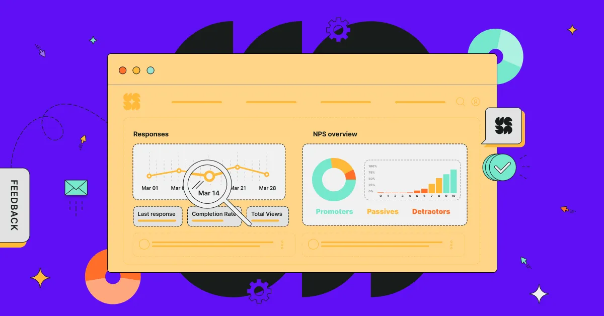
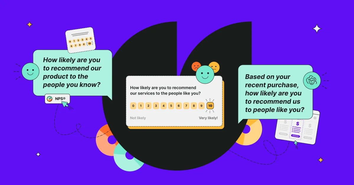
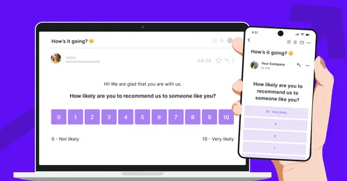
4. NPS survey
Net Promoter Score surveys are probably the most frequently used surveys out there. And there's a good reason for that - the surveys are short and sweet, and consumers don't mind taking them. (They get pretty high response rates.)
If you're looking for ways to improve onboarding your users to the app, consider triggering an NPS micro survey in your app. Distribute it among the new users to collect feedback on their new-user experience. Just make sure you give users enough time to get the feel of the app.
5. Usability testing survey
Send your new users the SUS survey that is used during usability tests. It is made up of 10 Likert scale questions that gauge if users find a tool easy to use or perhaps they think it's too complex and obscure.
The responses to the survey will help you find potential problem areas within the app - ones you can address with the onboarding messaging or redesign.
6. Single Ease Question
A Single Ease Question survey is excellent if you need to assess the difficulty of performing a task. It's a standard survey used during usability tests. Feel free to use it while carrying them out, or trigger it to a group of users in your app.
Of course, do not send all of the surveys to your user base. To avoid survey fatigue, choose one or two of the surveys above.
To get the most actionable results, segment the audience before you send the surveys. Dividing your audience into personas will let you run more effective campaigns.
Are you new to Survicate? Check out the survey templates we recommend.↑ Give the tool a try! And, best of luck with redesigning your onboarding flows!
💡YOU MAY ALSO BE INTERESTED IN:


.svg)

.svg)

