
Creating a survey is relatively simple. Distributing it to get as many responses as possible is usually not rocket science either.
However, the most challenging part of this process is analyzing the data to reveal the key insights.
At first, you feel joy as you observe the rising response rates and see how the “total responses” counter quickly shifts from two to three and on to four digits. But then, you start asking yourself: this is great, but how do I analyze survey data so that it's useful?
Today, we'll explore four effective ways to untangle the message hidden behind unstructured data with tools such as Survicate, Excel, Google Sheets, and Data Studio, and analyze their pros and cons.
We'll also show you how Survicate breaks down survey data, giving you ready-to-use graphics for any purpose you need, be it marketing assets, stakeholder meetings, or just your own curiosity.
What is survey analysis?
Survey analysis is the process of analyzing customer insights. The goal is to transform numbers into actionable objectives that your teams can use to enhance and grow your product, customer experience, customer support, and overall business.
How can you use different types of survey data?
1) Measure loyalty and predict growth → NPS survey data
- When you should use it: You need a north‑star loyalty metric and a source of qualitative “why.”
- Best survey: One‑question NPS (0–10) + open‑ended “What’s the main reason?”
- How to analyze survey data: Track NPS over time; segment by plan, channel, or region; read themes from detractors vs promoters. In Survicate, filter by attributes and let AI summarize open text by topics and sentiment.
💡 Pro tip: If you track your Net Promoter Score, it's a good practice to benchmark it against industry averages. You'll need to know how to calculate NPS, and we recommend you check out our NPS calculator to quickly make sense of the numbers and the NPS formula.
Once you are done with your Net Promoter Score calculation, you'll need to see if you keep improving and keep the dialogue with the customers going. Benchmarking your score will let you discover if your NPS score is good in your industry and let you maintain a competitive edge.
And if you still haven't started measuring your NPS score, the quickest way to do so is to use our NPS survey template:
2) Validate experience at a touchpoint → CSAT survey data
- When you should use it: You shipped a feature, changed a flow, or ran a campaign.
- Best survey: CSAT right after the experience (in‑app, on-site, or via email) with a 1–5 or emoji scale.
- How to analyze: Group by channel/feature; compare before/after; pair with verbatim reasons.
⭐️ Success story: Fortive, a Fortune 500 company, implemented Survicate to improve the websites of its portfolio companies. With plenty of CSAT survey raw data, they managed to draw meaningful conclusions, and in just three months, they increased CSAT by 20% at the portfolio level, with one OpCo increasing its score by 50%.
When drawing conclusions based on Survicate data, the sample size is usually in the thousands, which gives us confidence in the positive impact these changes will have on our customers.
Glen Hamilton, Senior Director of Digital Growth at Fortive
We have some great news, too. You can use any of these surveys in minutes with Survicate, without the need for a lengthy set-up, including the CSAT template below:
This survey lets you gauge overall customer satisfaction in a way that doesn't take your customers more than a few minutes to complete.
3) Reduce friction in journeys → Customer Effort Score survey data
- When you should use it: Support deflection, onboarding, checkout, or account changes feels hard.
- Best research question: “How easy or difficult was it to [task]" with a follow-up "Is there anything you'd like us to improve?"
- How to analyze: Correlate CES with churn or conversion; mine open‑text blockers.
⭐️ Real-life example:
“Whenever we launch a new feature, we often include a CES survey to check if users find it intuitive. If scores are low, we know we need to make adjustments.”
Bruna Maia, Director of User Experience at Wellhub
Wellhub, a corporate wellness platform, uses CES surveys to keep a constant pulse on usability. They deploy a CES survey with every new feature to gauge ease of use from day one, and run always-on surveys across critical workflows for continuous monitoring. The insights surface friction points that could hinder adoption and retention, while ad-hoc CES surveys after major updates validate improvements and guide follow-up fixes.
4) Understand churn and retention → Exit and win‑back
- When you should use it: Users cancel, downgrade, or go dormant.
- Best research question: “What’s the main reason you’re leaving?” + multiple choice for reasons; customer exit survey template.
- How to analyze: Trend reasons; segment by plan/tenure; trigger Intercom conversations on save‑able cases.
You can launch any of the above in minutes with Survicate’s templates and logic.
What is Survicate, and why is it easier to run and analyze your survey data there?
.webp)
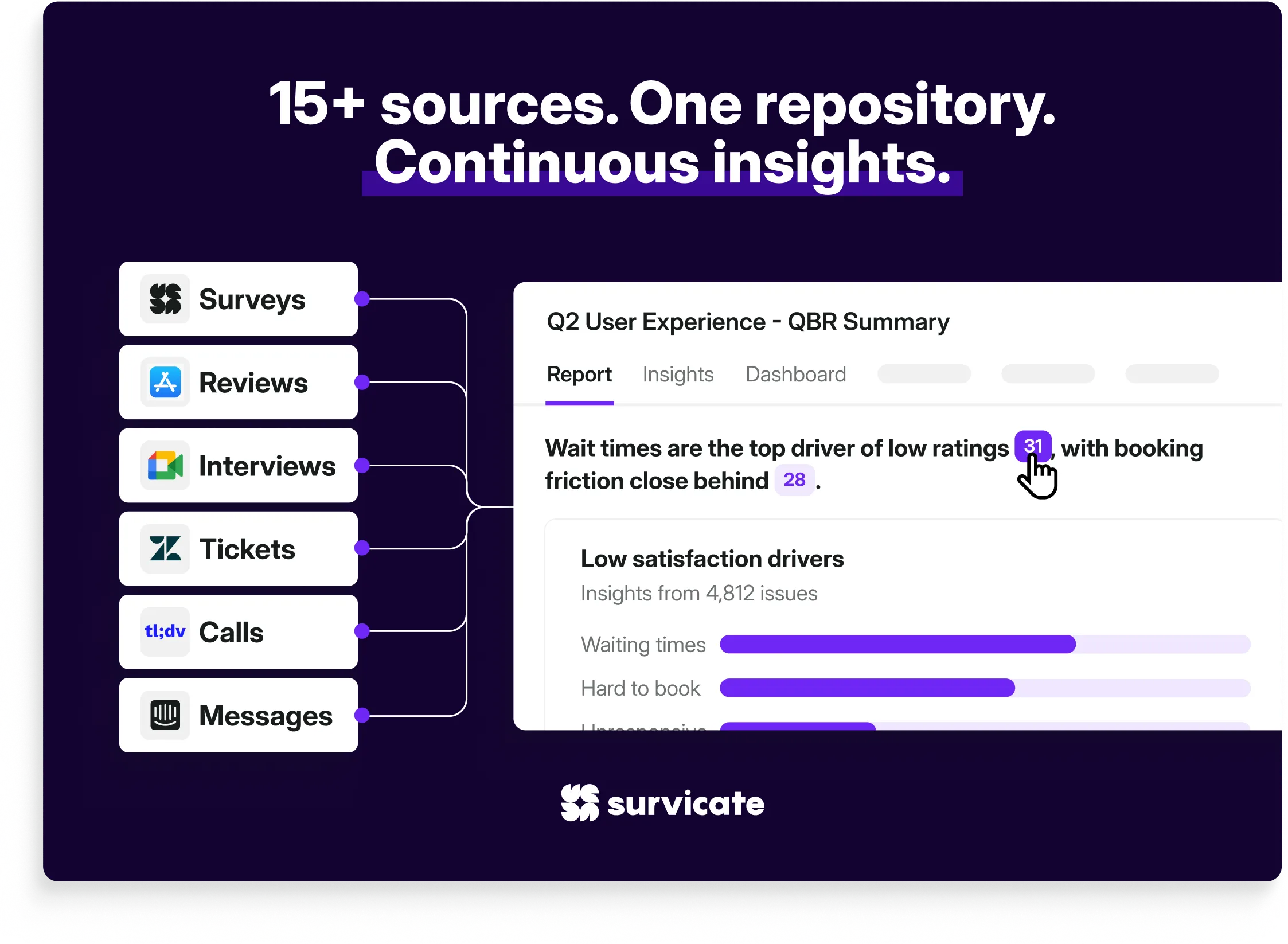
Survicate is an all‑in‑one customer feedback platform to create, distribute, and analyze survey results without juggling disconnected tools such as Forms, Sheets, or Excel. Instead of manually stitching together data from multiple sources, Survicate centralizes all your feedback in one place, automates response collection, and turns responses into instant insights with survey analysis AI.
With built-in logic, branded templates, native integrations, and visual dashboards, Survicate simplifies both quantitative and qualitative survey data analysis, saving time, eliminating spreadsheets, and helping teams make better decisions, faster.
Take survey analysis to the next level with Survicate's AI
.webp)
Manual survey analysis is out. AI-powered, automed insights are in.
Survicate’s Research Hub and Research Assistant transform how you understand and act on customer feedback. Together, they make survey analysis faster, smarter, and incredibly efficient, especially when you're short on time but need valuable insights.
Research Hub: Centralized and automated feedback intelligence
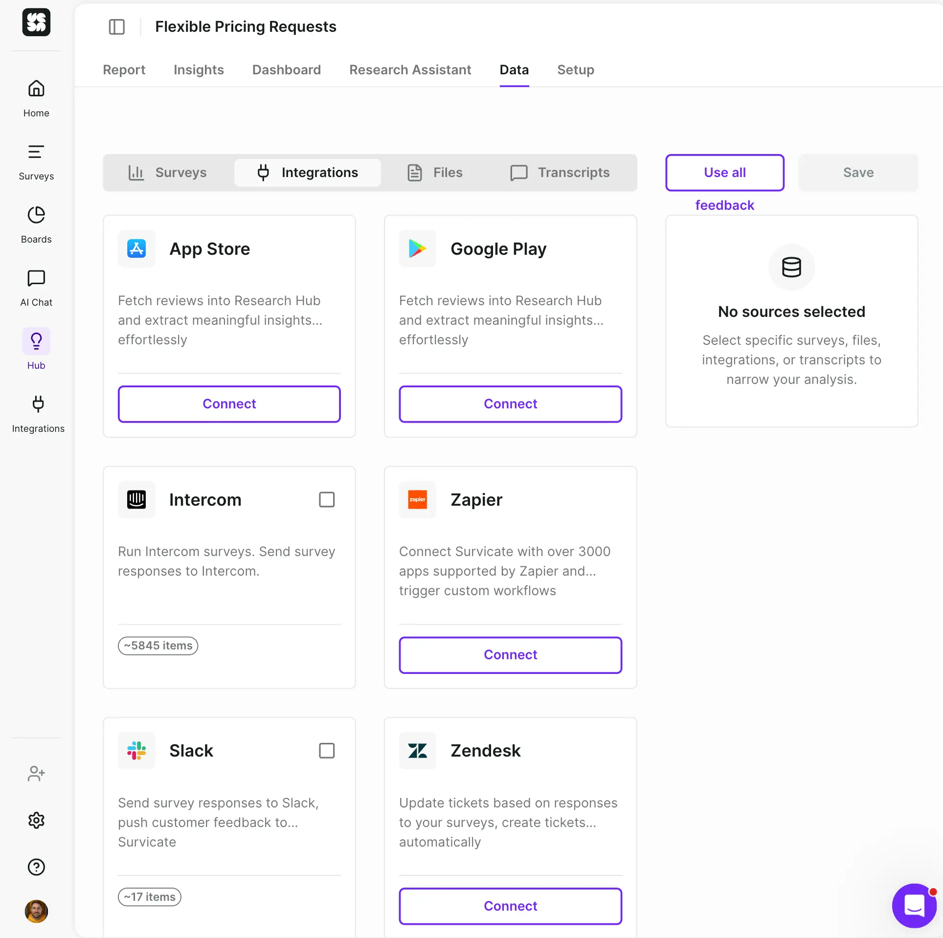
No more scattered spreadsheets, tagged-up Google Docs, or chasing feedback across tools.
Research Hub automatically gathers feedback from multiple sources, including survey results, App Store reviews, support tickets, or even user interviews, and organizes it in one place. You can then create research projects based on selected sources and time frames to answer specific research questions.
You'll get:
- AI-powered categorization: Instantly group survey responses into insights without you lifting a finger.
- Real-time visibility: Spot issues and trends as they emerge.
- Custom projects: Create defined projects that align with your business goals or research focus.
Research Hub helps you make sense of your rich qualitative data, no matter if you're identifying friction in your onboarding flow or running a sentiment analysis of a recent feature launch, without analysis paralysis.
Every insight is linked to the original user quote and feedback source behind it, always.
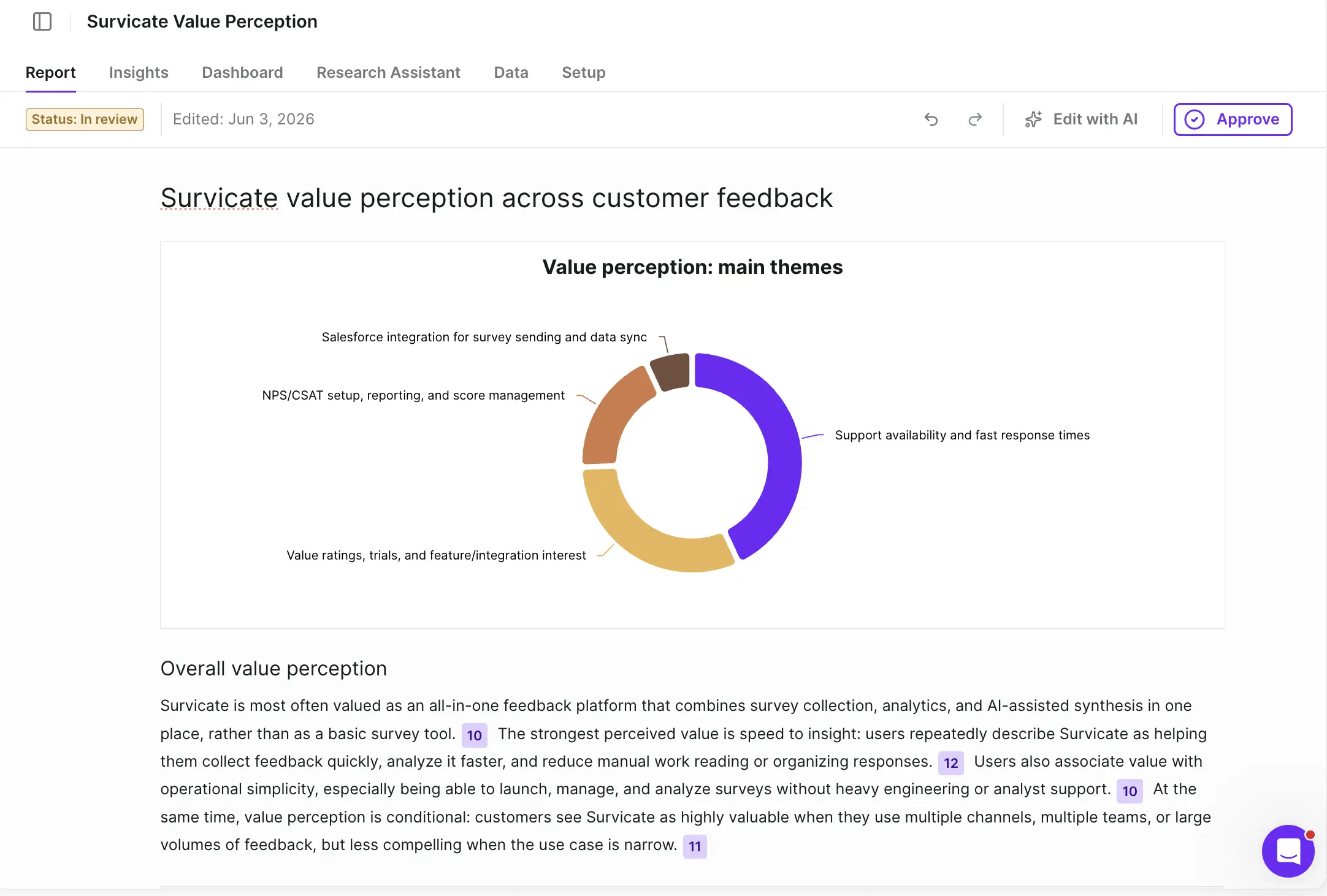
Research Assistant: Ask questions, get useful insights
Need to understand what customers think about a specific feature? Curious why churn spiked last month? Just ask.
Research Assistant is an AI chatbot that reads through all your connected survey research and feedback data and gives you straight answers in seconds. Think of it as your always-on research teammate.
Try prompts like:
- “What are the top complaints about our mobile app onboarding?”
- “Summarize the main feature requests from the last 30 days.”
- “What do users love about our pricing model?”
It analyzes:
- All connected feedback in Research Hub
- All live surveys in your workspace
- Open-ended and structured answers (e.g., NPS, CSAT, rating, dropdowns)
It's fast, insightful, and cuts through the noise so you can make better decisions with clarity and confidence.
Who benefits most?
- Product managers: prioritize feature development with confidence.
- UX & user researchers: understand user behavior at scale, without hours of tagging and coding.
- Customer experience teams: detect issues before they escalate.
- Marketing teams: spot messaging gaps and surface value props that resonate.
⭐️ Real-life example
Wellhub's Director of Global UX, Bruna Maia, uses Survicate's AI to quickly turn research findings and present data to other company stakeholders. For example, when the UX team needed to understand what first-time gym visitors worried about. They used Survicate to design a short survey and emailed it to a segment of first-time users, aiming to uncover their biggest concerns.
We got 2,000+ responses in a day and a half. Survicate’s AI let us quickly cluster those comments into clear themes, helping us to quickly shape the product experience we aimed to release.
Bruna Maia, Director of User Experience at Wellhub
The team was able to deliver a complete survey report with UX ideas on how to ease first-visit anxiety.
Tl;Dr: What does it all give you?
- Centralized feedback from all sources
- No hallucination since AI is based on real customer feedback
- Instant data analysis using all connected data points
- AI categorization and sentiment tagging
- Smart, conversational research assistant
- Always-on insights, no analysts required
Start making better product and business decisions—faster, with less guesswork.
Dashboards: visualize and monitor feedback in real-time
Survicate's Dashboards allow you to create customized, real-time visualizations of your survey data and insights from the Research Hub, so you can ditch other analysis methods. It allows you to present survey results compared with other metrics, including qualitative and quantitative data.
This feature enables teams to track key metrics, monitor trends, and make data-driven decisions efficiently
Key Dashboards' components
- Single survey question widgets: visualize responses to individual survey questions using various chart types, such as bar, column, pie, or line charts. This helps in understanding specific aspects of customer feedback at a glance.
- Combined score widgets: aggregate scores from multiple questions, like NPS or CSAT, into a single chart. This is particularly useful for tracking overall customer satisfaction across different surveys or time periods.
- Research Hub widgets: integrate data from the Research Hub to display trends over time, sentiment distribution, and feedback categorized by custom attributes. This provides a deeper understanding of customer sentiments and recurring themes.
Customization and flexibility
- Multi-survey integration: combine data from multiple surveys into a single dashboard, eliminating the need to switch between different reports.
- Custom attributes: break down data by various attributes, such as user segments or feedback sources, to gain targeted insighs.
- Export options: download charts and data in PDF or PNG formats for easy sharing with stakeholders.
Complete your feedback data analysis workflow
Integrating Dashboards with the Research Hub and Research Assistant, Survicate offers a powerful suite for comprehensive feedback analysis:
- Centralized data: gather feedback from various channels into one unified platform.
- AI-powered insights: leverage AI to categorize feedback and extract actionable insights.
- Interactive dashboards: visualize and monitor key metrics in real-time, facilitating quick decision-making.
This integrated approach ensures that teams can move from data collection to actionable insights seamlessly.
Other analysis features
Spotting trends over time
.webp)
- Track response volume, completion rate, and view count
- Group metrics by day, week, month, or quarter
Filtering survey responses
- Filter responses by:
- Question and answer,
- Custom attributes (e.g., plan type, user role),
- Date, device, location, and tags.
- Combine filters using AND/OR logic
Individual survey-level view
.webp)
Besides collective AI features for survey and feedback analysis, each survey you run with Survicate can be analyzed separately with an individual survey response tab, in which you can:
- See every answer from a specific respondent,
- Check out survey impressions,
- View the response rate,
- View their metadata: URL, OS, browser, session,
- Get a direct Slack/shareable link to highlight specific feedback internally.
Qualitative analysis
.webp)
Besides analyzing large quantities of data in Survicate easily, you can also dive into the specifics, with:
- Word clouds for AI-generated visual summaries of common phrases and keywords from open-ended questions,
- Manually or automatically tagging responses for easier categorization and follow-up,
- Exporting full or filtered results to XLSX or CSV,
- Scheduling recurring email reports (daily, weekly, monthly),
- Enabling email notifications for real-time feedback alerts,
- Automatically pushing responses to CRMs like HubSpot, Intercom, Salesforce,
- Syncing survey attributes with user profiles for richer segmentation and targeting,
- Seeing answers in support tools like Zendesk, Slack, or Google Sheets.
How to analyze survey data in Excel
If you're not an Excel pro, here are a few tips that might motivate you to upgrade your Excel data analysis skills. And believe us when we say this – it's worth becoming friends with this Microsoft data superstar.
So, without further ado, let's get right to it!
Once you get your responses from a survey, export the desired file in .xls or .csv format. Then, open the survey results in Excel. It's time to format the data to make it more analysis-friendly.
Tip #1: Create blank data rows with a filter
A lot of survey respondents provide answers only to some of your questions. This may result in a survey data file that resembles a checkerboard.
So, how do you delete empty rows and make sure you're not accidentally deleting a row that only appears to be empty at first glance?
While you'll find a lot of different ways online, we believe the safest way is to identify blanks consecutively, column after column.
Let's go through the steps of making this:
Looks more like this:

Let’s go!
To start, select Column A and click the “Filter” icon.

A filter will appear on the top row of the first column. Click on it and choose “(Blanks)” from the list.

Repeat these steps for the remaining columns.
Select all the filtered (blank) rows. The numbers will appear in red on the left. Right-click and choose “Delete” > “Delete Sheet Rows”.
Now, clear the filters. All that will remain are rows with at least one field filled out. Your survey data will instantly look better and be more actionable.
Tip #2: Count the number of blanks in a range with COUNTBLANK
You might also want to find out how many empty cells there are per row, column, or entire file. In terms of your survey data analysis, this will tell you how many answers weren't provided for each question.
COUNTBLANK allows you to quickly define and test a range against empty cells. Let's assume you want to inspect several rows.
Create a new column at the end of your file. Enter the formula:
“=COUNTBLANK(first_cell:last_cell)”
In our survey analysis example, this would correspond to cells A2 and D2.

When you hit “Enter”, you’ll see the answer. You can now drag the formula down to as many rows as applicable.

It’s that simple!
Note: If you’re an analytics newbie, your initial instinct might prompt you to delete all blank cells and retain answers only. We advise you not to do this unless you’re certain this won’t hurt your data structure or desired results.
This approach might backfire if your feedback collection strategy isn’t designed to handle respondent anonymity. This is because removing blank cells can shift data from one row to another.
Now that we got this covered, here’s a formula to instantly start making sense of your numbers.
Tip #3: Convert numbers to ranges with VLOOKUP
This will do wonders if you want to segment responses based on numerical values in a selected column. It is also a great first step to deriving data in a way that can be used for more intricate analysis.
Data Scientist Ashutosh Nandeshwar recommends using the VLOOKUP formula to quickly overview what the numbers in your file stand for.
Example: Let’s say you asked your respondents to provide information on the number of employees hired at their organization. Your goal is to understand how many respondents fall into the category of micro, small, medium, and so on companies.
Let’s assume you define the size of businesses according to the ranges below:
- 0-49 - Micro
- 50-99 - Small
- 100-199 - Medium
- 200-499 - Large
- 500-999 - Huge
- 1000+ - Enterprise
Once you’ve defined this, apply and copy the formula with the following syntax to the entire column:
=VLOOKUP(lookup_value;table_array;col_index_num;[range_lookup])
In terms of the table below, this corresponds to:
=VLOOKUP(A2;F3:G8;2;1)
Use the dollar ($) sign to keep the formula from shifting the numbers.

To make things simpler to understand, column C shows what formulas were inserted in column B.
As you can see, VLOOKUP instantly assigned the responses according to your definition.
The best thing? This is just one of the countless ways to measure various data to derive insights from your audience.
Imagine where VLOOKUP can take you in terms of measuring the number of purchases a user has made, the value of their subscription plan, or the number of sessions they initiated with your software, to name just a few.
💡 Pro tip: With Survicate, you can go even a step further in grouping your respondents and pass custom respondent attributes from your website or app.

This way, you export a survey report that includes information you believe complements your results or knowledge on the specific user best. You can read more about targeting based on respondent attributes in our Help Center article.
Tip #4: Convert binary answers to binary numbers
Oftentimes, you'll want to convert two-choice answers to categorical questions to a numerical value.
Example: Let's say you've noted an increase in customer satisfaction (say, through an NPS survey) and want to find out how much it's been influenced by a recent integration with a popular tool.
Let's assume you've singled out a group of users who've tried the integration and sent a survey asking them: “Are you satisfied with our integration with X?”
The results are in, and they look more or less like this:

The easiest way to convert text values into numbers is by applying the following formula:
=--(Cell_number=”yes”)
Let's get to it. Create a new column at the end of your sheet.
Assume Column C holds all your “Yes/No” answers. Enter formula =--(C2=”yes”) into a cell in the new column.

Drag the entire formula down and watch the binary magic happen.
Note that the formula recognizes all “yes” answers and assigns them a numerical value of 1, while everything else is assigned a 0.
This simple formula won't work for questions with rating scales of more than two options or where more than one type of answer is crucial for user feedback analysis.
Tip #5: Calculate the correlation between survey results with CORREL
Now, if you want to uncover what the 0-1 answers you extracted actually say in relation to your NPS, CSAT, or CES score, one of the most efficient ways is to use the CORREL formula
Here's the syntax:
=CORREL(First_Cell:Last_Cell,First_Cell:Last_Cell)
How does this work in real life?

As you can see, two cells have been selected. Now, a numerical value is displayed. But what does it actually mean? If you insert a line chart, all will be graphically revealed:

You can see that the users who have activated the new integration tend to give higher NPS scores.
Pros and cons of survey data analysis with Excel
Hopefully, you just learned a couple of useful formulas to guide you through your future customer feedback analysis.
So, is Excel the best solution for you? Let's sum up the pros and cons.
Pros
- Almost endless survey analysis possibilities with advanced use
- Widely used; it has kept its hegemony for years and will likely be popular for many years to come
Potential cons
- Not an ideal solution if you're working on data with a team; if you don't use Office 365, there's always the risk of overwriting data
- Not especially convenient if you want to regularly export and update real-time data (if this is the case, then you'll like our Google Sheets integration)
- Comparing different spreadsheets is impossible without add-ons
- Working in the cloud is practically impossible
How to analyze survey results in Google Sheets
For the occasional spreadsheets user, Excel and Google Sheets appear to do more or less the same. The fact is, most Google Sheets formulas are either identical or very similar in syntax to the Microsoft software.
For the sake of focusing on tips specific to Google Sheets, here's a cheat sheet with the available functions and their descriptions.
So, without further ado, let's take a look at how Google Sheets can be used differently from Excel as far as survey data analysis goes.
Let's connect our Survicate account with Google Sheets. Go to the Connect tab in your panel.

And search for the Google Sheets integration.

You can send previous responses…

Or create an entirely new sheet.

Save data from several surveys to one spreadsheet
Here at Survicate, we are often asked for tips on how you export your survey responses to a single spreadsheet.
Certainly, while some surveys are best saved to a single file, this doesn't apply to all use cases. Especially if you run regular surveys of the same type and want instant access to all previous response data, not just your recent export.
For example, let's assume you run regular NPS surveys.
You want to store all survey response data for NPS surveys your organization carried out between 2018 and 2022. Ideally, you'd like each new survey response exported to save to a separate worksheet/tab of a single file called “NPS surveys 2018-21”.
With Survicate's integration with Google Sheets, this is all possible. Just click “View Sheet” in the “Connect tab” to get your up-to-date information.
Saving surveys to a single file is just one of the benefits of our Google Sheets integration. Here's one that will take your standard analytics charts and tables to a whole new level.
Consider survey data visualization with Looker
Looker Studio (formerly Data Studio) is another unbeatable Google Suite perk that puts basic spreadsheet histograms to shame.
If you're not familiar with the tool, it turns your .xls/.csv file into real-time graphics reports that transform data into visual, actionable insights.
Here's a short video by Google that shows how you can connect your Google Sheets with Data Studio.
Let's imagine you've just run an NPS survey and want to visualize it aesthetically for your next stakeholder meeting. You also want to run the data by the results from the previous quarter.
After you've uploaded the Google Sheets file, you'll quickly see the magic – you don't need to move any data into charts manually or create any custom formulas. All is synchronized with your file in real-time.


Looks great, doesn't it?
Still, what if you've already uploaded the .xls file before, but with survey responses from the previous quarter? How can you upload the newest Worksheet?
It's very simple:
1. Go to “Data Sources” and select “Google Sheets” from the list.
2. Find the name of your source file on your survey list.
3. Select the new Worksheet you want to update your report with.

4. Hit “Connect” in the upper right corner.
5. Double-check if there's anything you want to correct in the worksheet before you proceed.
6. Upload the data – say, even simply convert a “number” to a “currency” field.
7. Hit “Add to report” in the upper-right corner.
You can now choose between your older survey responses and the newest worksheet and decide which data sources you want to compare or use for specific tables and charts.

Pros and cons of survey data analysis with Google Sheets
Now that we've shown you our two favorite tricks for real-time analysis (hats off, Google), it's time to summarize the pros and cons before you start analyzing data with Google Sheets.
Pros
- Google Sheets is free (or reasonably priced for Enterprise accounts)
- Can be worked on by multiple users (useful for remote teams)
- Can be easily transformed into striking Looker Studio visuals
- Data can be sent and updated in a matter of seconds to both new and previously created files
- You can incorporate survey results into your company's other key metrics, such as revenue, registration, or churn rates, and create stunning visuals for all critical data
Potential cons
- If you're a state-of-the-art data analyst, you might find Excel much more powerful, but for basic-to-intermediate survey analysis, Sheets win at versatility (read this comparison for more in-depth details).
How to turn survey results into objectives
In this guide, we've already talked you through our favorite features, functions, and formulas available across Microsoft and Google data analysis and reporting software.
Assuming you have now learned a couple of new things about optimizing your survey feedback analysis process, it's time to focus on what your next steps are.
In the words of UX Matters:
“Too often, (…) we focus purely on analysis—and the identification of facts—and ignore synthesis, which often occurs organically during analysis.”
As you can see, this relates as much to UX research methodology as it does to survey response analysis efforts. So, let's take a look at some tips that might help you organize your work effectively.
Make a list of patterns
Now's the time to review what your efforts in Excel/Google Spreadsheets have revealed. See any surprising numbers or peculiar correlations of data? It might be worth watching this pattern first.
Write down every single hypothesis that comes to mind
What might seem to be of minor importance now might reveal itself as part of a much more significant pattern later on. It's better to observe and note it now instead of returning to it from scratch in the future, even if it'll eventually land in a backlog (forever).
It's like a dental appointment. Your teeth might be perfectly fine now, but your dentist might see a tooth or two that might become troublesome in the future.
Discuss what insights these patterns reveal
Sit down with your team and think about the patterns that keep showing up in your survey results. In most cases, there is a common thread that keeps showing up in survey results with a similar audience.
- Is this a recurring trend?
- Is it something worth acting upon now, or putting to the test of time?
- What would this piece of data say if we contested it with other notable information?
These are all effective questions to engage your team in processing and synthesizing data. You'll be surprised to see how far you go with some of your best minds set on the task.
Validate your insights beyond the team
If you're still hesitant as to whether the results are worth acting upon, extend your search. Ask your team members for their opinion or send follow-up questions to a selected segment of your audience.
Talking to other team members will often reveal a fresh point of view on the matter, while asking your users might uncover the missing elements of the puzzle.
In the case of the latter, we recommend taking your time to formulate questions in a way that doesn't leave any doubt and clearly validates or disproves your hypothesis.
Unresolved? Give it some time
If there's a result or pattern you don't think should be dismissed but you can't find the source of, don't give up. Write it down and correlate the results with several of your future response results. What isn't apparent now might reveal itself in months to come.
Collect and analyze survey results with ease
In this post, we've shown you several actionable steps and tools that may prove valuable in your future survey analysis endeavors.
Now that you know your way around survey data analysis, you might also like our tips on increasing the survey response rate to collect even more actionable feedback.
Decided to give Excel a chance to become your “go-to” tool? Found some unbeatable advantages of Google Sheets? Or maybe fell head over heels for Data Studio capabilities?
Regardless of where you take your data analysis, Survicate will help you master the art of effective feedback collection
With Survicate, you can:
- Organize and analyze all your feedback from different sources
- Integrate with tools for seamless updates
- Use our user-friendly, built-in analytics tool, where data is both visually appealing and actionable – a great place to kick off your analytics adventure!
And perhaps best of all, you can use Survicate for free on our 10-day trial


.svg)

.svg)