Tl;dr
When comparing Typeform vs SurveyMonkey, we come to the conclusion that both are pretty good tools—but each for a different audience.
So:
- choose Typeform if you’re just starting your journey with customer feedback and want to see what it’s all about. It will allow you to create forms and analyze the response data, but you’ll have to turn a blind eye to a bit outdated designs.
- and choose SurveyMonkey if, in addition to collecting feedback from your customers, you also need an external respondents base, which you can purchase additionally. What you’ll have to look past is the clunkiness of this software, a steep learning curve, and dated designs.
If neither seems to fit...
choose Survicate if you’re looking for a survey software that’s easy to use and as modern as they make them. Here, you can safely let AI help you create your surveys in minutes and analyze large amounts of data for you, effortlessly. Add NPS, Matrix, CSAT, and more questions to your surveys, test out the logic using an interactive preview, use endless targeting options, and get the response notifications exactly where you need them, even if it's directly on Slack.

Typeform vs SurveyMonkey, two survey tools, different learning curves, similar outcome.
In this article, we’re taking both software for a test drive to see just how far we can go in terms of online surveys, detailed data analysis, distribution methods, and more.
But besides just features, we’ll also give you a comprehensive analysis of both tools’ ease of use, pricing, and reviews.
🚨Spoiler alert: seeing a common theme of dated designs in both Typeform and SurveyMonkey, we’ve decided to throw in Survicate into the mix. For good measure.
Let’s get right to it.
Typeform: a beginner-friendly solution
Typeform is a form builder that helps you create quizzes, surveys, and, most of all, forms.
Founded in 2012 by Robert Muñoz and David Okuniev, Typeform was created in response to how complicated online form tools were back then, and how lacking they were in terms of design.
⭐ G2 Rating: 4.5/5 [700 reviews]
Ease of use
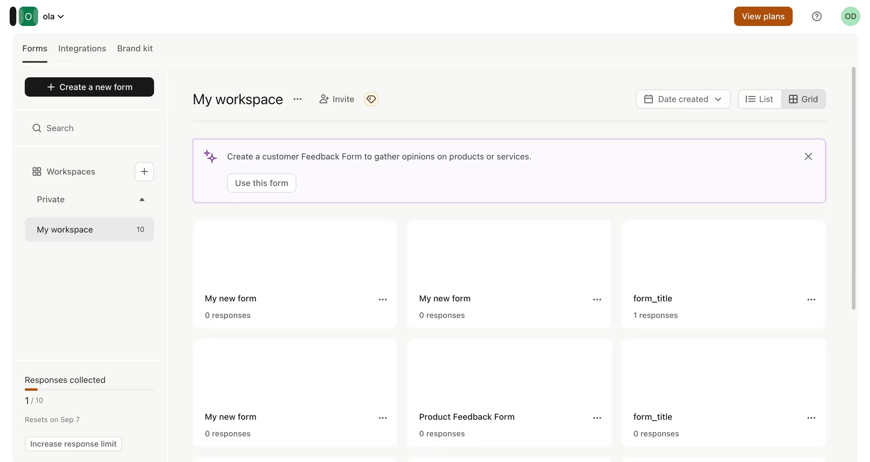
The process of signing up for Typeform is fairly easy, there are no credit card details required, nor too many steps in the whole process. Immediately after signing up, you're met with the first action to complete—to create your first survey project, with the help of AI, starting from scratch, or by importing your questions.
Overall, the tool is rather simple, consisting of a dashboard and all your added forms. The smallest of hiccups, such as forcing you to reveal a question to see the included options in case of single-choice questions or not the most modern design, are not affecting the ease of use too much.
Free trial
Unfortunately, Typeform does not offer a traditional free trial, meaning you can't take the paid plans for a proper test drive. Instead, you can hop on the free plan with limited features and 10 responses per month, and if you're curious to try the paid features, you can, but there's a catch.
You can test the paid features, but you won't be able to make your surveys or forms go live if they include them and you're on the free plan.
Features
Creating surveys
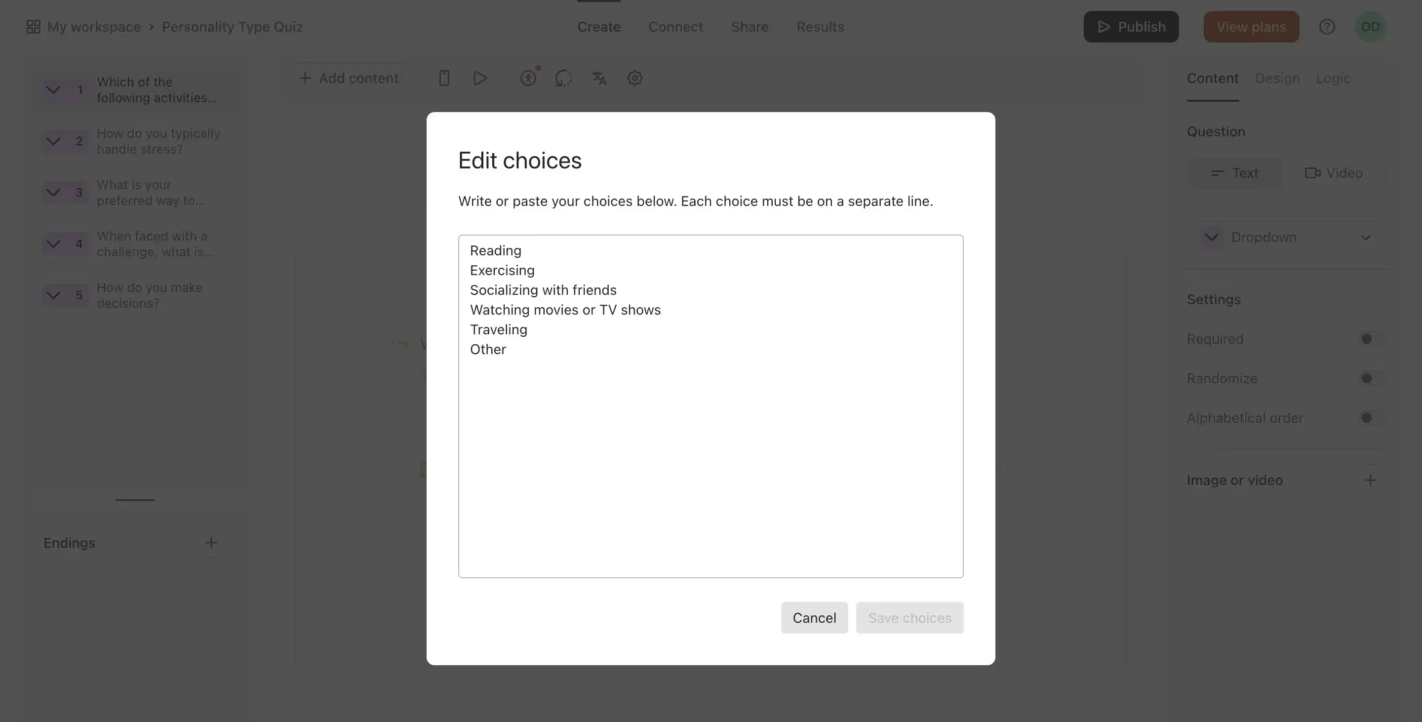
Just as we mentioned, you can choose to start your survey either completely from scratch, using Typeform's AI, or by pasting your questions into the tool.
For the last option, Typeform handles the editing part, even if you include answer choices in the imported text.
💡You can also import your surveys directly from Google Forms, which is a nice touch for those upgrading from the Google survey solution.
Next, using Typeform's AI to create your survey can also be helpful. All you have to do is describe which type of form, quiz, or survey you want to get, and Typeform will generate that real quick. The questions are logical and fit with the entered description, just as the answer choices.
Moreover, Typeform suggests what you could generate if your brain feels fuzzy, making the whole process even easier.
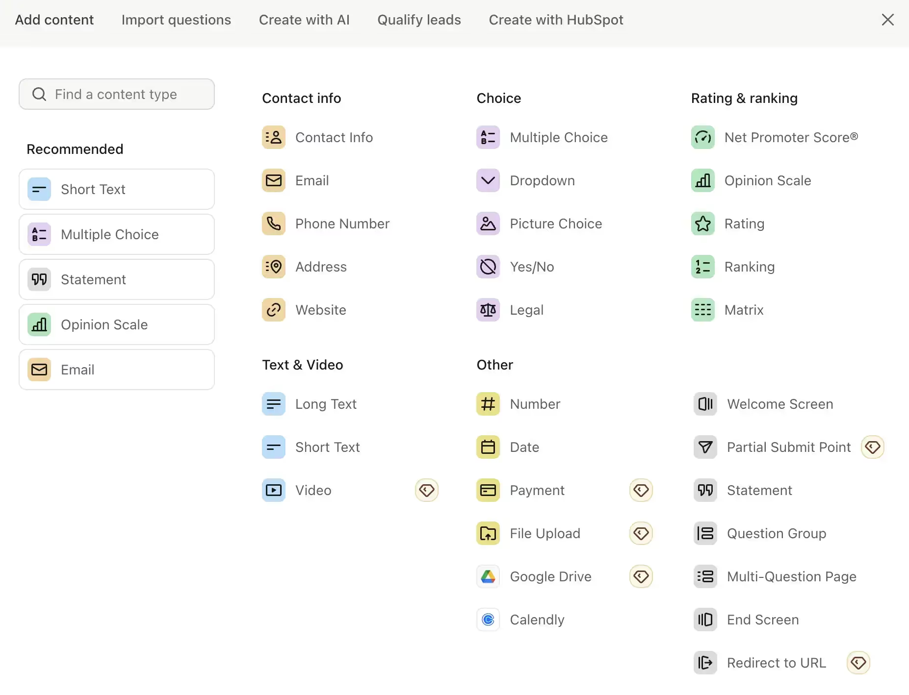
When starting from scratch, you get to "Add content" to build your form—which caught us a bit off guard. Yet looking at all the options you can add, the UX copy choice ultimately made sense.
For example, you can choose to add different contact details fields for your users to fill in, like a phone number or an email address, but you can also go for video files or embed a Calendly booking form.
Overall, you get many fields to choose from, even a legal question (which is basically a field in which your user can choose to accept or not accept a certain term you enter).
Following that you get right into the ranking questions, which cover the Net Promoter Score (NPS), an opinion scale, rating, ranking, and matrix. You can also choose long and short text, a video answer, number, date, payment, file upload, Google Drive, and Calendly.
Just a heads up, though. More advanced question types, like video answers or payment fields are premium features, unavailable for use on the free plan. 👀
Moving on.
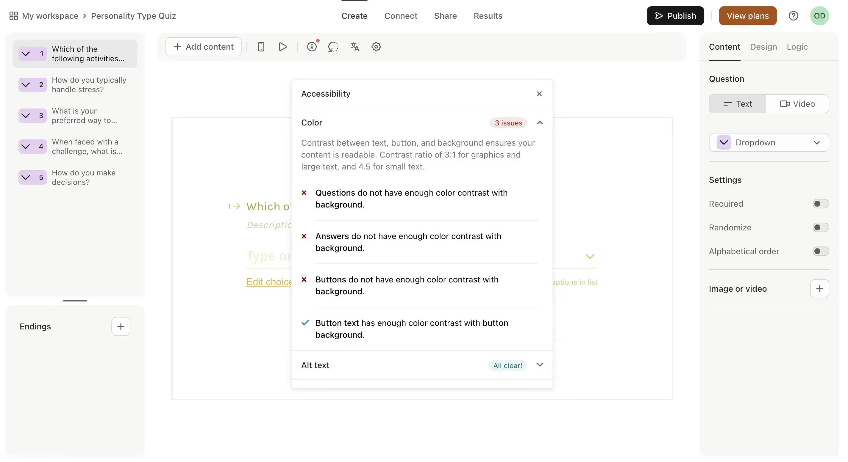
If you dive deep into the Typeform options, you’ll also notice the accessibility option, which is an extremely nice touch to the survey creation process.
It automatically checks whether your survey will be accessible in terms of the colors you use, if the alt text is visible, and whether the content of your survey is clear.
Overall, creating a survey in Typeform is pretty easy; however, it's the little things that threw us off sometimes.
For one, the designs seem a little dated, we can safely say that we expect a bit more from a SaaS product in 2024.
For two, the preview—in this case, it’s not a WYSIWYG (What You See Is What You Get) type of solution.
The preview is available, but you have to go on a quest to find it under the little play icon on the top of the form editor. It's very hard to notice, but it does allow you to click through your survey to see how it behaves and to check the mobile view.
For three, setting up the logic seems to be done in the most roundabout way possible, with a nearly Figma or Miro-like view.
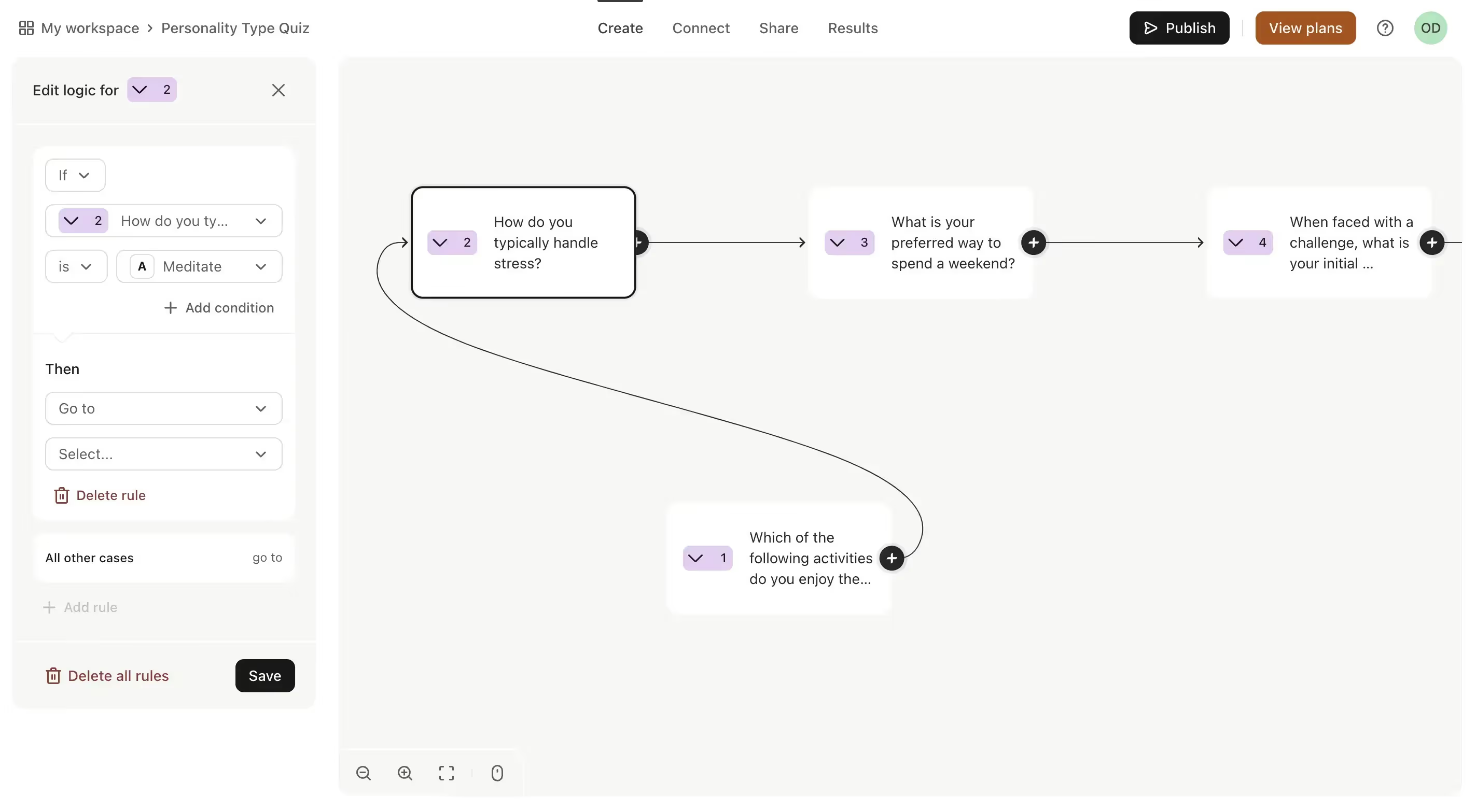
You have to scroll and drag your mouse through the whole screen to see the different questions.
You then have to drag one question to another to set up the branching logic, but you can also use a left-hand panel to set up the logic there, which makes things even more confusing.
Final result
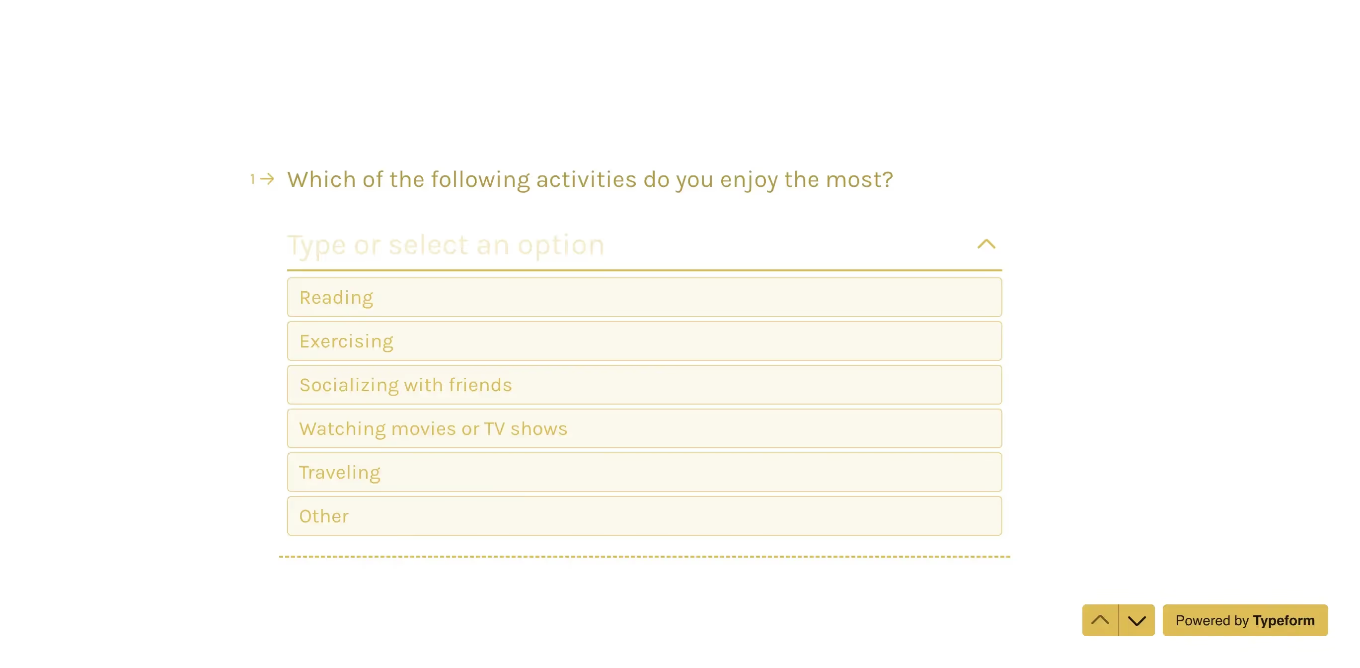
The final result is a clean, but maybe not the most modern of surveys.
You can share it with your clients or users with a direct link, embed it in an email, embed it on your website, or use the various integrations Typeform offers.
Analyzing survey data
To analyze survey data, Typeform puts forward four options:
- Basic insights: views, starts, submissions, completion rate, and time to complete the survey. On the premium side, you also get a question drop-off rate calculated.
- Summary: a percentage summary of your users' answers to each question.
- Table view: all the responses presented in a table view with filtering options available to sort through that data more easily.
- Smart insights: a premium feature available on the paid plans that allows you to analyze the survey data using AI.
Data analysis here is, again, not the most modern thing in the world, but it definitely does its job and presents all the basic details from the completion of your surveys.
Qualifying leads with AI
The Qualifying Leads with AI feature is the one that seemed the most interesting to us when we first signed up to Typeform simply because it lands under the "Create new form" button. And we soon found out why it’s in that exact spot.
After feeding Typeform's AI with basic information about your business and ideal customer, it drafts a profile description of your company, which you can then use to generate questions based on that information.
But these aren't just regular questions. Typeform generates a lead qualifying form, which you can further enhance by applying different logic rules and lead scoring. For example, by tagging a lead as "high priority" if their answer to the business size question falls under 250-500.
We find it to be a pretty useful feature.
Pricing
Typeform offers a total of eight plans. Yes, you’ve read that correctly, eight plans.
So you’re sure to find something for yourself—but beware of analysis paralysis with this one.
The easiest way to break down Typeform’s pricing is to make a division between the Core plans and the Growth plans.
The Core plans give you 5 options to choose from, which can be broadly categorized into the free plan and the 4 paid options.
The free plan
What you get ✅
It comes with 10 responses you can collect per month, unlimited forms you can create, and all the basic form creation features. This plan also includes the AI form generator and a part of the integrations, including Zapier, AirTable, Calendly, Slack, or Mailchimp. You can analyze your survey results and download the responses.
Being on the free plan comes with one team seat.
What you don’t get ❌
Here, you won’t have access to any of the paid plans’ features, including basics like form translations, redirecting users to a URL after completing the form, or accepting file uploads on your forms.
The paid plans
There are four paid plans in the Core division of Typeform’s pricing: Basic, Plus, Business, and Enterprise. They cost 25 EUR, 55 EUR, 89 EUR per month on monthly billing. The Enterprise plan is a custom solution, whose price depends on your specific needs.
What you get ✅
Being on the paid plans gives you more responses, starting from 100 per month all the way to a whopping 10 000 responses per month on the Business plan. Here, you can also upload your logo or change the metadata of your forms. Starting with the Plus plan, you can also remove Typeform’s branding completely and enjoy a more white-label experience.
Connecting a custom domain however is only available in the highest-tier of the Core plans—Enterprise, which is a custom solution. Form translation is available from the Business plan and up, just as the more advanced integrations, like Google Analytics. On the paid plans, you can finally redirect your users to a different URL, from Plus plan and up.
Smart Insights, the AI analysis feature we’ve mentioned earlier is unfortunately only available from the highest tier—the Enterprise plan. You can accept payments in your forms from the Basic plan and collect responses from the Plus plan. The highest-tier plans also include more of a VIP treatment with priority support.
What you don’t get ❌
None of these plans include the features that are available in the Growth plan division of Typeform’s pricing. For example, video answers, reCAPTCHA, drop-off rates, a dedicated Customer Success Manager, HIPAA compliance, and more.
The Growth plans come in three options: Growth Essentials, Growth Pro, and Growth Custom. The plans cost 179 EUR per month, 309 EUR per month, or custom, based on your needs.
Pros & cons
Typeform’s pros
Playing around with Typeform and its survey creator, we especially enjoyed:
- The shallow learning curve—although little things hidden in the nooks and crannies of Typeform seemed unintuitive, like its preview being a small play icon, we found ourselves up and running pretty quickly. The time from creating an account to working on the first form can be counted in minutes, which is always a good sign.
- You get what you pay for—although the free plan doesn't offer many features, the first few paid options definitely won’t break your piggy bank, starting at 25 EUR per month. However, be aware that the more advanced features are hidden in the most expensive plans.
- The accessibility feature—automatically checking your forms for proper accessibility—won us over when trying out Typeform.
- All the basics in one place—from creating your surveys and quizzes to analyzing the results, Typeform generally offers all the basic features you’d need to manage customer feedback with one tool.
Typeform’s cons
Now for the parts that either caught us off guard or were on the rather unpleasant side of things when playing around with Typeform:
- No free trial—Typeform decided to ditch the traditional free trial and replace it completely with a free plan. The thing is, Typeform’s free plan is heavily limited, and doesn’t allow you to take for a test drive all of the premium features. And those that you can test out, you can’t make live, which doesn’t give you a full picture of how those features actually work.
- Complicated pricing—Having to choose yet another subscription plan to commit to among all the other subscriptions you’re juggling, and having to make your choice between eight options is just way over the top.
- Not so modern designs—Typeform’s designs seem to be a little stuck in time, not following the modern design trends. All would be fine if you didn’t have to share those forms with your clients or, even worse, potential clients to convince them to work with you.
- Form logic straight out of Miro’s hell—The form logic in Typeform is one of the most difficult things to figure out. The fact that you have to zoom in and zoom out on your Figma or Miro-like logic setup is difficult on its own. Add to that the ability to change some of the logic connections using the panel on the left, and you’re even more lost.
- A bit too simple data analysis—Typeform is a simple survey tool and it shows not only in its ease of use, but also in some of the features being a bit too minimalistic. We didn’t get to test out the premium features, like their Smart Insights, but the report analysis we did get was the most basic it can be. Getting the jobs done, but not pulling a lot of conclusions out of it.
Who is Typeform for?
We believe that Typeform is a great tool for those who have just decided to collect feedback and get serious about it. It covers all the basics, from creating your forms to simple data analysis after, for not the most painful of prices.
If you can look past a bit of outdated designs and don’t mind a complicated pricing to go over in order to choose your best option, you’re in for a treat, because Typeform knows how to do forms right. Oh, and their AI is pretty helpful, too.
SurveyMonkey: more options, but at what cost?
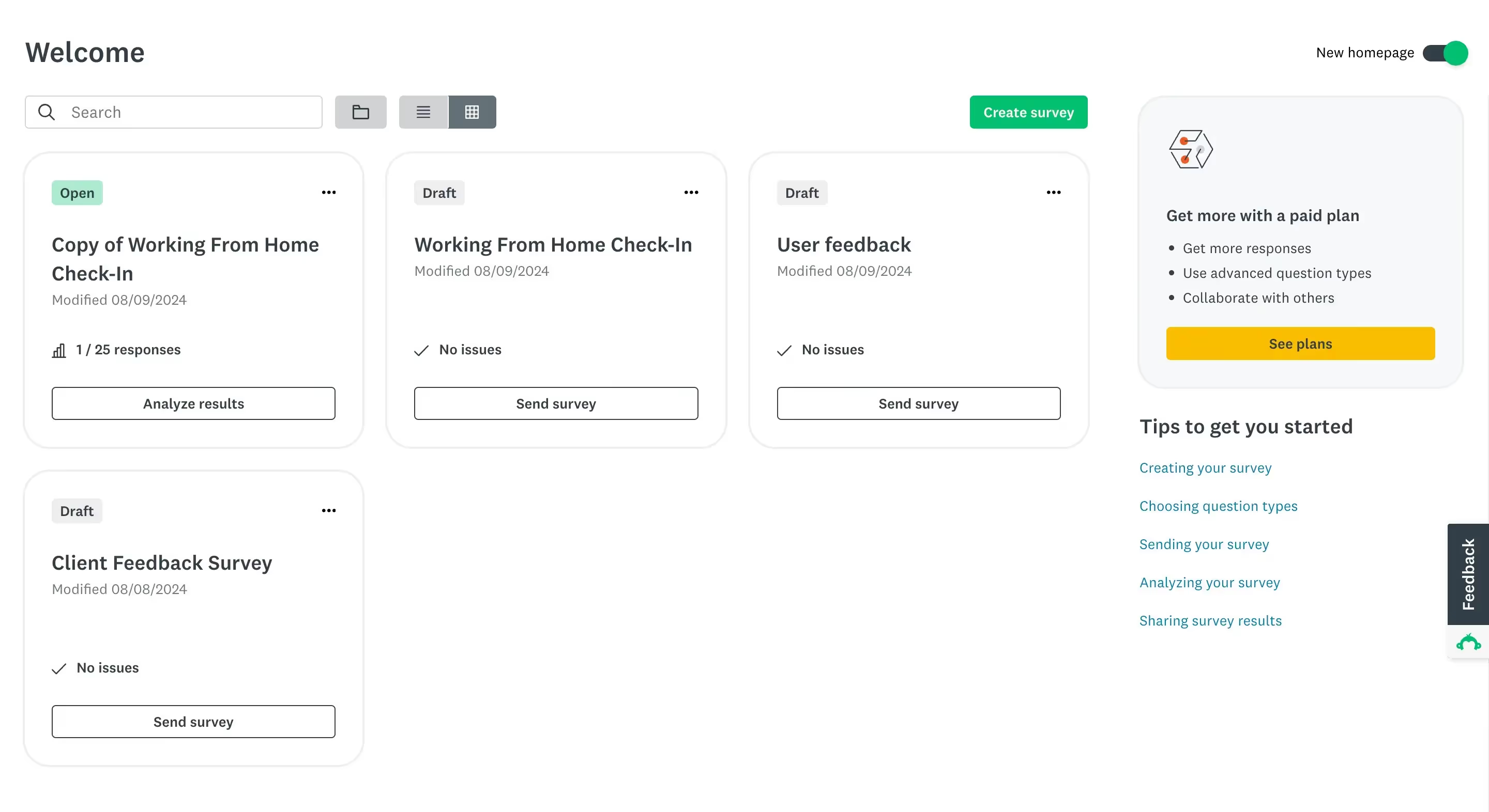
SurveyMonkey is yet another customer feedback platform, this time with a much longer presence on the market—founded in 1998 (just like the author of this article 😉) by Chris and Ryan Finley.
⭐G2 Rating: 4.4 [22.8k reviews]
Ease of use
Now, SurveyMonkey’s date of origin shows in its outdated designs, but it’s not only its designs that affect the learning curve and ease of use.
Luckily, we got to testing SurveyMonkey at just the right time, coinciding with a much-needed dashboard update. Now, the main dashboard does not require any excessive scrolling; it simply shows the created surveys in either block or list view.
Still, this survey software is not the easiest to figure out. Every single question you want to add creates unnecessary steps, and oftentimes seems genuinely like editing WordPress settings.
Free trial
Unfortunately, SurveyMonkey, just like Typeform, is allergic to free trials. Instead, you can create a free account on the very limited free plan to help you get a feel of the platform.
Features
Creating a survey
To create your first survey, you can go for pretty much the same options that Typeform offers.
To be precise: you can choose to start from scratch, go for an AI builder, import your questions, copy and paste your survey, or start with a ready-made template.
Now, going for the base option of starting with a clean slate, you get to choose from nearly 30 different field options.
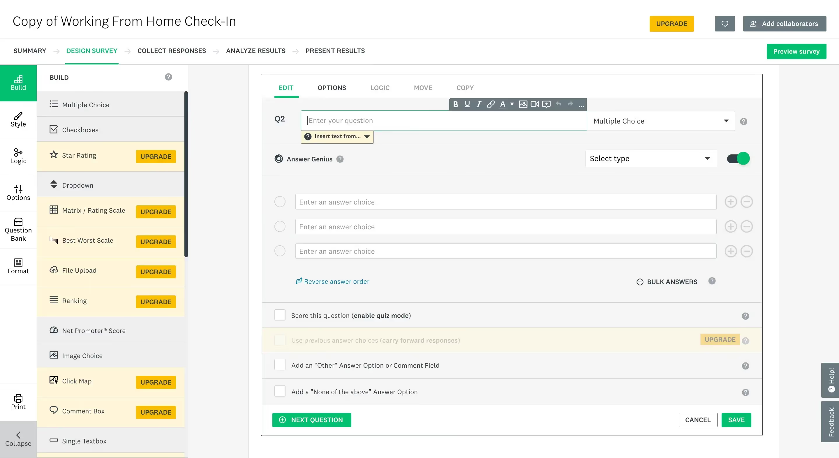
Some are basic contact detail fields, like a phone number or an email address, while others are a bit more advanced, like a Matrix rating scale or an NPS rating score.
In turn, the survey builder is an old-school drag-and-drop tool.
The dated look of this solution wouldn’t really be an issue if it worked correctly; unfortunately, it didn’t work perfectly for us. Scrolling through the survey fields slowly enough to choose the right option seemed nearly impossible as even the slightest scroll movement sped through the list like Edward Cullen through the woods of Forks.
It’s also worth noting that anything more than basic is off-limits for free plan users. Meaning, you won’t get a taste of SurveyMonkey’s NPS or star rating, file uploads, or payment boxes—unless you don’t plan to send your survey out, similar to how it works with Typeform.
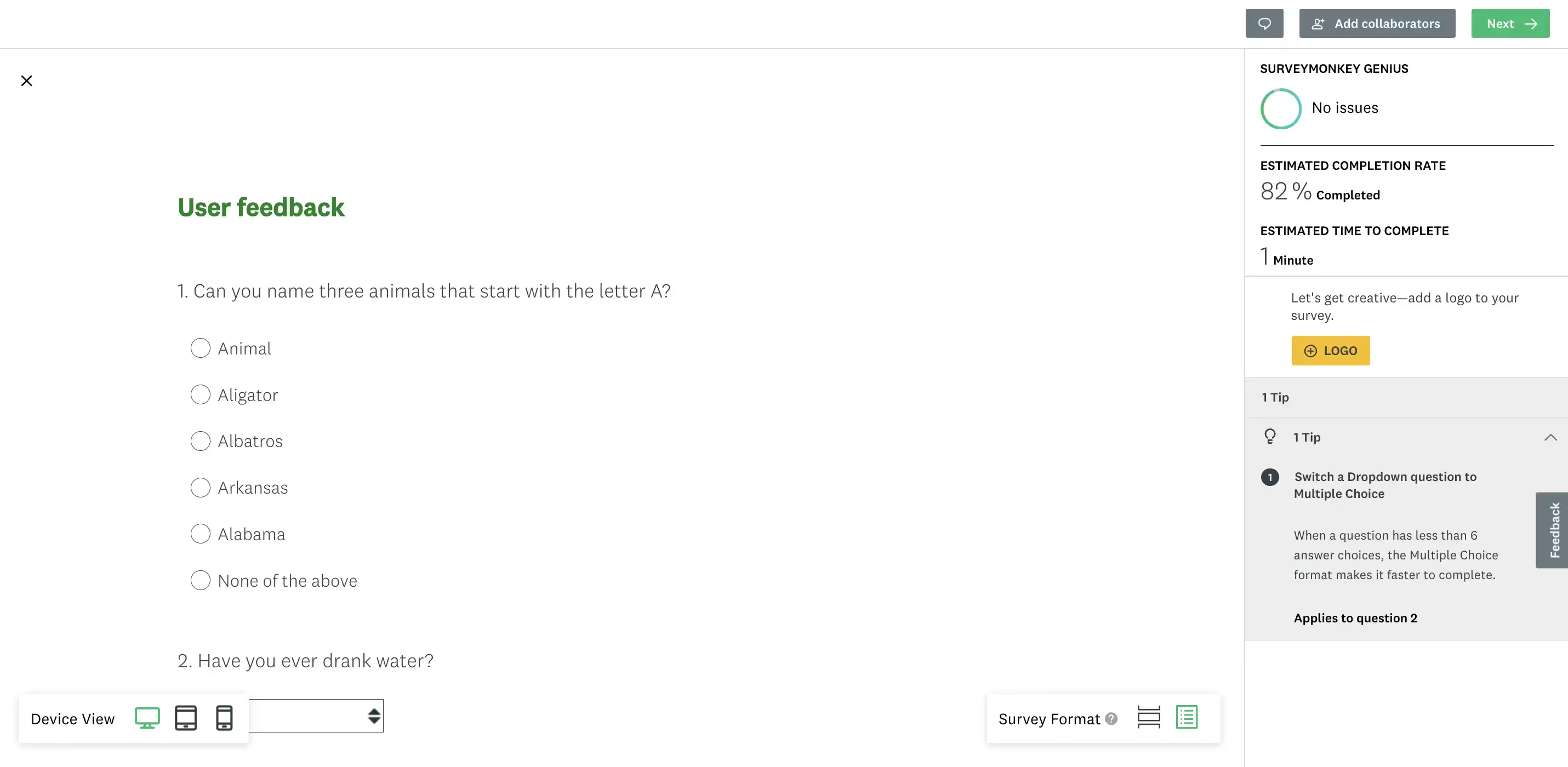
When it comes to the preview, it is available, opening in a new window—again not being a WYSIWYG option. It does let you click through the survey you’ve created, and allows you to switch the view using different devices, from desktop, mobile, to a whole tablet view.
💡SurveyMonkey preview gives you tips on how you could improve your survey, on the right-hand panel, after analyzing what you’ve created. For example, for our survey, it recommended switching a dropdown question to a multiple-choice one, because we’ve included more than 6 options.
Of course, building from scratch is not your only option. You can also go for SurveyMonkey’s AI builder or modify one of their many templates to speed up the whole process. Yet again, more advanced templates are available on paid plans only.
Final result
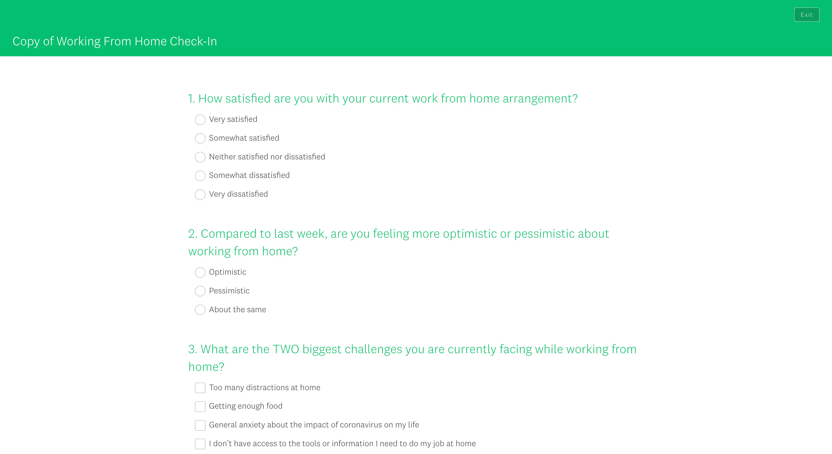
The final result reveals a much better-looking survey than what we’ve seen when editing it, cue WordPress-like settings.
You can share the created survey using a bunch of different methods. From sharing a link to embedding the survey on your website, as a website popup, sending it via text or email, embedding in a mobile app, posting on social media, or using the SurveyMonkey app as a kiosk to use the survey and collect responses as you go.
However, the more advanced options, like the kiosk mode or sending the survey via email, are not available on the free plan. ❌
Analyzing survey data
Analyzing survey data from submitted responses gives you access to percentage-based and chart-based data from each question included in the survey.
But besides the basic stats, you also get estimated data from SurveyMonkey itself, called SurveyMonkey Genius. The genius in question estimates the completion rate and the time needed to complete the survey.
A paid feature we couldn’t test is called Insights, which further analyzes the responses, this time looking for gibberish, straightlining, and more.
In turn, one feature that is available on the free plan is definitely the possibility to add the results you choose to your dashboard for even easier access.
Buying targeted responses
Lastly, if external research is what you’re after—you can choose to pay for SurveyMonkey’s respondent base instead. Whether that’s for academic or market research purposes.
Pricing
If you haven’t yet taken a breath after Typeform’s complicated pricing, you better take one now.
SurveyMonkey will also have you take out a whole whiteboard to figure out which of the paid subscription plans you should choose. However, the main division is between the Team, Individual, and Enterprise plans.
The individual plans come in four variations: Basic, Standard [monthly], Advantage [annual], and Premier [annual].
Not every plan can be purchased on a monthly basis, which may be even more difficult for some to make their choice since you can’t really test the paid plans without a free trial.
Free plan
Now, if you’re wondering, the difference between the free plan and the paid options is quite staggering. So let’s take a look at what’s included in the free vs paid plans.
What you get ✅
The free plan arms you with 10 questions per survey, but using the basic field options. With those questions, you can collect up to 25 responses per survey.
When it comes to sharing your survey, the free plan includes solely web and social sharing.
You can use video answers and turn your surveys into quizzes, and to speed up your work, you get 40 short survey templates.
Apart from that, you get to do a basic analysis of your survey answers and filter them using one option for good luck.
What you don’t get ❌
However, you don’t get to download your survey results or dive deep into analyzing them, especially not with SurveyMonkey’s insights.
Complex surveys are also out of the question since advanced question types, like an NPS or star-rating are off limits, along with the more robust templates.
Sharing your surveys through email and collecting responses, or using more fancy methods like SurveyMonkey’s kiosk app, are also not included in the free plan.
Paid plans
The paid plans, on the other hand, settle their disputes in other areas—primarily, the response limits and things like branding, white labeling, or advanced survey logic.
The Team plans add to the whole thing with additional users, as well as team management and team collaboration features. However, it’s not only the added users or the lower prices that make this deal sweeter, it’s also the fact that you get even more responses with the Team plans.
For example, the lowest-tier Team plan ($30/per user/per month) already gives you 50k responses per year, whereas the lowest-tier paid individual plan comes in with only a thousand responses per month, so 12k per year. The Team plans however, require at least 3 users added, and can only be purchased on annual billing.
To add to the whole pyramid, you can also choose the Enterprise plan, which is a custom-made solution that comes with an extra layer of security, like encryption, SSO, or HIPAA compliance.
Pros & cons
SurveyMonkey’s pros
SurveyMonkey wowed us with the following:
- Base of respondents—for those that use surveys not just to measure customer satisfaction but more so for research, whether market or academic, SurveyMonkey’s respondent base could be a great place to start. It is a payable feature, yet it may still ease things for a lot of researchers.
- Kiosk & mobile app—going a step further, you may even conduct your research in person, collecting survey responses with SurveyMonkey’s kiosk feature and mobile app in place.
- All the basics in one place—if you’re just starting out with collecting feedback through surveys, SurveyMonkey gives you everything you need in one place. From templates and an AI builder to data analysis.
- The soft details—the features that really drew our attention were SurveyMonkey’s Genius, which estimated the time needed to complete your survey, as well as the tips the tool gives you when previewing your survey.
SurveyMonkey’s cons
In turn, the things we struggled with were a bit bigger:
- Steep learning curve—SurveyMonkey is not the tool you can grasp immediately after signing up. Even basic actions like creating a new survey seem too complicated, resembling clunky WordPress settings.
- Outdated designs—even though the software just updated its dashboard, which btw looks much better than the old version, the rest of the software is still very much outdated, giving off 2000s vibes.
- Heavily limited free plan—the free plan is there, but is it any useful? With only the basic question types you can add to your surveys, basic analysis features, no downloading of your responses, and more limits, SurveyMonkey’s free plan seems more like a way of testing out the software, but in a very restricted way.
- No free trial—not giving users a way to properly test out premium features makes the process of deciding whether this user feedback tool is for you a Mount Everest climb.
- Complicated pricing—just like in the case of Typeform, SurveyMonkey went bonkers offering a total of eight subscription plans you can choose between, which makes the final choice hard enough.
Who is SurveyMonkey for?
Thanks to the possibility of buying responses from SurveyMonkey’s targeted base of respondents, this tool may fit all the study and market researchers.
But customer feedback seekers can also find their place in SurveyMonkey—with a wide base of responses you get yearly, you won’t feel neglected. In turn, you might need to look past the clunkiness of this tool and its outdated designs, and anticipate quite some learning curve.
Survicate: collect & analyze feedback in a modern way [bonus option]
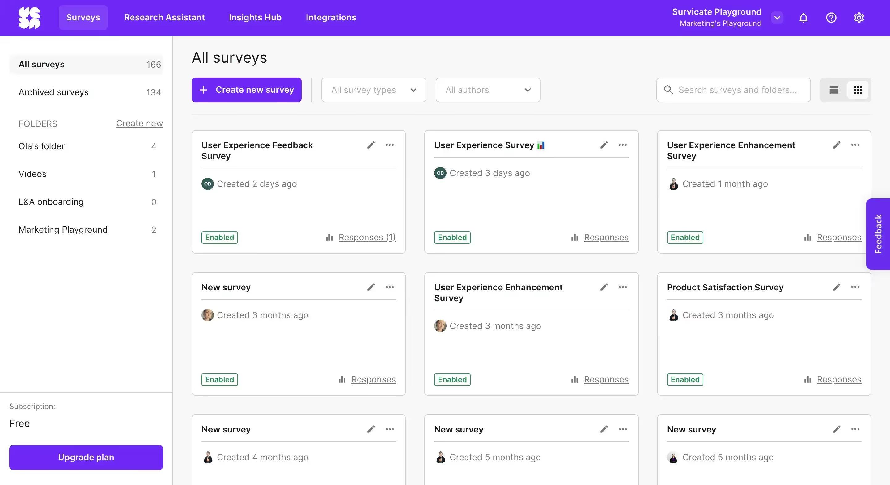
Survicate is a customer feedback software founded in 2013. Initially, Survicate focused solely on feedback collection, offering a wide range of questions within 6 survey types: website, email, in-product, mobile, Intercom-based, and a continuous feedback button.
In 2024, the tool became a whole customer feedback platform by adding AI-based feedback analysis tools called Insights Hub and Research Assistant.
⭐ G2 Rating: 4.6/5 [172 reviews]
Why are we adding it to the Typeform vs SurveyMonkey mix, though?
💡Having noticed both tools’ shortcomings in terms of the dated designs and some quite limited free plans, we decided to give you one more option to choose from that fills those blank spots quite well.
Let’s see how Survicate compares.

Ease of use
You can sign up for Survicate in a blink of an eye, without having to give out your credit card details. Armed with just a business email address, create your account to get right to setting up your surveys.
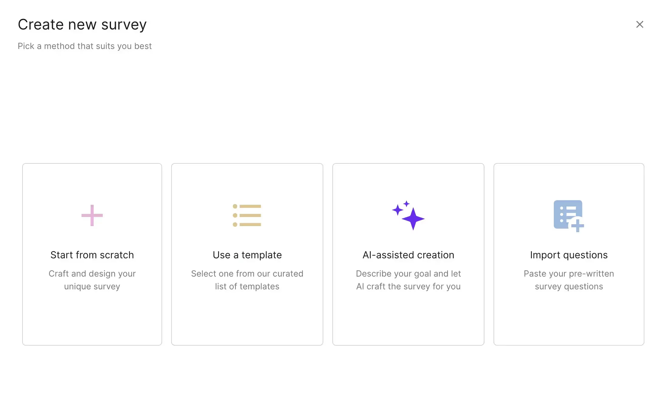
Following the sign-up, you'll be prompted to create your first survey, and you can choose to do it using one of four methods available.
You can select from a myriad of professional templates, let AI craft the survey for you, start completely from scratch, or paste ready-made questions into Survicate, which then automatically assigns the best-fitting question types to the imported text.
What further adds to the simplicity of Survicate is its modern and clear design, leaving no doubts as to where you should put your attention next.
Free trial
Survicate comes with a 10-day free trial for its most popular pro features, but also offers a completely free plan that gives you all the basic features to get up and running with collecting feedback.
The free plan is limited to 25 responses per month, but comes with 3 team seats, all the survey types, and every template available. Making it a strong competition for both Typeform and SurveyMonkey’s limited free plans.
The free trial, on the other hand, allows you to take Survicate for a complete test drive, including its freshly added AI data analysis features.
Features
Creating a survey
Depending on how you want to distribute them, there are six survey types you can create in Survicate: email or a shareable link survey, a popup website survey, Intercom-based, in-product survey, a mobile app survey, and one for collecting continuous feedback via a sticky feedback button.
Creating each survey type in Survicate is as easy as they make them.
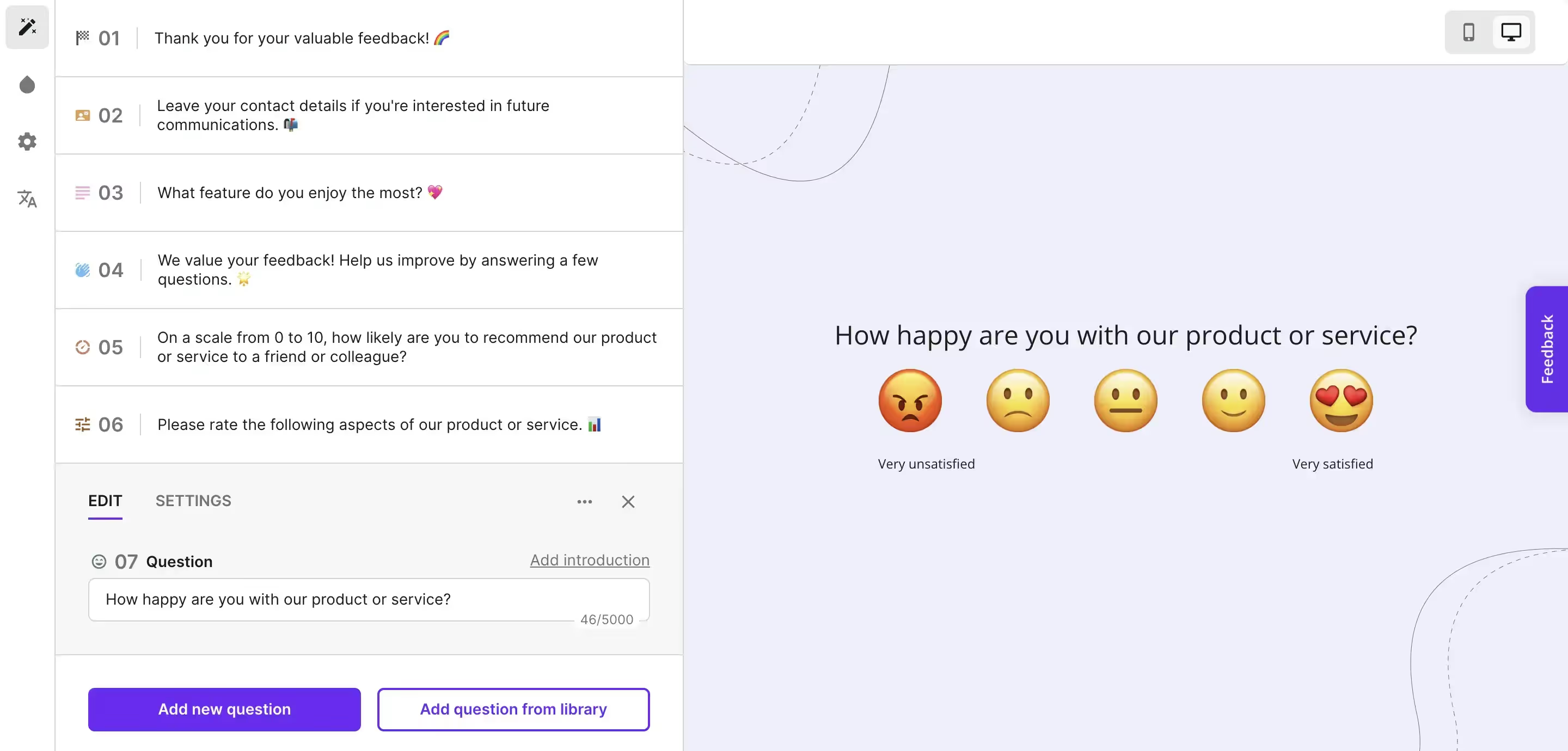
You can choose to work on your survey from scratch using 12 different fields, from a welcome message, a single choice question, to a whole matrix scale, an NPS scale, or smileys for rating satisfaction.
But you can also go for AI to generate the survey questions for you, start out using one of many templates, or import questions by pasting them.
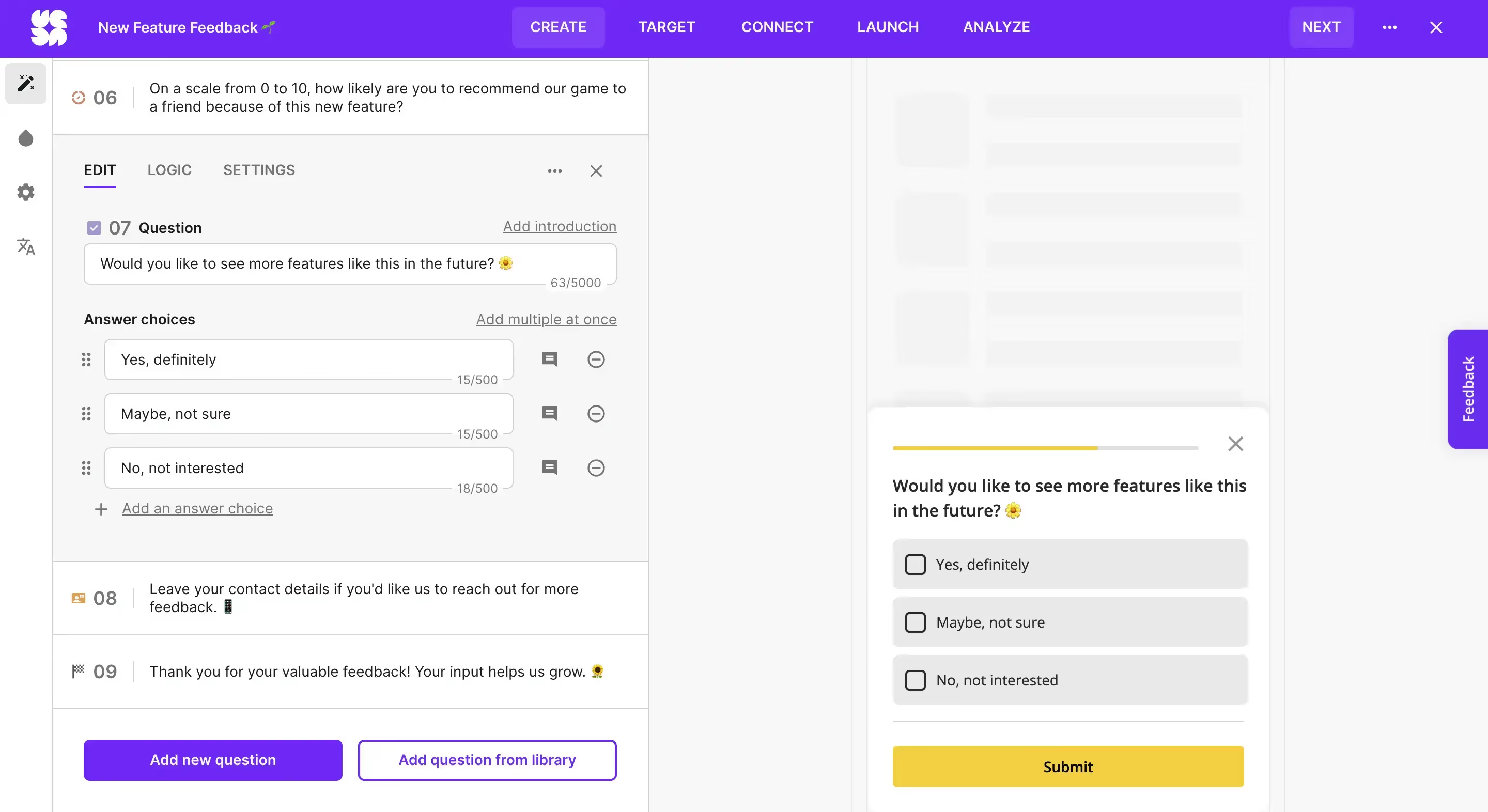
The AI solution quickly generates accurate survey questions based on the input goals and descriptions. Survicate also supports you in the process, suggesting survey ideas and descriptions you can use to create your new form—making everything even more effortless.
Now, what’s especially convenient about Survicate’s survey creator is its automatic WYSIWYG preview, which shows right next to the questions you’re working on, in real time.
What’s more, the preview is not just for looking. You can test out your survey as you go and work on it, click on the different elements, or test out the logic rules you’re setting up.
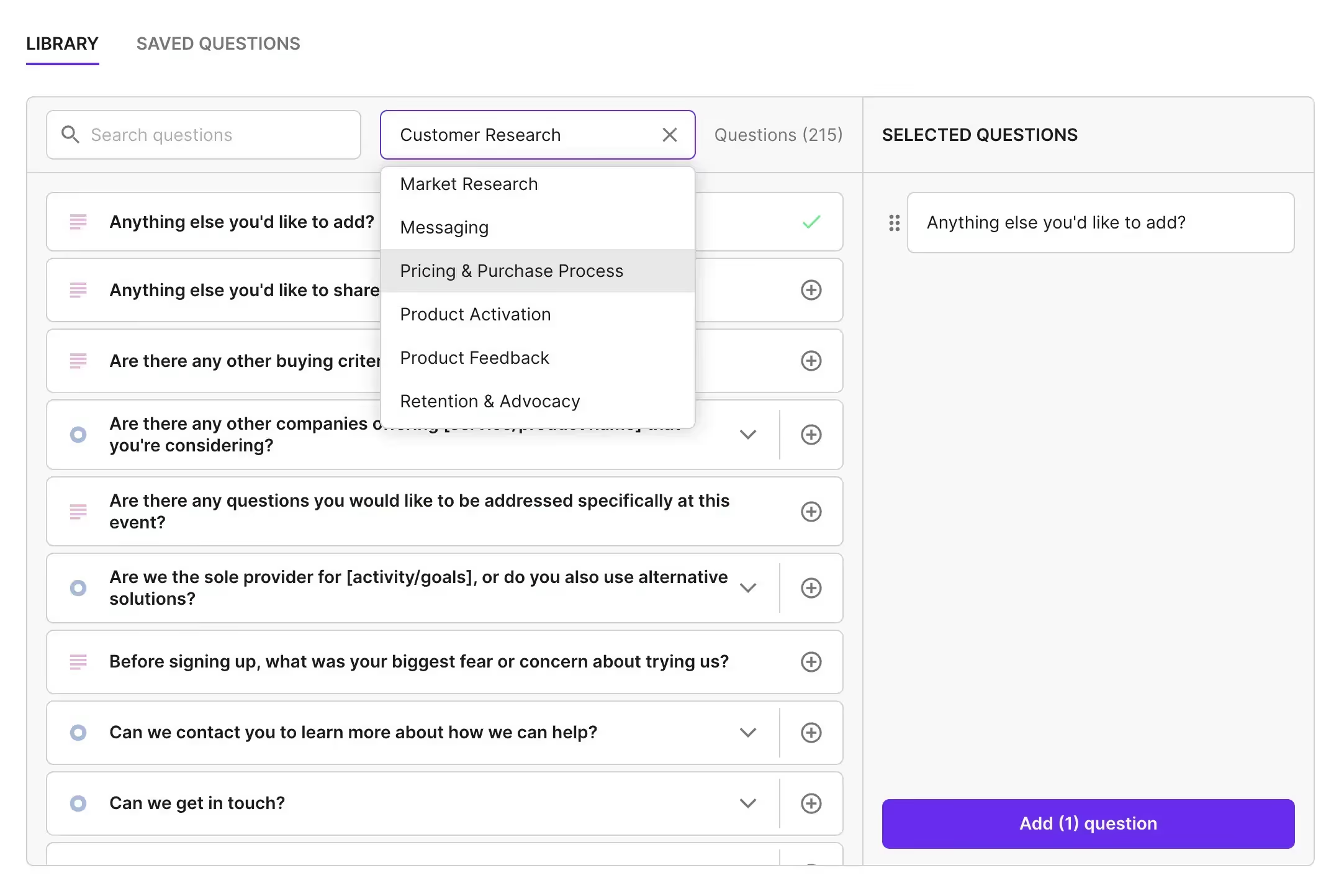
Now, even if you’re working on your survey from scratch or following a template, you still get a question library with hundreds of ready-made questions to choose from to further ease your workload.
Survicate is extremely modern software, which adds not only to the user-friendliness, but also makes your surveys look 10x more professional.
When it comes to the design, you can choose from the many options available or create your own survey theme. Depending on the survey type, you can also choose if it’s going to be a popup survey or one accessible through a button on our website.
Final result
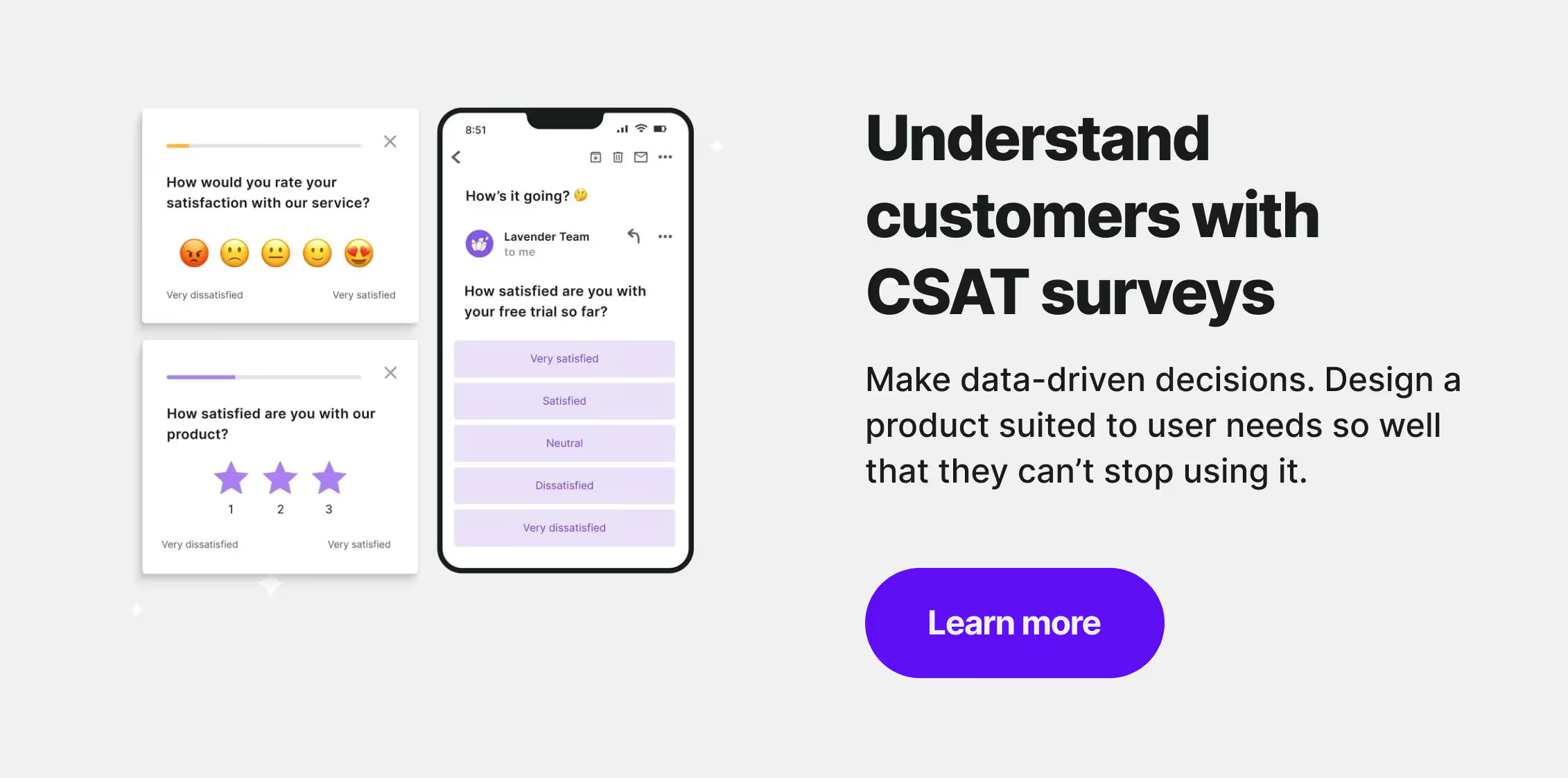
The final result is a modern and professional-looking survey that works perfectly.
Now, to share the survey, you have several options according to the survey type you’ve selected. For example, if you choose a regular link-based website or email survey, you get a dedicated URL with your survey that you can then share with users.
But you can also choose an embedded survey and connect Survicate directly with your website, product, or mobile app and embed your survey directly there.
You can display the survey only on specific URLs of your website, in certain areas of your product, after a user scrolled through a selected portion of the website, and much much more—the targeting options are truly endless.
Feedback Button
Survicate knows how important unintrusive feedback collection is. In addition to offering a popup solution for your surveys, it also provides the option of a feedback button.
The feedback button is available for all the in-product and website surveys you create. But it’s not just one button to add—you can add as many as you want, on different pages.
It’s continuously available on the selected spot of your website or product, which allows your users to share their feedback whenever they feel like it. We find it extremely useful for supporting the ongoing efforts of collecting user feedback.
💡Bonus tip: you can customize the text appearing on the feedback button and test out how it works in the WYSIWYG preview.
Integrations
A big part of collecting and analyzing feedback with Survicate is its integrations—there are over 40 available, including HubSpot or Slack.
That’s how you can make the most of the feedback you collect, whether that’s sending survey responses as notifications on Slack to speedrun the reactions or automatically filling out lead details in HubSpot to automate the whole process.
Survey data analysis
The basic survey data analysis goes over the responses using a visual bar chart along with the response rate, the total views, unique views, the completion rate, and the date of the last response.
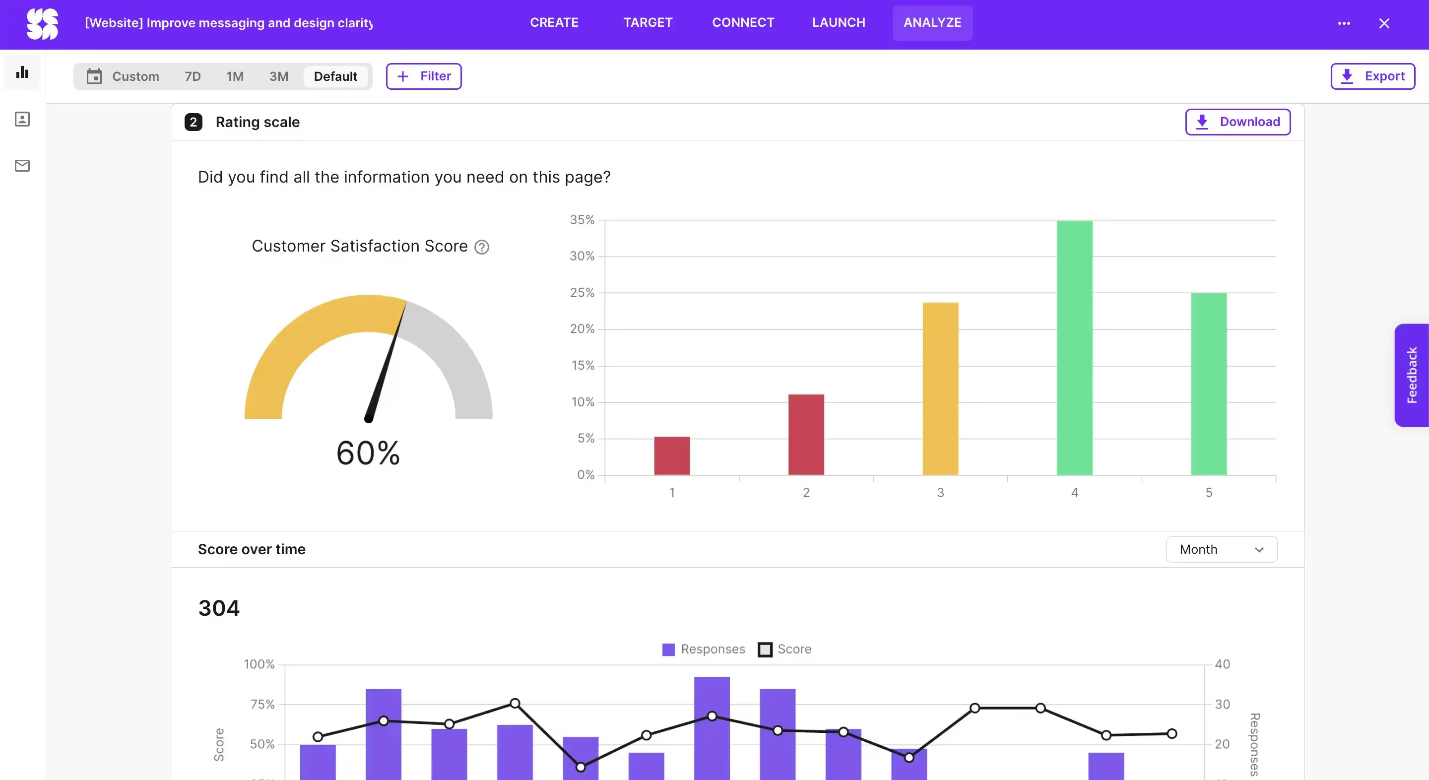
But Survicate also comes with more robust data analysis capabilities. For example, it gives you real-time information about the calculated CSAT and NPS scores and presents those scores on a bar chart changing over time.
Apart from all that, you can also analyze the responses to each question individually, check the total number of responses per each question, analyze some more bar charts, see which words stand out the most in the word cloud, and in the case of a large number of responses—use AI to extract common themes and answers.
AI survey data analysis
And now we want to highlight an especially big addition to Survicate, which changed the whole product.
Drumroll please… 🥁
Survicate added two AI-based features, Insights Hub and Research Assistant.
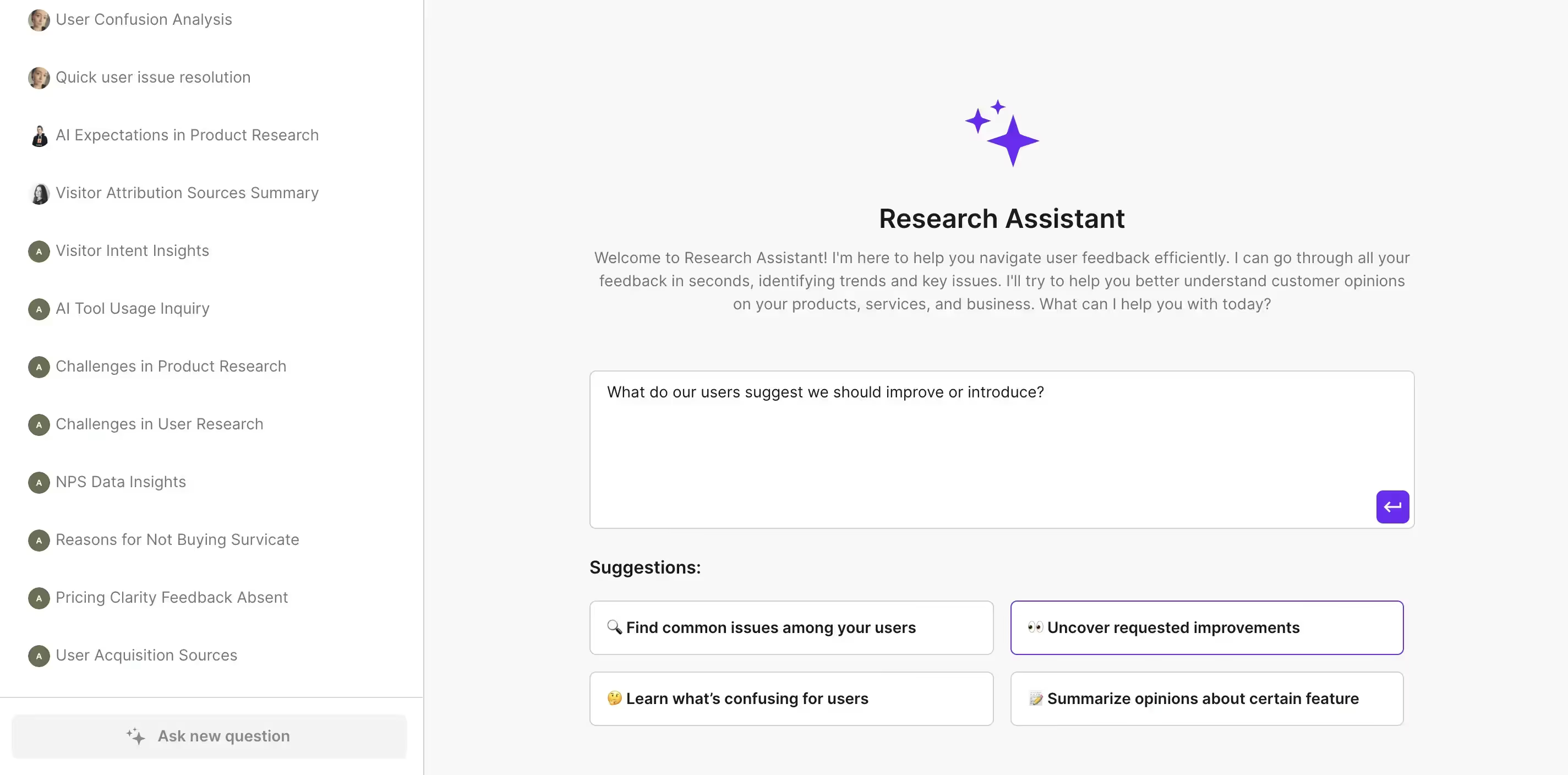
To explain those data analysis tools in the most brief of ways:
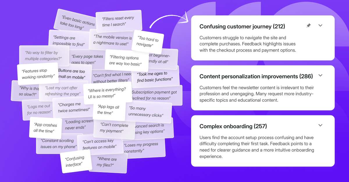
- Insights Hub—automatically categorizes all the feedback you feed it with by connecting different sources, from your survey data to Intercom conversations or reviews you receive on the App Store. Moreover, it lists commonly appearing topics or issues your clients raise, and always links back to the specific answer source, giving you actionable insights ready to be used.
- Research Assistant—it’s like ChatGPT for your feedback. Drawing from the feedback you’ve connected to Insights Hub, as well as that collected through your surveys in Survicate, ask the Research Assistant any question you’d like answered, and it will provide a response. It gives you both a holistic overview, just as detailed angle-specific insights. Again, each piece of information is linked to its actual feedback source to make sure it’s relevant.
Pricing
Survicate offers simple pricing, with five plans you can choose from: Free, Starter, Growth, Pro, and Enterprise spread over two categories: Essential & Advanced.
Free—$0/month
Best for: beginners collecting basic feedback
Key features:
- Collect feedback across email, link, and web
- 25 responses/month
- 1 survey
- Basic survey creation, logic & analytics
- Basic CRM software integration
- GDPR & ISO 27001 compliance, 2FA, Google SSO
Starter—$89/month (monthly billing)
Best for: short-term projects or feedback testing
Includes everything in Free, plus:
- 100 responses/month ($0.89 per extra response)
- 2 active surveys
- Unlimited responses (with overage)
- Branding with company logo
- Survey-level analytics & data export
- AI tagging of survey answers, Research Assistant
- Human support reached within 5 minutes
Growth—$56/month (billed yearly)
Best for: teams with ongoing feedback programs
Includes everything in Starter, plus:
- Unlimited active and recurring surveys
- Feedback Button
- Personalization (retargeting, multilingual, session targeting)
- AI sentiment analysis, Insights Hub
- 10 user seats, role management
- No Survicate branding
Pro—from $349/month (yearly commitment)
Best for: businesses needing deep insights across the customer journey
Includes everything in Growth, plus:
- Event-based and JavaScript targeting
- Survey sampling & audience segmentation
- Multi-survey dashboards
- Advanced integrations: Mixpanel, Amplitude, Salesforce, Marketo, and more.
- Session sync: Fullstory, Smartlook, SessionCam
- Export API, Webhooks
- Priority human support & enhanced compliance
Enterprise—from $569/month (flexible billing)
Best for: large organizations with advanced security & customization needs
Includes everything in Pro, plus:
- Dedicated Success Manager & onboarding
- White-glove implementation and training
- HIPAA compliance
- Custom legal agreements (ToS, DPA, NDA)
- SAML SSO, user access logs
- CDN proxy for secure survey delivery
Pros & cons
Survicate’s pros
Having tested all three survey platforms, Survicate stood out in terms of:
- Effortless usage—a shallow learning curve runs in Survicate’s blood, even as new complex features are added to the software. It’s extremely simple to create surveys, but also to analyze the received results, or combine them with a seamless integration of your choice.
- All basics in one place—from creating different types of surveys, through in-depth targeting options, to a myriad of data analysis functionalities, like bar charts, word clouds, and even AI scanning batches of feedback data, Survicate has everything you need to properly collect and manage customer feedback.
- An abundance of powerful integrations—automatically sending a notification on Slack for new survey responses? Got it. Automatically triggering a whole workflow in Hubspot? Also, got it. The many integrations available in Survicate can truly take your feedback management to the next level. What’s more, they’re one-click connections, so you don’t need any extensive technical knowledge.
- Survey distribution methods—from simply sharing a link to embedding a whole survey in a specific area of your website, Survicate comes with a wide variety of survey placement options that you can use to collect accurate feedback, right where you need it most. Combine that with the advanced triggering options and you get a complete solution for getting those answers right.
- Factual AI data analysis—Survicate is one of the tools that joined the AI hype, but took a surprising turn. Instead of just adding AI for the purpose of shining that badge, we created actually useful features for data analysis that link every AI insight to verifiable feedback.
- Modern designs—despite originating more than a decade ago, Survicate flows with the current times and offers an extremely modern solution, making it easy to create your surveys, but also making you proud to showcase them to customers.
Survicate’s cons
Survicate may also cause some minor inconveniences in these ways:
- Collecting partial responses—some will love it, others will hate it. Survicate is all for collecting partial responses, which tremendously helps those looking for every scrap of feedback. In turn, researchers may find partial responses insufficient in their findings.
- Pre-made charts—analyzing survey data in Survicate, you’ll stumble upon different charts or word cloud solutions. A minor inconvenience could be the fact that these charts are not editable; instead, they come in a pre-made form.
Who is Survicate for?
Survicate is a powerful yet very much effortless tool for collecting and analyzing customer feedback. It’s a solution for those who look for modern surveys that can be targeted in many different ways, using detailed triggers. Here, comprehensive data analysis is laid out on a silver platter with its AI features, Insights Hub and Research Assistant.
Thanks to its many native integrations, such as with Slack or HubSpot, you can take your survey feedback to the next level.
So if you’re looking for a modern and effortless way to create, distribute, and analyze your surveys—Survicate is the way to go.
Typeform vs SurveyMonkey vs Survicate: Which is better in 2024?
All three tools we’ve compared above can give you meaningful insights taken from customer feedback.
But to sum it all up:
- The main difference between Typeform and SurveyMonkey lies in the learning curve. Typeform is easier to use.
- Both Typeform and SurveyMonkey suffer from dated designs, which is why we introduced Survicate into the mix—with its intuitive interface and attractive surveys it serves as a strong competitor.
- All three tools can help you create engaging surveys, but not all will give you the same options in their free plans. For example, SurveyMonkey is heavily-limited, not even offering NPS questions on the free plan, while Survicate offers all question types for free.
And remember, the final choice belongs to you and may differ based on your needs. Choose your fighter wisely.
Frequently asked questions: Typeform vs SurveyMonkey vs Survicate
What is Typeform?
Typeform covers your survey, form, and quiz needs, with various form fields available, from simple contact details to payments. After launching your forms, you get to do a basic data analysis, for example, using a table view. With this tool, be prepared for not-the-most-modern surveys.
What is SurveyMonkey?
SurveyMonkey is a survey platform suitable for data collection using surveys and forms. SurveyMonkey comes with an old-school drag-and-drop survey builder, a response base you can purchase, an AI builder and more. Unfortunately, it lacks in terms of ease of use and the look of the surveys created.
What is Survicate?
Survicate is an effortless customer feedback platform that makes it super easy to collect detailed insights through email, website, in-product, mobile, and even more survey types. It comes with various targeting options, an AI survey builder, AI data analysis, and more. But in this context, modern designs seem to be its main differentiator between Typeform and SurveyMonkey.
Typeform vs SurveyMonkey vs Survicate—Which Is Better?
When comparing Typeform vs SurveyMonkey we learned that Typeform is easier to use, while offering more features on its free plan. However, both tools suffer from dated designs, which is why we introduced Survicate into the mix. It will give you modern surveys, combined with advanced reporting, relevant AI options, to make the most out of your customer feedback.




.webp)

.svg)

.svg)


