Key takeaways:
- Prioritize a user-centric approach in app design by thoroughly understanding user needs, maintaining consistency across visual and functional elements, and ensuring intuitive navigation to create a seamless app experience.
- Implement a user-centered design process, including in-depth user research, user persona creation, journey mapping, and iterative wireframing and prototyping, followed by rigorous usability testing to refine the app based on real user feedback.
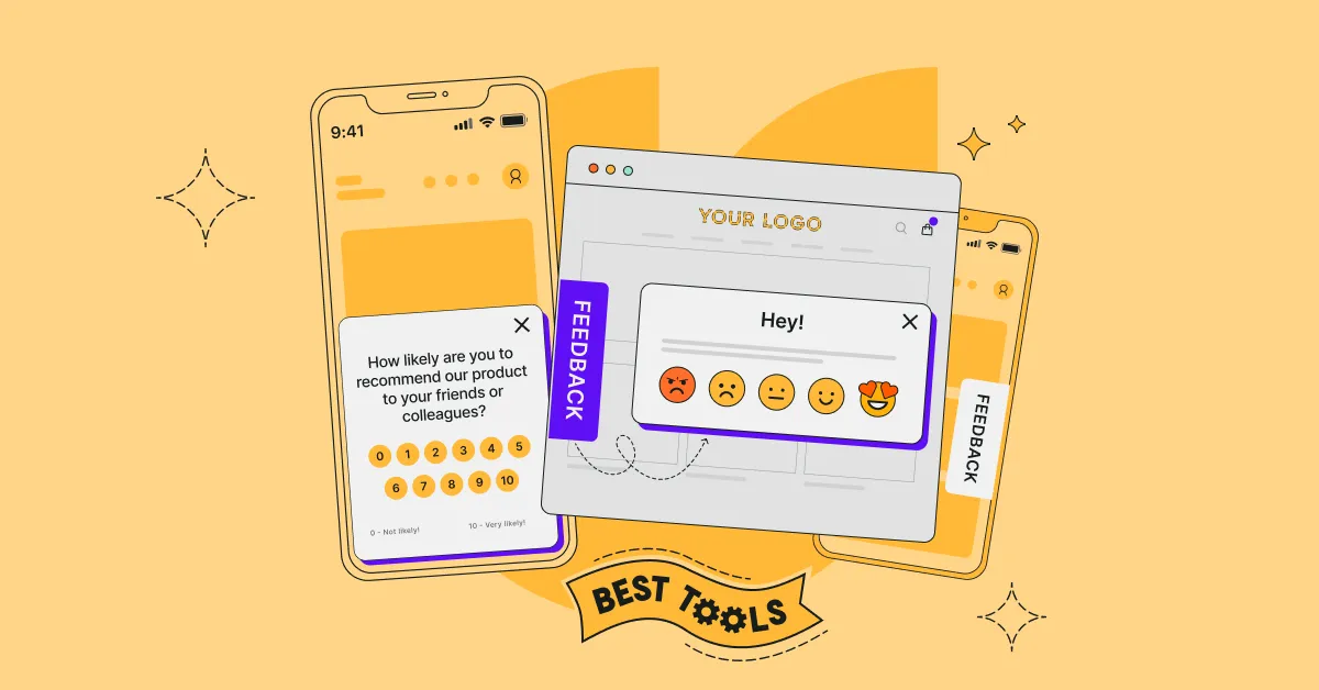
- Deploy mobile app surveys to capture user feedback on design, functionality, and performance, which is crucial for refining UX. With Survicate, you can seamlessly integrate in-app feedback into the digital journey, helping to identify user needs and improve the app experience.
- Enhance app performance by reducing load times through image optimization, caching, and minimized scripts, and encourage regular updates for efficiency.
- Ensure accessibility with high contrast, resizable text, and screen reader compatibility, promoting an inclusive mobile app user experience.
Ever tapped an app and felt like it just gets you? That's top-notch UX!
But when apps miss the mark, it's a letdown.
This guide is for app creators who want to delight their users every tap of the way. We'll tackle common UX hurdles and share key practices to keep your users hooked. From solid design basics to smart, adaptable interfaces—we're covering it all. Plus, we'll show you how user feedback can turn a good app into a great one.
Stick around, and you'll learn to craft an app that not only works like a charm but feels like one, too.
Mobile App UX Fundamentals
Let's start with the essential elements of mobile app UX design. This section will lay the foundation for elevating your mobile UX design, focusing on user-centric principles and best practices that are key to a standout user experience that leads to better user retention and overall satisfaction.
User-Centric Design: The user should be at the very core of your application. Your design decisions must prioritize user needs, preferences, and behaviors. Understanding and empathizing with your users is crucial for creating solutions that truly cater to them. Reflect on users' goals when designing mobile application features.
Consistency: Ensure your app maintains visual and functional consistency. It helps users feel more comfortable navigating through your app because they know what to expect. Use common UI elements, standardize button functions, and maintain a uniform color scheme to enhance familiarity.
Intuitive Navigation: Your app should be easy to move through, not to confuse users. Design an uncluttered user interface with a clear hierarchy and visible calls to action. The more intuitive the navigation, the less friction users will experience.
Feedback & Response: Interaction with your app should be acknowledged. Whether it's a visual cue when a button is pressed or an error message when something goes wrong, your app should provide immediate feedback to keep the user informed and engaged.
Performance Optimization: Users expect the mobile experience to be fast and responsive. Work on minimizing load times and ensuring your app operates smoothly across different devices. A high-performing app contributes to positive UX, making users more likely to continue using it.
Accessibility: An often-overlooked aspect of app UX is accessibility. Ensure your app is usable for people with a wide range of abilities. It includes considering color contrast, text size, and alternative text for images.
Mobile UX Design Principles
In mobile app development, user experience is critical. Your app's success hinges on how well these design principles are executed to create an intuitive and enjoyable user journey.
Consistency
Consistency ensures your app's interface elements and behaviors match throughout the app. Use common app UI design elements so that users feel more at home with your navigation and controls. For instance, standardizing button shapes and colors aids in recognition and promotes ease of use.
Clarity
Clarity is about making your app's offerings immediately obvious. Employ concise labels for buttons and actions, and make sure your typography is easily readable. It reduces the cognitive load on your users, allowing them to understand options without second-guessing.
Customer feedback
Customer feedback reassures users that their actions have been acknowledged. Elements that require user interaction, like forms or swipes, offer visual or tactile indicators upon action, such as a button's color change when pressed or haptic feedback on a long-press.
Minimization
Minimization in mobile app user experience refers to reducing the complexity of your app by focusing on essential content and functions. Simplify the user interface; prioritize core features to ensure users aren't overwhelmed. Strategies include:
- Menus: Concise and clear.
- Options: Limited to the most relevant.
- Actions: Streamlined to minimum steps required.
User-Centered Design Process
In mobile app UX, the user-centered design process is vital to creating products that truly fit user behavior and preferences. This approach involves several systematic steps to ensure the end mobile app UX design is usable and improves app user experience.
User research (UXR)
UXR is the foundation upon which you should build all user-centered design efforts. You gain valuable insights directly from your target audience by employing user research methods such as surveys, interviews, and observations. This data informs your mobile app UX design choices and helps create a product tailored to your users' preferences.
Mobile app user persona creation
Once you've gathered sufficient user data, it's time to create user personas. They are fictional characters that represent the typical users of your mobile app. By developing detailed personas, you can step into the shoes of your users and understand their motivations, behaviors, and pain points—guiding decisions throughout the design process.
Mobile app user journey mapping
With personas in hand, the next step is user journey mapping. It involves charting each step a user takes from start to finish within your app. Identify key interactions and potential frustrations to refine the user's journey, ensuring a seamless and intuitive experience.
Wireframing and Prototyping
Wireframes are simple visual representations of your app's layout, while prototypes are more advanced, interactive models. Both serve as blueprints for your app, allowing you to experiment and iterate on layout, features, and navigation before any code is written. This low-fidelity modeling is crucial for cost-effective design alterations.
Usability Testing
In usability testing, real users interact with your app to uncover any issues with your design. It's a continuous, iterative process that doesn't stop after the first round. Each test provides insights, highlighting what works well and what requires further refinement to enhance the overall user experience.
Mobile app UX and user interface elements
Effective mobile app UX design hinges on the strategic use of various interface elements that enable users to interact with your application seamlessly and intuitively.
Navigation Components
Navigation components guide you through the app, often determining the success of an app's usability. Tab Bars and Sidebar Menus are crucial for allowing you to easily find your way, often available at the bottom or side of the screen for quick access.
Input Controls
Input controls are elements that enable you to enter data. Buttons are a primary example, designed to stand out and encourage action, while Text Fields should be clearly labeled and provide ample space for entry. Another important aspect is checkboxes and toggles that afford you simple selection options.
Informational Components
Informational components impart critical data. Notifications deliver time-sensitive alerts, demanding prominence and clarity. Progress Bars inform your mobile users of ongoing processes, visually ensuring that the app is functioning as they expect.
Responsive and adaptive design
Responsive and adaptive mobile app design are core strategies for crafting user experiences that function across various mobile devices. Responsive design fluidly changes its layout based on the screen size, while adaptive design chooses among several fixed layouts based on the detected mobile device.
Breakpoints and Layouts
Breakpoints are pivotal in responsive design, as they determine where the layout adjusts to accommodate different screen sizes. You'll use CSS media queries to define these breakpoints. For instance, common breakpoints are for mobile devices (less than 768px), tablets (768px to 1024px), and desktop versions (above 1024px). On the other hand, the adaptive app ux design uses predefined layouts for each device category, such as handsets, tablets, or desktops.
Touch Targets and Gestures
The touch targets of your mobile app should be large enough for users to tap without error, typically at least 44px by 44px. Understand that touch gestures like swiping or pinch-to-zoom should be feeling natural and allow users to navigate easily through mobile interfaces. To ensure your mobile user experience is friendly, always consider the ease of reaching these touch targets with thumbs and fingers.
Device-Specific Adaptations
Device-specific adaptations involve tailoring app features or content to enhance user experience on specific devices. For responsive design, adaptations may include scaling images or using collapsible menus to fit content on smaller screens. In adaptive design, you might develop high-fidelity versions of your app's interface for high-resolution devices or simplify the interface for lower-end models.
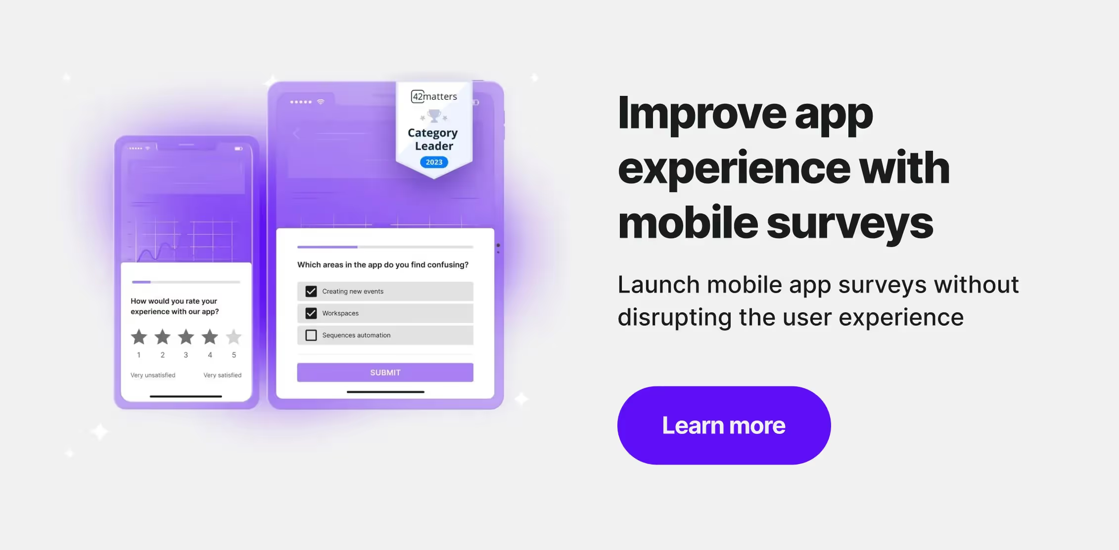
Improving App UX through Mobile App Surveys
Leveraging mobile app surveys can significantly enhance your app’s UX. You can gather actionable feedback on your app’s performance and user satisfaction by strategically deploying surveys. Integrate surveys at natural pauses or after user milestones to ensure they do not interrupt the user flow. Responses can then inform your UX design, highlighting which areas need refinement to serve user needs better.
Mobile surveys to improve app user experience
To elevate your app UX, tap into the power of mobile in-app surveys. They serve as a direct channel to gather user feedback, offering insights into the app's design and functionality that are often missed by analytics. Embed surveys within your app to capture real-time reactions and understand user preferences. This strategy is crucial for identifying pain points and validating new features, helping you to refine your app's design and functionality to suit user needs better.
Refining Design and Functionality
Incorporate surveys during usability testing to gain immediate feedback on your app's prototype. By positioning surveys at natural pauses in the app journey, you can encourage users to share their thoughts on what's working and what's not. Carefully crafted questions that resonate with the user's experience will lead to higher engagement and more meaningful insights, enabling you to fine-tune your design and improve overall functionality.
Prioritizing Performance
Performance issues can greatly affect user satisfaction. Use mobile app surveys to ask users about app speed and responsiveness. This direct feedback will highlight areas that may be lagging, allowing you to focus your optimization efforts where they're needed most. Addressing these issues based on user feedback can significantly enhance the app's UX.
Enhancing Accessibility
Mobile app surveys also play a vital role in improving accessibility. You can identify and remove barriers within your app by soliciting feedback from users with diverse abilities. Ensure your surveys are accessible, with options for voice input and compatibility with assistive technologies. This inclusive approach broadens your user base and demonstrates a commitment to providing a positive UX for all users.
By consistently leveraging in-app surveys, you can maintain a pulse on user satisfaction and continuously iterate on your mobile app UX, ensuring it meets and exceeds user expectations.
Performance and load times
When assessing your mobile app UX, performance and load times are crucial. They can make or break the perception of your app’s quality. High-quality mobile apps are marked by their visual appeal and usability and how swiftly they function.
- Load times refer to the duration it takes for your app to start up and present its content to the user. Quicker load times are synonymous with better mobile app UX, reflecting an app’s efficiency and reliability.
- Performance encompasses the overall operation of your app, including smooth transitions, responsiveness to user inputs, and the absence of lag or crashes.
To enhance mobile app UX, consider these key areas:
- Optimize Images and Content: Overly large files slow down your app. Compress and resize images for optimal performance.
- Leverage Caching and CDNs: Store commonly accessed data in a cache or use a Content Delivery Network to decrease load times.
- Minimize Ads and Analytics Tracking: Each script adds to load time, so limit them to essentials.
- Regular Updates: Encourage users to keep their app version current for the best performance.
Remember, your app's quick response and seamless functionality keep users engaged and satisfied.
Accessibility and Inclusion
When discussing the mobile app design, incorporating accessibility and inclusion is paramount to ensure that it's usable by the broadest range of individuals. Here are some key considerations to keep in mind:
- Contrast and Color: Use sufficient contrast between text and background. Ensure color is one of many means of conveying information.
- Text Size and Spacing: Offer options for larger text and adjustable spacing. The text should be resizable without losing functionality.
- Interactive Elements: Buttons and clickable items should be large enough to interact with, especially for users with limited dexterity.
- Screen Reader Compatibility: Your app should be navigable via screen readers. Provide alternative text descriptions for images and non-text content.
- Simplicity and Clarity: Keep language simple. Avoid jargon and complex sentences to support users with cognitive disabilities.
- Captioning and Transcripts: For multimedia, provide captions and transcripts for users who are deaf or hard of hearing.

Nail app UX with Survicate
Getting app UX right might seem tricky, but it's all about sticking to the basics: easy navigation, designs that work on any device, simple interactions, quick responses, and ensuring everyone can use your app.
To really nail the user experience, you need to hear from the people using your app. Survicate makes this easy by letting you ask your users directly through in-app surveys. They are easy to set up and even easier for your users to complete. You can find out what they like, what they don't, and what they need from your app. Survicate gives you the tools to make sense of the feedback and act on it, helping you to make your app better for everyone.
Ready to see how Survicate can help you improve your app? Try it out for free. You'll get all the features of the Best Plan for 10 days. Start your free Survicate trial today and take the first step towards a better user experience.
You might also be interested in:


.svg)

.svg)