Traditional UX research reports have failed.
I still remember the moment I realized my research basically turned into a Google Drive graveyard.
My story
Before Survicate, I worked at a research agency. Long PowerPoints were the norm. 100 slides was standard, 60 was considered short. We'd send them off and rarely know if anyone actually read them.
I witnessed this firsthand once: a colleague was presenting findings to a larger group, CEO included. At some point he stopped them and said: "Tell me, in two sentences, what are the conclusions from this research?" The room went quiet.
At Survicate, I ran into a different version of the same problem. I'd share reports on Slack, but almost no one except the direct stakeholder would open them.
Meanwhile, people from other teams kept coming to me with questions already answered in those reports. I'd reply and drop the link, and then check later to find most still hadn't opened it.
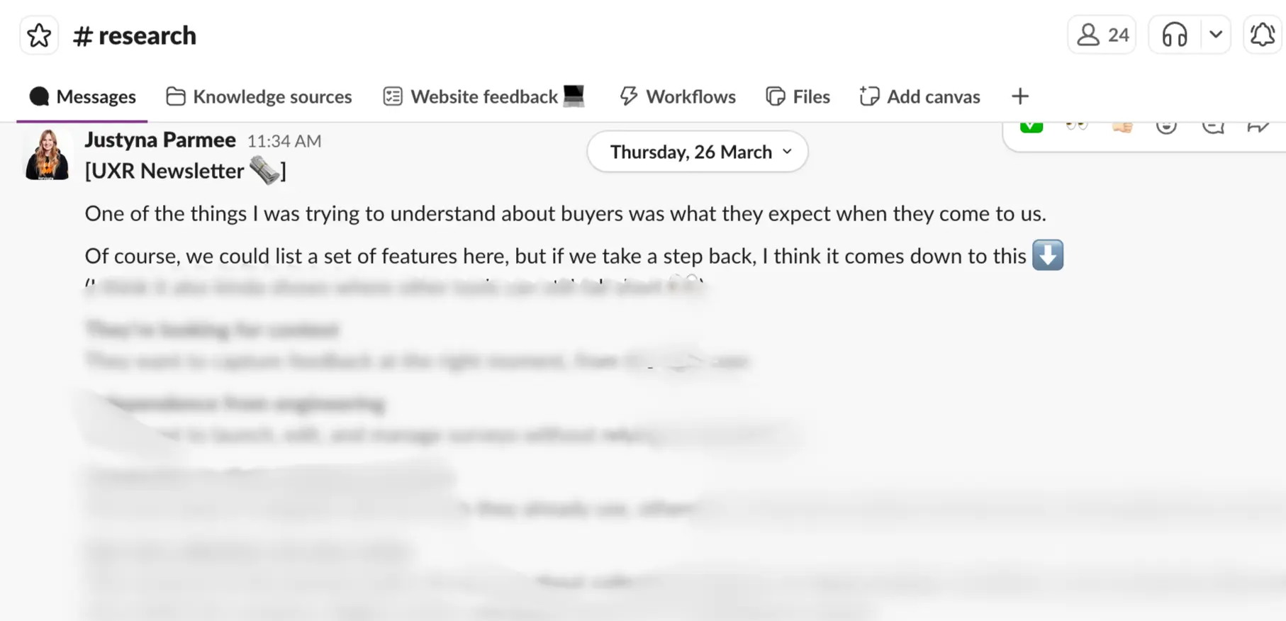
That's why I started an internal newsletter shared on Slack: shorter, more frequent, more visible. The idea was that even if I repeated insights a few times, they'd eventually reach more people and actually stick. It wasn't perfect, but there were cases where it triggered real action. That felt like progress.
In this article, I'm going to take that logic even further. I'll show you the new approach I've been testing and why I think it's what research communication needs right now.
But first, let's look at why traditional reports are failing. Not the usual complaints you've already heard, let’s dig into data from the UserInterviews report on the State of User Research in 2025.
Why traditional UX research reports fail?
When asked by UserInterviews whether they agree with the following statement: “I can easily see research remaining a core part of my role in 10 years’ time.”, almost half of studied researchers (49% - a 26-point increase from 2024) surveyed weren’t necessarily on cloud nine.
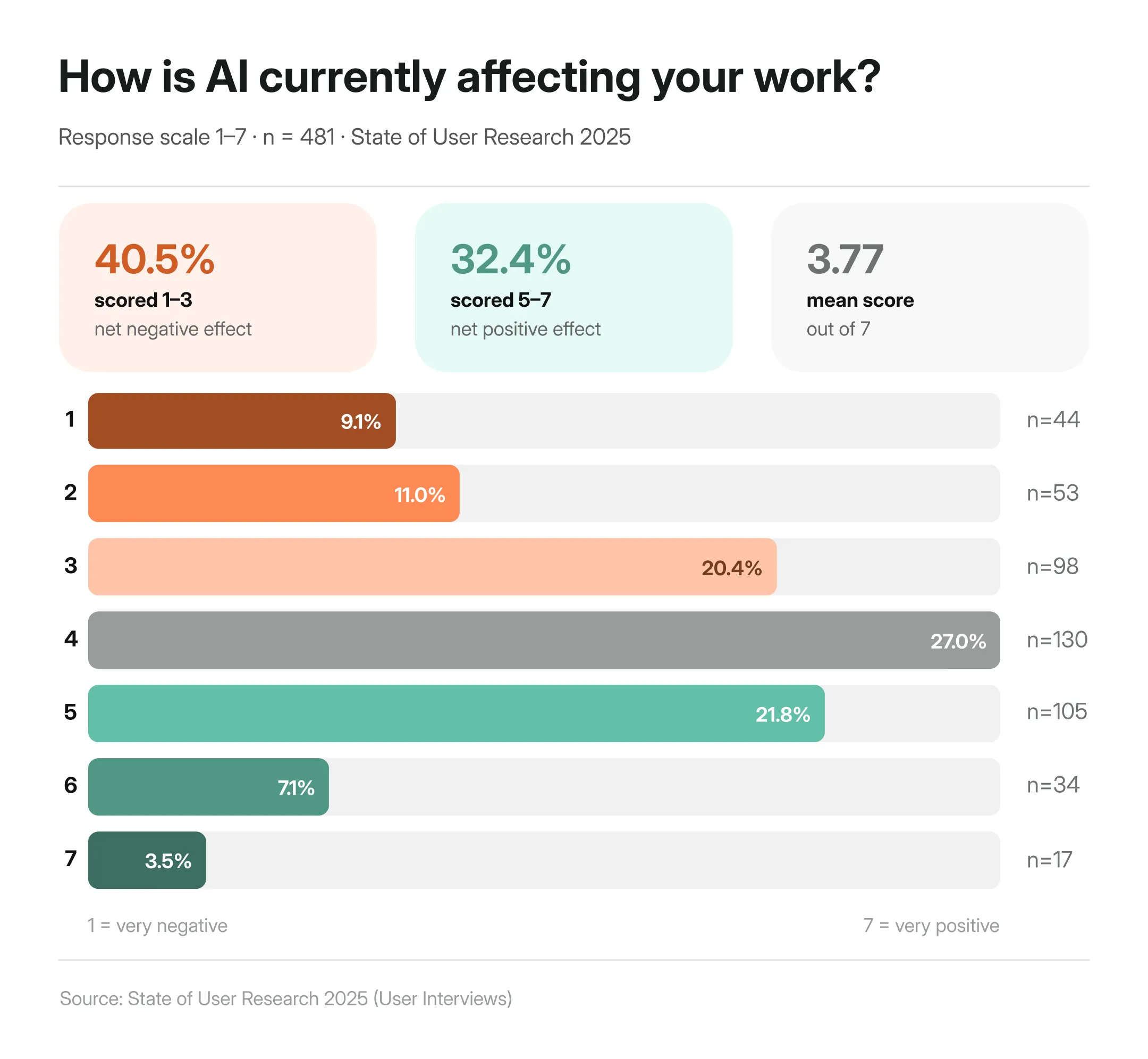
A part of it is of course the whole ‘will AI replace us?” thing, which I already gave my Ted talk pitch about in a separate article. When asked to rate the effect AI has had on user research so far, it turns out that researchers are more anxious than excited about AI, with more than 40% selecting it has had negative impact on their work.
Other parts of it could be strongly related to the commonly-shared frustrations research currently face.
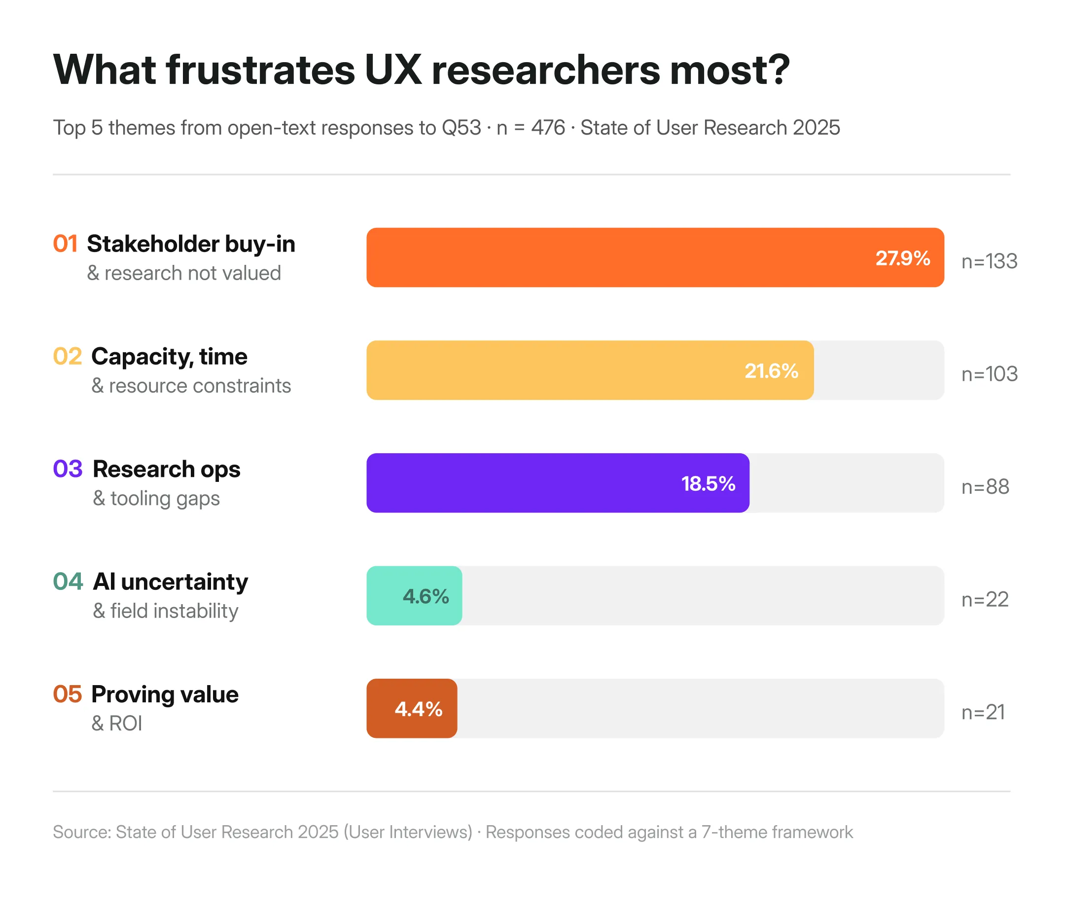
According to the State of User Research 2025 by User Interviews, one of the biggest frustrations researchers report in their work is stakeholder buy-in, as well as the constant pressure to prove the value of their work (I’ll touch on the other frustrations later down the article.)
One researcher put it plainly:
"I am reporting the same findings that I found 7 years ago. The same pain is still there."
Another said that their biggest frustration is the fact:
“That research is not being taken seriously by business leaders, they think we’re basically just chatting with people and making stuff up. It’s creating this overflow of useless tools that nobody needs, whereas we lack any kind of thoughtful and thought out tools that actually help us in our day to day.”
Something is structurally broken if we all feel that our work is undervalued, while at the same time feeling the constant pressure to speed up and do MORE.
In my opinion, it comes down to four things.
Reports are built for documentation, not decisions
Most research reports are structured the way academic papers are: introduction, methodology, findings, appendix. That format arguably made sense when research lived in labs and stakeholders had time to read it. But it certainly doesn't anymore.
The traditional report does one thing well: it documents that research happened. It's thorough, traceable, and complete. But thorough and complete isn't the same as useful to someone who needs to make a call by Friday.
Whether that research actually influenced any decisions—and to what extent—is a separate problem, and a harder one (nearly 50% of researchers answering the survey by UserInterviews have no quantitative way to measure their research's impact at all.)
Proving ROI, tracing which insight led to which product change, measuring impact: none of that gets easier just by changing the format. But the format is where we can start. Because if insights never reach the people making decisions in the first place, nothing else matters.
When research isn't connected to decisions, it doesn't drive them. Plain and simple. It just documents that something has happened to check off another box and call it UX.
One report doesn't work for every audience
The next point is very much connected with the multiple stakeholders we have to respond to.
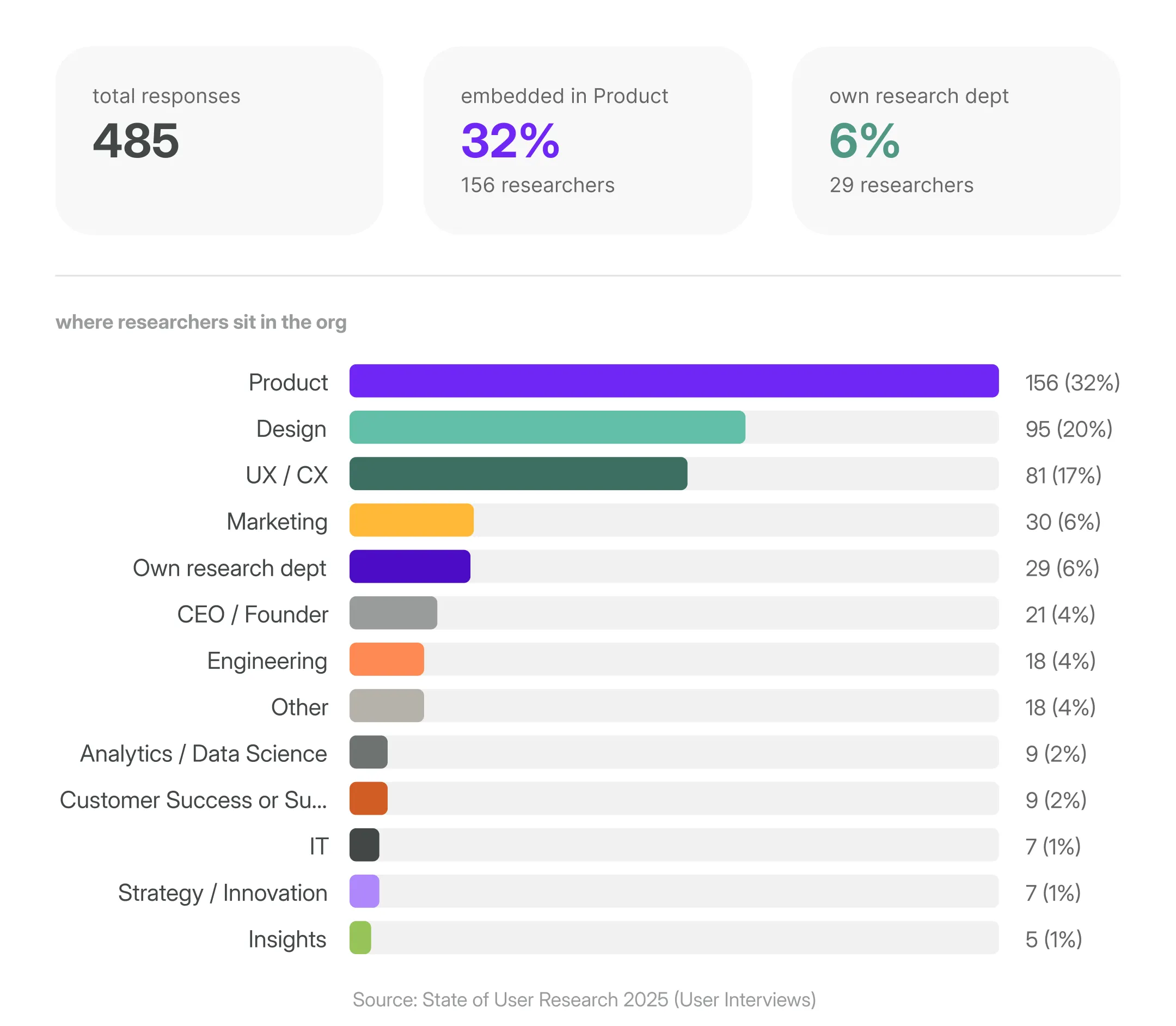
Again, based on the UserInterviews report, over 60% of researchers are embedded inside Product, Design, or UX/CX teams serving multiple stakeholders who speak entirely different languages.
A PM wants to know what to build next. A designer wants to understand the why behind user behavior. An exec wants the business case in 30 seconds. And the CX Director has to know why users churn at onboarding, fast.
One 40-slide deck can't do all of that. At least not now when everyone’s running as fast as they can.
In my opinion if researchers want their insights to be heard, they need to tailor how they communicate with different stakeholders.
Traditional reports can't keep up with how fast teams move today
I won’t say anything shocking, but a point about product dev speed has to be made when talking about traditional reports. Because it fundamentally changed.
Agile introduced shorter dev cycles. AI-assisted development has compressed them even further. And it’ll probably speed up even more in the near future.
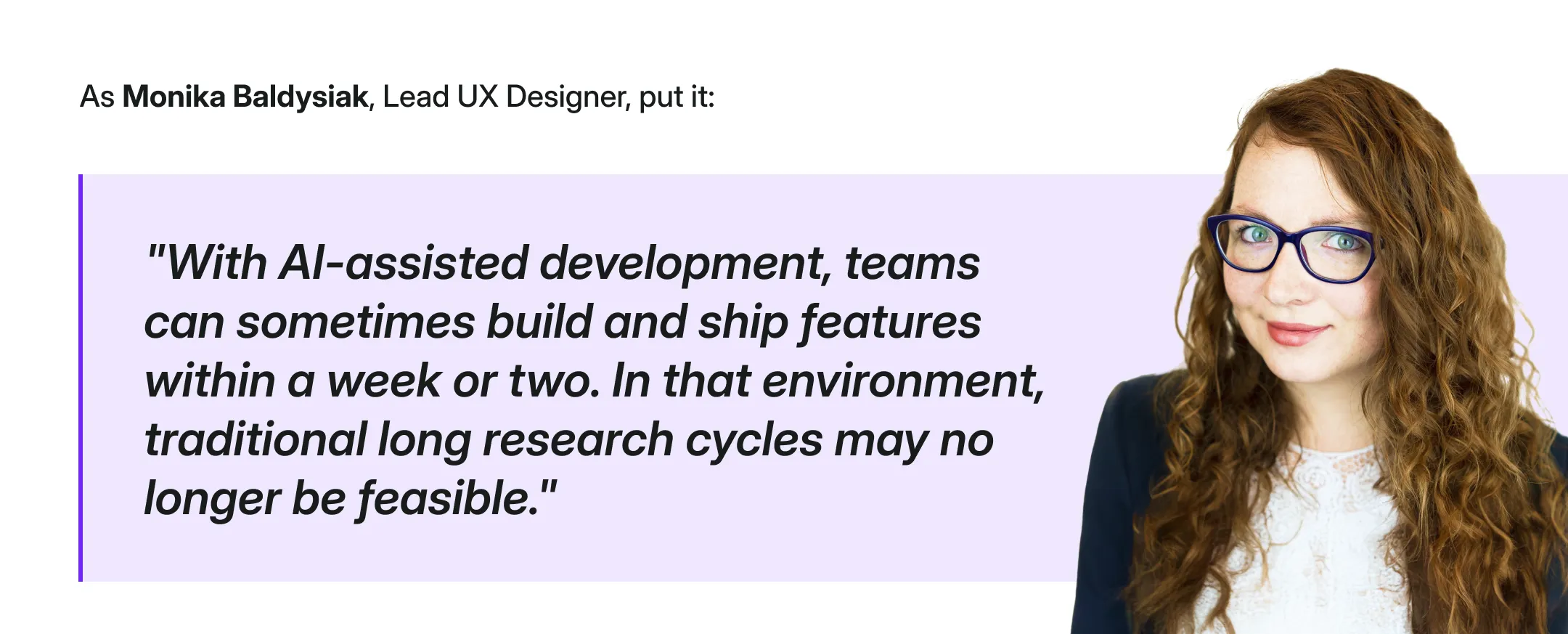
Weronika Denisiewicz, my colleague and a UX researcher as well, puts it even more directly:
"Long and overly detailed reports have never worked well, neither in the past nor now. Today, attention spans are shorter and people are even more busy."
It's not that stakeholders don't care about research. It's that by the time a traditional report lands in their inbox, the decision has often already been made (or had to be made).
Traditional reports don't live where decisions happen
Marshall McLuhan famously said "the medium is the message.”
Translated into research terms: if your insight isn't in the channel your stakeholder actually uses, it doesn't exist.
Product decisions today happen in Slack threads, Notion pages, MS Teams calls, and quick async Looms.
But it’s not to say that you’ll drop your traditional research report into those spaces and all will be solved. The report you write needs to be repurposed, reformatted, and redistributed every single time, often across channels.
"What compounds is smaller: a single finding, clearly stated, with the source attached [...]" Source
What modern research communication looks like
So what does good actually look like?
Nikki Anderson, UX Research lead and educator, puts it simply:
"Make reports impossible to ignore. If no one is reading your research, the problem isn't them — it's how it's delivered."
The shift starts with one reframe: stop writing for the archive, start writing for the decision. Lead with what matters, aka, what you found, what’s the support data, and what should happen next.
Methodology, sample sizes, detailed appendices, all should be the supporting material for you to own to make sure your research is of course credible. But not be the lead of the report.
It also means being where decisions actually happen.
A Slack thread with three key takeaways. A two-minute Loom. A one-pager in Notion that links to the full report for whoever wants to go deeper.
As Kasia Jordan-Kaźmierczak, UX Researcher, notes:
"Not everything needs to be presented in long form, we can be more selective and structured, and this is an area where AI can help—especially in organizing data, surfacing initial patterns, and creating concise summaries.”
The scattered data across multiple tools
Now, sometimes getting the communication right is not quite enough. Even if you customize the language for every person reading the findings, even if you share quick snippets on Slack.
Apparently, it's not the tools’ fault though, it’s actually spelled: data fragmentation.
Because you know the drill.
Survey data lives in one place. Support tickets in another. Sales call recordings somewhere else entirely. Interview transcripts in another folder. And when it comes time to write the report and answer the question you need to, you usually have to manually pull data from all of it, synthesize it by hand, and hope you haven't missed anything important.
The result is a system where insight gets lost not because researchers aren't good at their jobs, but because the toolset makes it nearly impossible to connect the dots at the speed teams actually need.
Weronika Denisiewicz, UX Researcher, nails it:
"A good report synthesizes a large amount of information into a few key insights and clear directions that people can remember."
That's the goal. But synthesis takes time…time most researchers don't have, especially when the sources are fragmented across a dozen different tools.
Because you're not still using LLMs…or worse, Google Sheets, to manually synthesize large volumes of research data, are you?!
The new approach
That's exactly what Survicate's Research Hub is built for, it removes the part that slows us down and helps us prove ROI of research with fully customizable reports based on data centralized from across tools.
So, as you know, a research repository.
But it’s not just any research repository.
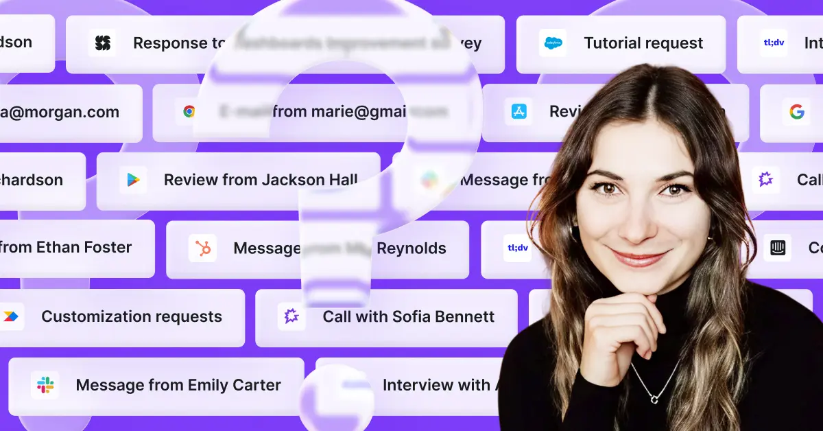
Research Hub connects your feedback sources, from surveys, support tickets, CRM conversations, call transcripts, app reviews into a single place, and uses AI to help you generate focused, stakeholder-ready research reports.
Reports that are backed by direct evidence. Reports you can customize. Reports that don't require a Friday afternoon spent at work and a prayer for them to get read.
These are AI reports that don’t replace you, but automate things to speed the whole process up, while you own it all from beginning to end.
You could piece something similar together with Notion, ChatGPT, or Claude, of course.
But without source-grounded synthesis, you're still doing the heavy lifting manually and you're one hallucinated insight away from losing a stakeholder's trust permanently. Or you run out of tokens. Or the linked-backed sources disappear after you complete the report or log out.
Now, here's how to build a reliable, customizable research report in Research Hub step by step. Something I’ve been testing myself, sparring with hundreds of researchers across the last few months, and heavily researching.
Let’s use a concrete scenario to make this easier to track.
The testing scenario
A UX researcher at a mid-size B2C food delivery app called Feastly (think UberEats, but regional) has been asked to investigate why new users are dropping off during onboarding. Activation rates have dipped 18% over the last quarter and the CPO wants answers before the next product planning cycle.
The researcher has feedback scattered across multiple sources: in-app onboarding surveys, App Store & Google Play reviews, Intercom support tickets from confused new users, and a handful of user interview transcripts.
The goal: deliver a research report to the CPO that's clear, evidence-backed, and ready to inform roadmap decisions without spending a week stitching it together manually.
Primary stakeholder: Sarah, CPO. She has 10 minutes, wants to know what's broken (preferrably over a dedicated Slack channel), why, and what to do about it.
How to build a research report in Research Hub: step by step guide
Using our Feastly onboarding drop-off scenario throughout.
Disclaimer: I’m using a prototype version of Research Hub to test the new approach. The result is not perfect just yet. The article will be updated after Research Hub official release.
Phase 1: Set up your project
1. Open Research Hub and create a new project

In the left sidebar, navigate to Hub. Click New Research Project.
2. Choose your project type

Select One-Time Analysis if you need immediate answers from existing feedback, which is what we're doing here.
Choose Continuous Monitoring if you want to track a topic over time and get notified when new patterns emerge.
3. Choose your data scope

Select Selected Feedback to handpick exactly which sources feed into this project. For our Feastly scenario, we want to focus only on onboarding-related feedback, not every feedback data piece existing in the system.
4. Select your sources

Across four tabs, choose exactly what goes into your analysis:
- Surveys: search and select your relevant surveys. We're pulling in Feastly's in-app onboarding exit survey (340 responses).
- Files: upload any external files in different formats, from csv to docx.
- Integrations: connect sources like Intercom, App Store, Google Play, Salesforce, Jira, or Slack. We're including App Store & Google Play reviews and Intercom support tickets.
- Transcripts: add any call or session recordings separately if needed.
Keep an eye on the Selection Summary on the right; it shows a running count of total feedback pieces across all sources before you commit.
If the data size is not big enough, you can add more before starting the project.
5. Set your time period

Use the slider or pick a preset. We're going with the last three months to match the timeline of our interview study and keep the data fresh for the CPO.
6. Set exclusion filters

Under What should we intentionally skip?, add rules to remove noise.
For Feastly, we're excluding users from companies smaller than 1000 employees. This keeps the analysis focused on real users only (feature available for enterprise accounts).
7. Write your project description

This is the most important step. The more context you give, the sharper the output.
Here's the description we used for Feastly:
"We are a regional B2C food delivery app and our new user activation rate has dropped from 64% to 46% over the last quarter. We need to understand why new users are dropping off during onboarding before placing their first order. Our primary stakeholder is our CPO, who needs clear, evidence-backed answers to inform the next product planning cycle. She has 10 minutes and wants to know: what's broken, why, and what we should do about it—not how the research was conducted."
But it’s not just the quality of the output here. If you know you’re crafting a report for a specific stakeholder that prefers to read/access insights in a specific way, that’s the place you want to use to highlight that so that the report is fully customized for that stakeholder.
Maybe they’d rather have tables, no intro, and some stats to help back up the conclusions. Maybe they actually like to dig into some more context and the ‘why’ behind the data.
Phase 2: Launch and wait
8. Review and launch

Check your project summary—type, sources, time period, filters, description—then hit Launch.
Research Hub will confirm your project is being created. For our Feastly project with six sources, this takes just a few minutes.
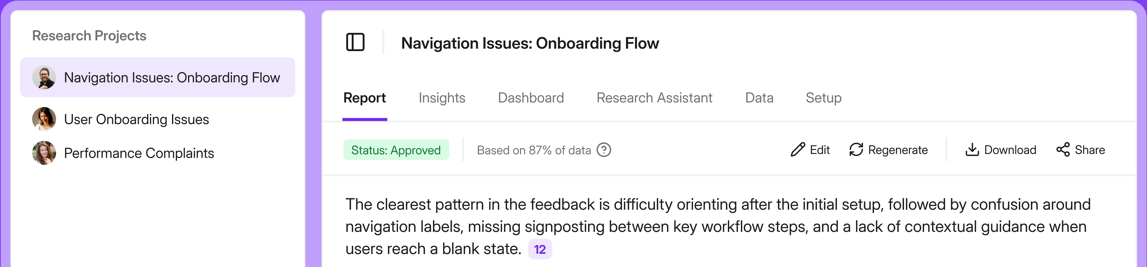
Phase 3: Read, review, and edit
9. Read the Overview

The Report tab opens with a plain-language summary of the core problem, no methodology preamble, no fluff.
For Feastly, the overview immediately surfaces the key finding: onboarding drop-off isn't caused by a single issue but a cluster of friction points at three distinct stages.
10. Review the pattern tables, added charts, and all conclusions made + edit away

Now, the most important part, aka, reviewing and editing the report.
You can edit the generated report, remove unnecessary sections, rename them, move important things higher up, bold things out, and more.
Whatever you do, make sure it’s just the way you or the stakeholder you’re creating the report for, likes it.
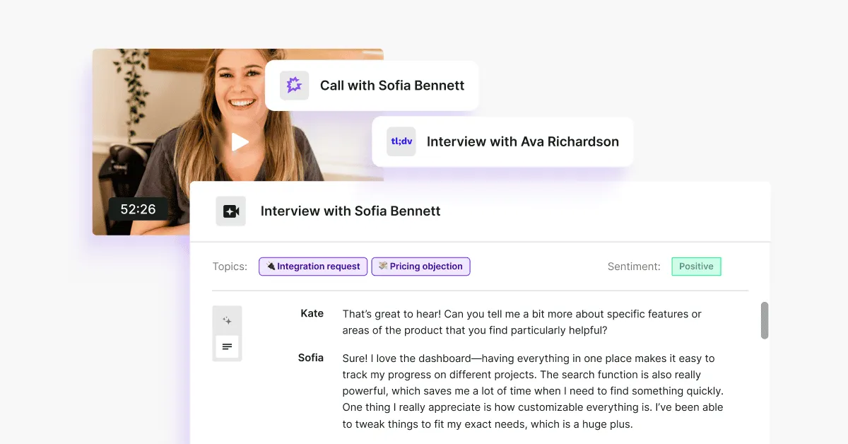
11. Check the supporting feedback panel

On the right side of the report, every conclusion is linked back to the exact piece of feedback that supports it: source, sentiment, date, and quote.
This is what lets you walk into a CPO meeting and say "47 users mentioned this" instead of "users seem to feel this way."
This is also where AI analysis finally doesn’t break down. You can double check whether hallucinations happen, everything’s linked back to the original source with sentiment breakdown and exact quote.
12. Explore the Insights tab

Open Insights for a fuller list of detected themes with the option to track them over time.
Useful for flagging issues you want to monitor even if they're not the focus of this particular report. You can also remove conclusions you deem completely irrelevant for a given study.
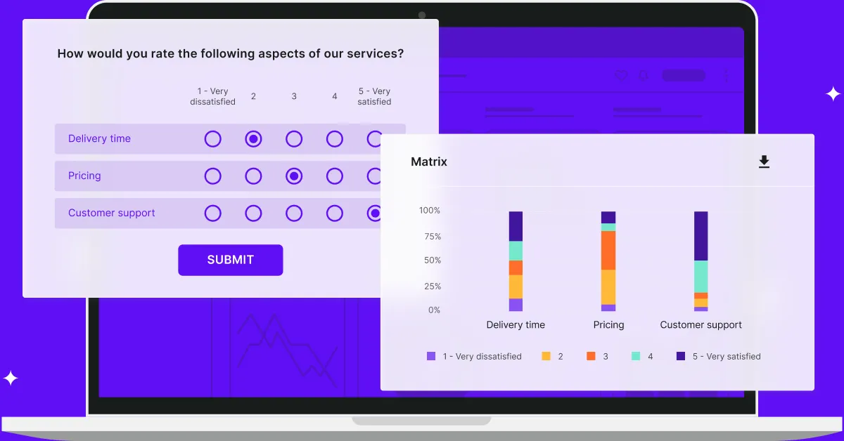
13. Build charts in the Dashboard tab

Visualise trends with automatically generated charts and graphs.
Useful for showing the CPO not just what the problem is, but when it started and whether it's getting worse.
14. Ask follow-up questions in Research Assistant

Use the Research Assistant tab to dig deeper into anything the report surfaces.
Ask it to find more evidence for a specific finding, reframe a section for a different audience, or summarise a single insight in one sentence for a Slack update.
15. Adjust the setup anytime

If you want to refine the project, let’s say change the time period, add a source, or update the description, open the Setup tab and edit any section without starting from scratch.
16. Edit with AI

Want the edits done even faster? Edit the report with AI entering prompts right in the report window.
It’ll make necessary changes for ya, still leaving the credible part in, aka, linking back every conclusion back to supported sources with exact quotes.
Phase 4: approve and share
17. Approve

Once you’re happy with the results of the report, click “Approve” in the top right corner.
18. Share

Then, all there’s left to do is share away. You can copy-paste sections you find most valuable to your given stakeholder (in our case, Sarah, the PM), download only the graphs you’ve generated based on the data, or give your stakeholders a direct link to the full report so that they can spar with it on their own.
Going a step further, if you connect Research Assistant (part of Research Hub) with your Slack workspace, you get to chat with AI (based on your data only) directly from Slack.
The AI concerns
If you're skeptical of AI in your research workflow…good. You should be.
Researchers have been burned by tools that overpromise, hallucinate confidently, and produce outputs that look rigorous but fall apart the moment you pull on a thread.
And if you're skeptical of the data being used to sell you on AI? Also fair.
Anthropic's Economic Index, which tracks how Claude is being used across the economy, has a real limitation worth naming: the dataset skews toward power users and enthusiasts.
People who use Claude actively, opted into a voluntary chat interview, and did so without compensation. The person who opens ChatGPT once a week to reformat an email is basically invisible in this data. A smaller, intentionally designed study would have been more valuable than 80,000 self-selected responses.
But the directional signal is still useful.
What the index shows, with all those caveats on the table, is that augmentation is the dominant and growing mode of AI use. Not automation. Not replacement. Augmentation. By February 2026, it's sitting at 55% augmentation vs. 44% automation, and that gap has been widening.

For us researchers, this distinction matters especially.
The hard parts of research, knowing what's worth investigating, reading what a user didn't say in an interview, pushing back on a finding that feels too convenient, those require judgment that no AI has.
What AI can handle is the mechanical work that currently buries that judgment: pulling from 15 sources at once, surfacing patterns across hundreds of responses, building a draft structure you can react to and edit.
Research Hub is built on that principle: AI is great at synthesis, but bad at expert thinking. Researchers are the experts. AI is the assistant.
For our solution, that means:
- You control what gets analyzed. You choose which sources go in, set the time period, and filter out noise, so the AI is only ever working with what you've deliberately scoped.
- Every conclusion links back to its source. Every insight in your report is tied to the exact quote and feedback it came from. You can verify any claim before it leaves your hands. You're not trusting the AI blindly but checking its work, faster than you ever could alone.
- You direct the final output. The AI drafts. You verify, edit, and finalize. Nothing goes into the report that you haven't signed off on, officially hitting the "Approve" button.
The common worry of "but I'll have to check everything anyway, so does it actually save time?" is worth addressing head on.
The difference is that Research Hub is built with verification in mind from the start. The evidence trail is already laid out. You're not hunting for quotes after the fact, they're attached to every conclusion, ready for you to review. The checking is faster because the work is already organized.
You remain the expert. Research Hub just removes the part that was never the expert work to begin with.
One last thing
Us researchers have been told for years to communicate better, tell better stories, get a seat at the table, and prove our value. And we've been doing all of that, often brilliantly.
Here's what I've come to believe: the traditional research report is now actively getting in the way to make us feel heard and prove our value.
It's the reason insights don't land. The reason stakeholders skim or skip even if you apply all the right tips (adjust the language, be in the channels, share Loom snippets, you get it). The reason research gets done and then forgotten. We spent years blaming the communicator when the format itself was the blocker.
The good news is that's finally something we can fix.
The tools, the formats, the channels, they're all catching up to the way research actually needs to move inside an organization. Research Hub is how we're approaching it at Survicate, but the shift is bigger than any single tool.
If you're rethinking how your research lands, I'd love to hear how it goes. You can message me on LinkedIn if you want to exchange ideas. 😉


.svg)

.svg)