The easy slide into Google Forms—with a Google account you already have—can be tempting. And if your main focus in finding the right survey software is your budget, then Google Forms is a good choice.
But is it a perfect one?
Especially when compared with SurveyMonkey, Google Forms seems, in most cases, insufficient. Often leaving us to fend for ourselves, with mere 17 templates, no questions bank, or tips for improving surveys.
On the other hand, SurveyMonkey gives you more advanced features, but not all for free. The limitations on the free plan are actually quite heavy.
In this article, we’ll dive head-first into a direct SurveyMonkey vs Google Forms comparison. You can expect a side-by-side view of the features, an overview of their limitations, user reviews examining, and more.
And yes—we have tested both tools, tinkered with the features, settings, and pulled apart the pricings.

Tl;dr
If your main focus is:
- your budget—choose Google Forms. It serves the basic purpose of creating forms, surveys, and quizzes, with the fundamental question types and design options available. You won’t have to pay a cent or create a separate account—Google workspace is enough. Your responses won’t be limited, the questions you can add either. Plus, the results can still be collected and analyzed in Google Sheets.
- more advanced features—choose SurveyMonkey. It will go beyond basic question types. Think AI survey creator, data analysis, lots of templates, and diverse targeting. But beware of a steep learning curve, not-so-modern designs, and pricey subscriptions.
SurveyMonkey vs Google Forms: in a nutshell
SurveyMonkey is a survey software with quite a bit of presence on the market, starting in 1999. It caters to various industries, from healthcare to government, and diverse positions, from marketers to HR.
Google Forms is a part of the Google Docs Editor suite, first introduced into the set of the giant’s web applications back in 2008. Like Google Docs you use on a daily basis, Google Forms is a click away from your Google account.
Reviews: what do people say?
Both Google Forms and SurveyMonkey are quite popular, which makes it easy to take a look at other people’s opinions before making any commitments.
So, let’s analyze some of the reviews coming from the users of both tools.
Google Forms: readily available and easy-to-use, yet basic
Google Forms is often chosen for its ease of use, like Janice S. says: “I chose Google Forms for its ease of use. It's really easy to create surveys or intake forms.”
Marcie P. seconds this, saying “I chose Google Forms because it was readily available. It was easy to use and it was online. And since most of my classes are online, it just made it very convenient to use between me and my students.”
On the other hand, what’s most often underlined as a con is the lack of advanced features and customization options. Like Amit B. says: “[Google Forms is] Not customizable enough, not too many options when it comes to question types, automation and more. Pretty basic.”
Muhammad Zubair S. also highlights this issue, saying: “The look and feel of the embedded forms in a website seem so generic, anyone can recognize that the forms are created with Google Forms. There are very few or limited options to customize the forms in order to enhance the form design. There are only four font styles, and no option to resize the fonts.”
SurveyMonkey: ease of creation, diverse use cases, but limited & expensive
One G2 user describes their experience with SurveyMonkey this way: “I like the ability to easily create surveys and pass them along to others. It is easy to share with lots of people. It is also easy on the receiving end to use. Also the graphics are cute. I use it a lot for work.”
SurveyMonkey is also used in a variety of industries.
In education, just like Dawn T. “What I like best is the ability to collect responders' information. In an education setting it is not unusual for students or parents to attempt to submit multiple responses.”
Or healthcare, like Nicole Y. a Nurse Supervisor says “Survey Monkey is easy to use. We have used it in my work environment multiple times and it was easy to individualize each survey, the users were more likely to complete the survey because it was fast and efficient.”
Now, one of the few cons that stand out in terms of SurveyMonkey are its limitations.
As Christy M. puts it: “When I designed my survey, I didn't realize some features required a subscription. I spent a lot of time creating it, and then I found out very basic features need to be purchased, so I sort of had no choice but to purchase the subscription, in order to complete my project.”
Many reviews also highlight that SurveyMonkey comes across as rather expensive. Just as Eva S. says: “So for me, the one downside would be the pricing. I am a small business, and only send a couple of surveys a year, so for me spending almost $500 a year seems a bit steep. I would love to see a way to be on the free plan but to add features a la carte.”
Getting started: easy with Google vs steep SurveyMonkey hill
Moving beyond reviews, let’s analyze how easy or difficult it is to get started with each tool.
For Google Forms, all you need is your Google account. Log in to your Gmail account and head to the Google apps menu; from there choose “Forms”. That’s it.
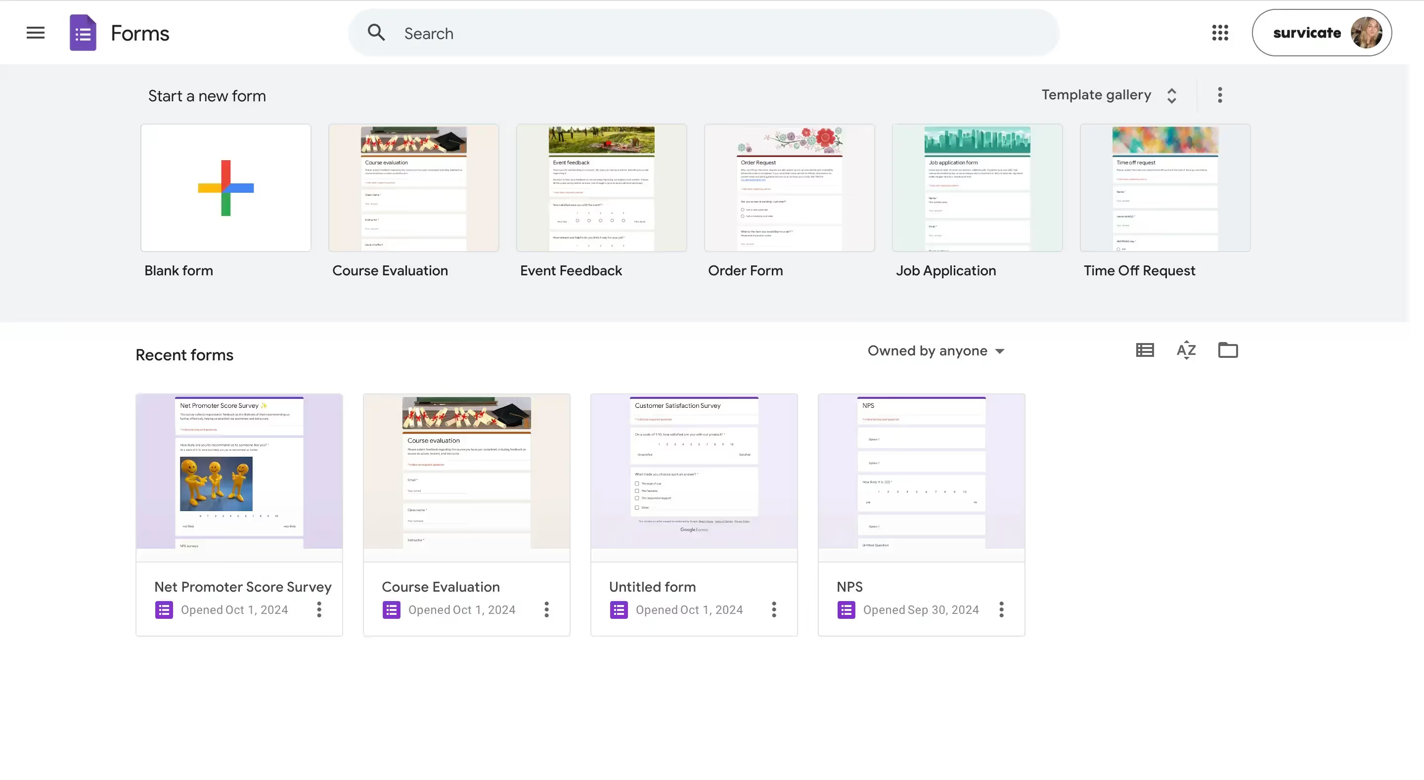
You don’t need to create another account or fight for your life trying to create that first form. That’s all because Google Forms is a simple tool. One of the reviewers even called it “basic”—which all adds to a very shallow learning curve.
For SurveyMonkey, creating an account is not rocket science, all you need is an email address. However, the tool itself is much more complex compared to Google Forms, so there’s a bit more to learn.
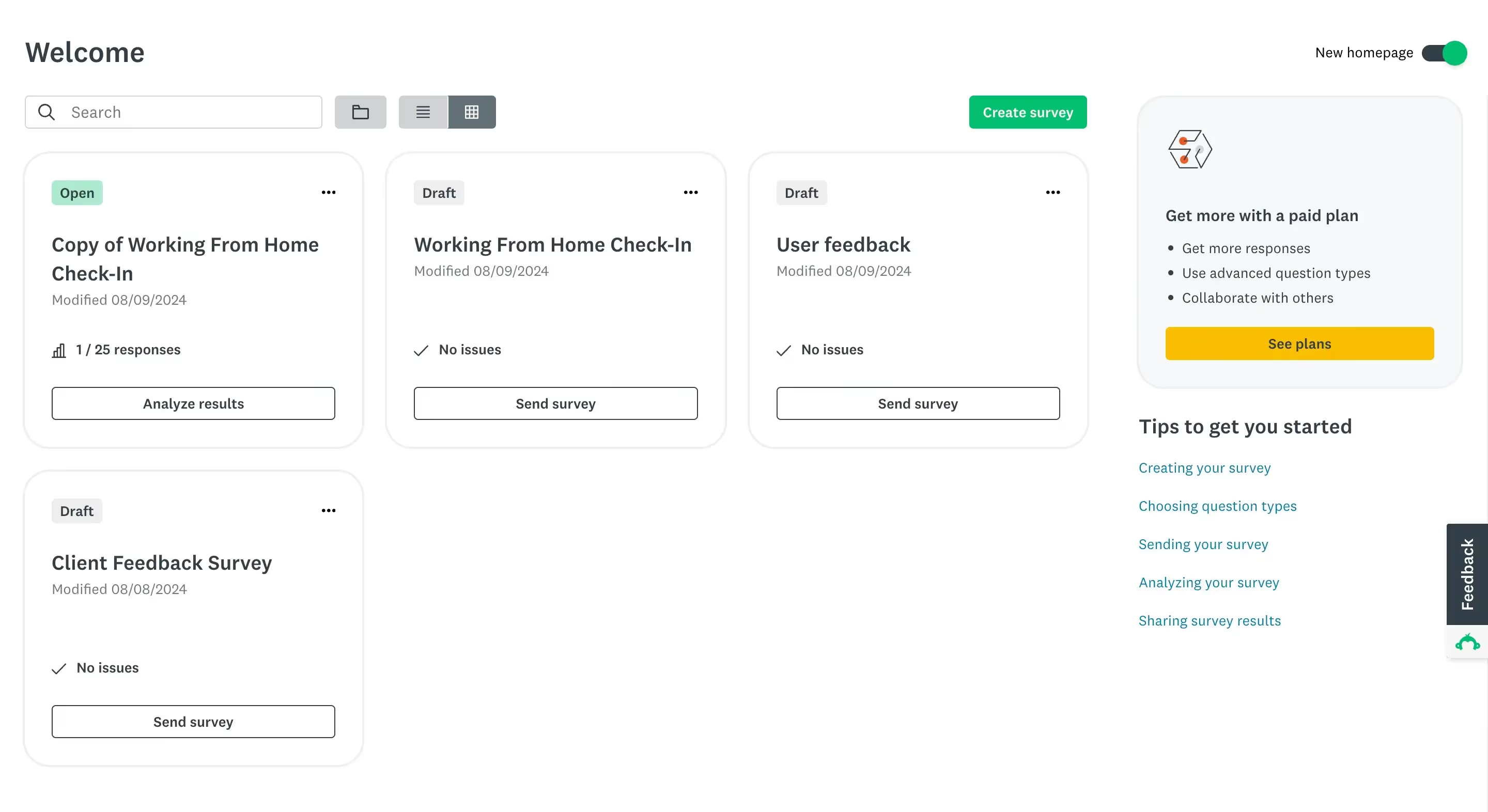
At first, there will be many options and features to figure out, all laid out on a rather outdated interface, which makes it much harder to get started with.
Side-by-side feature comparison
Once you’re logged in, you can actually test out some of the features and properly compare both tools.
We’ll focus on question types, form builders, design options, templates, and analyzing responses.
Question types
In Google Forms, the variety of question types you can use is quite generous for a free tool. It certainly provides more than SurveyMonkey in this area.
Building a form in Google Forms, you can choose to add:
- Open-text questions, including short answers and longer paragraphs,
- Choice selections, including multiple choice questions, dropdowns, and checkboxes,
- Different types of grids, from a linear scale, through a multiple choice grid, to a checkbox grid,
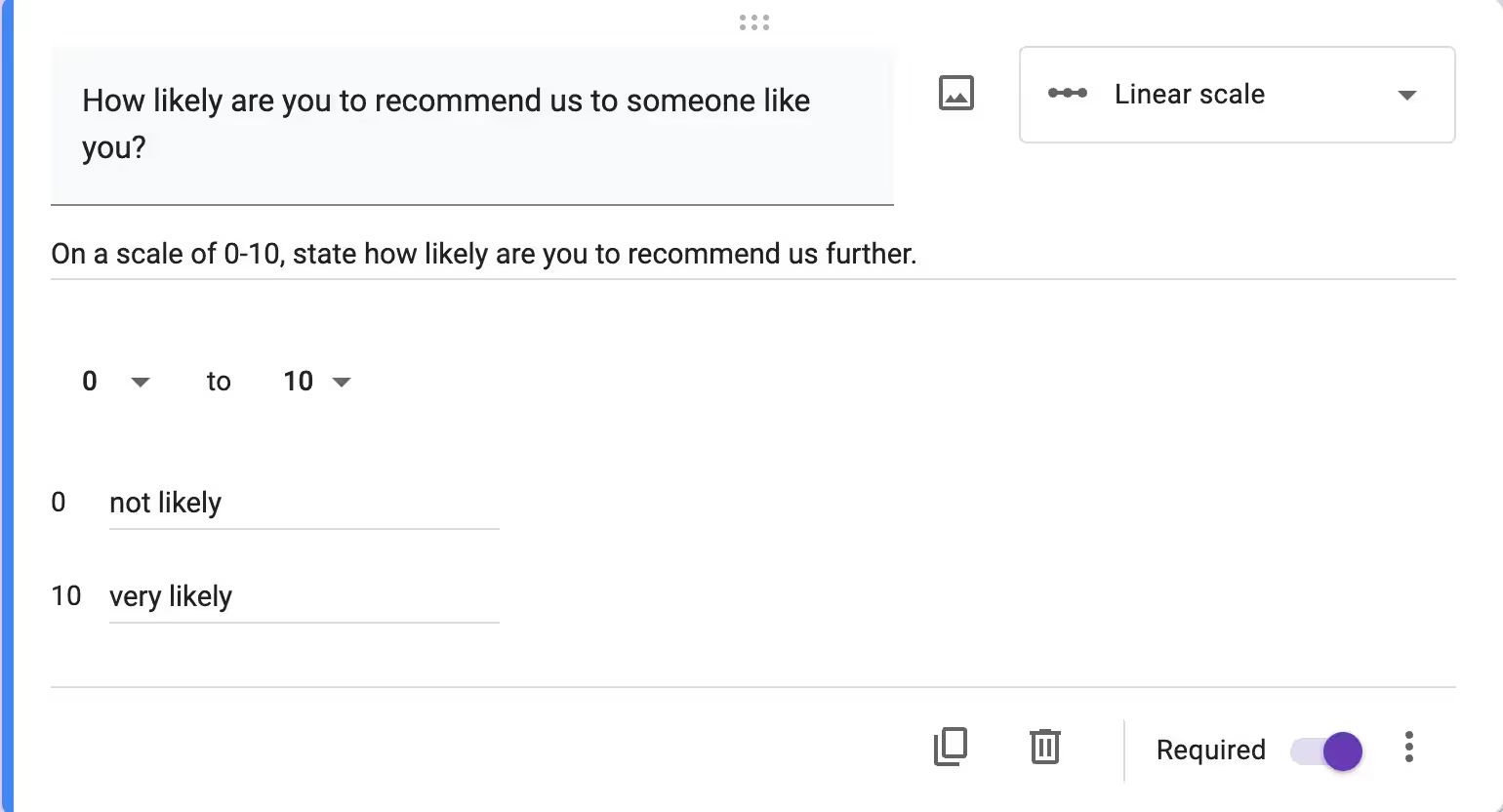
- A file upload field,
- Organizational fields, including asking respondents for date and time.
What’s more, you can complement each question with an image.
After that abundance of questions, we can now move to a more limited SurveyMonkey form builder.
On the free plan, SurveyMonkey covers the following question types:
- Choice selection questions, including multiple-choice, checkboxes, and dropdown questions,
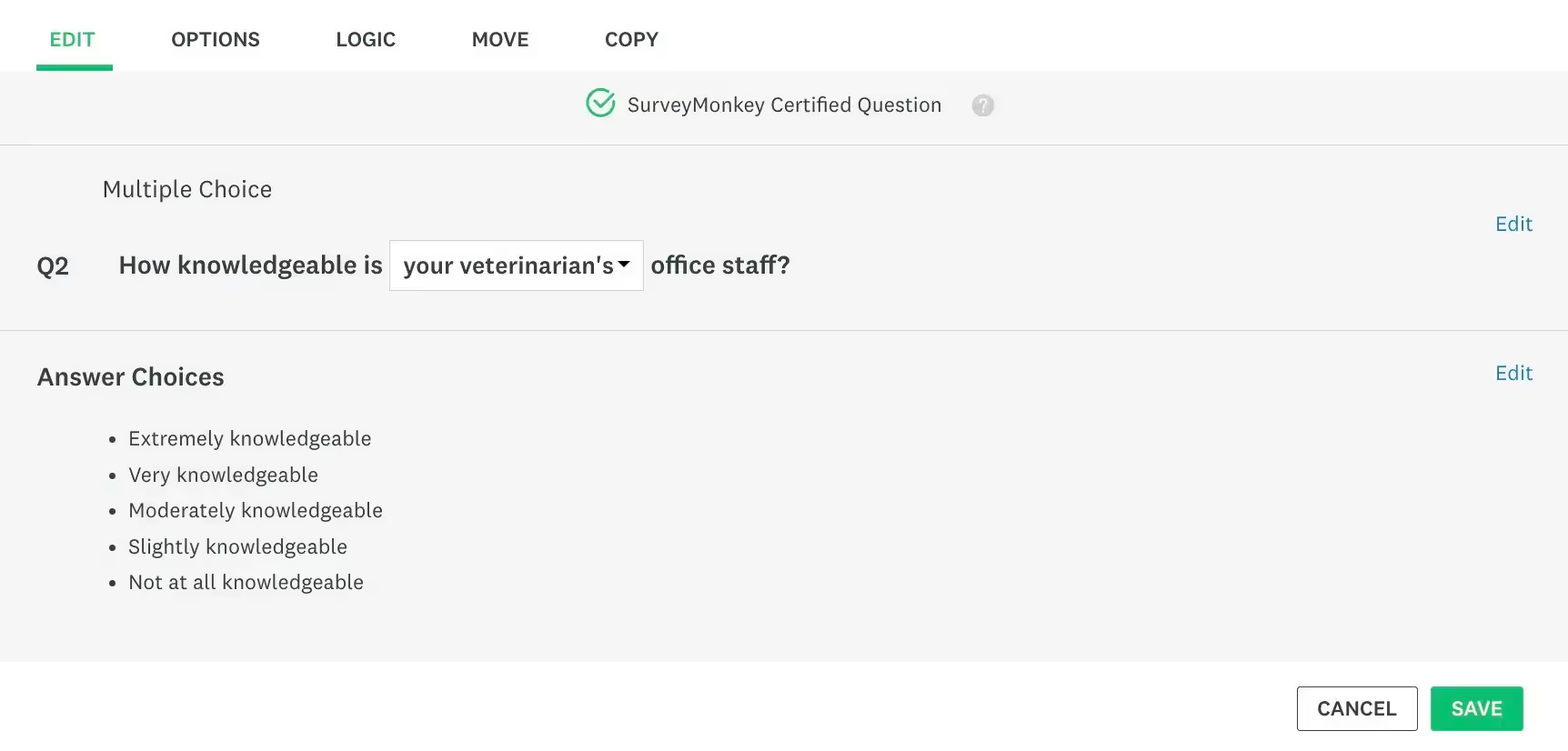
- A single textbox question,
- A Net Promoter Score question,
- Contact details, including a question about the respondent’s name, email address, phone number, and postal address,
- Organizational questions, including a date and time question,
- An open-text question,
- And finally, image-based questions.
For free, you can also add an intro page, a new page, and dividers into your surveys—but that’s about it.
💡In case it’s hard to see what the difference between the two is, Google Forms basically gives you three different types of grid-based questions and a file upload field for free, while SurveyMonkey doesn’t.
The grid-based questions can then be used to calculate essential metrics, like NPS or CSAT scores.
Now, if you decide to purchase a subscription in SurveyMonkey, you can freely use the remaining question types, including:
- a star rating,
- a Matrix grid,
- a file upload,
- a slider question.
But also enrich your surveys with additional features, such as A/B tests.
Form & survey builders
Knowing the bricks we can use to build our forms and surveys in both tools, we should now focus more on the building experience itself.
And yet again, it’s a bit better in Google Forms.
You start off by giving your survey a title and then add your questions with the plus icon. Each new question is a multiple-choice one by default, but you can easily change that.
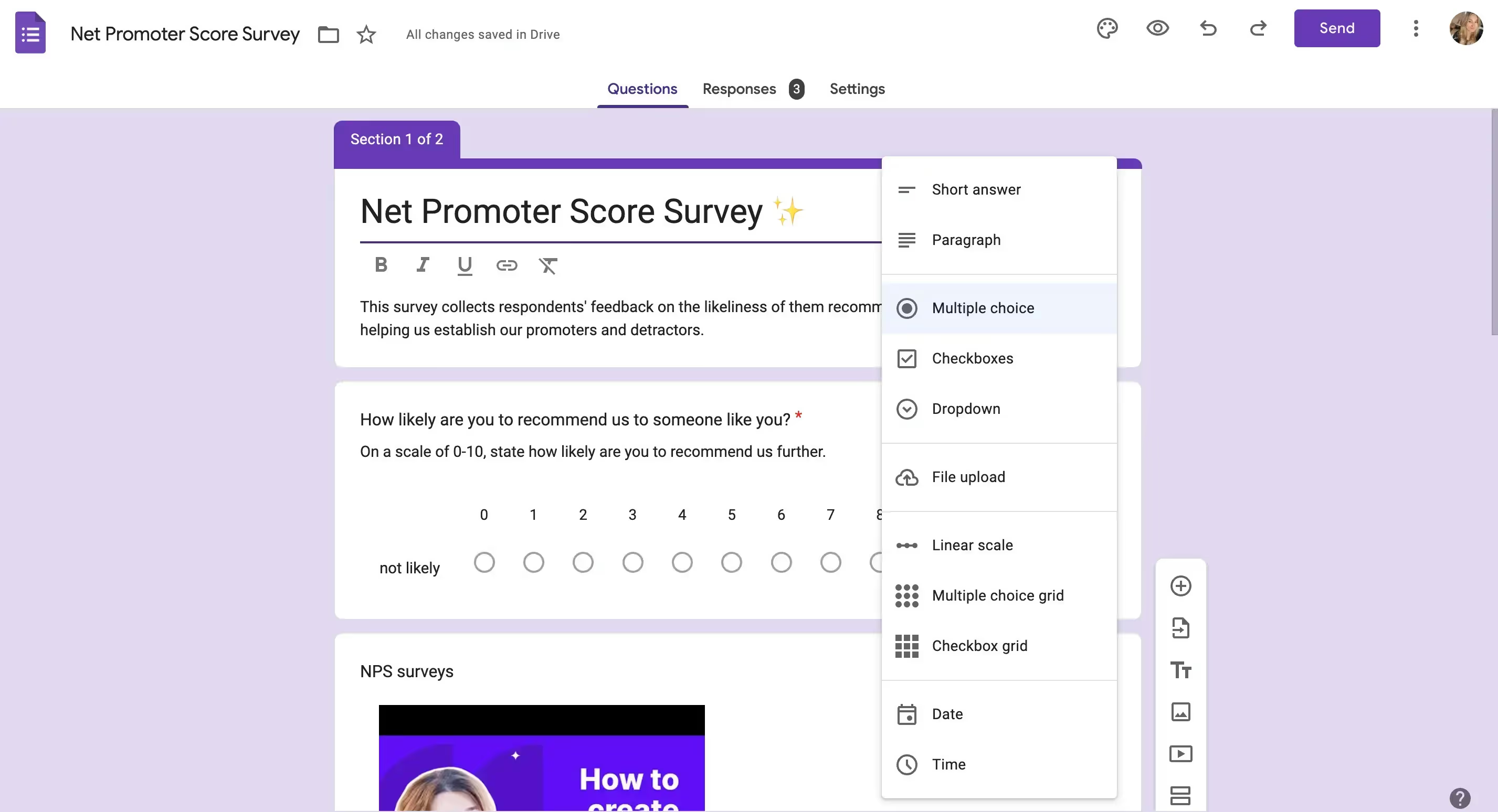
Then, depending on the selected question type, you can tinker with the settings, rename options, add images, or mark the question as required.
Additional building options come in the form of adding videos. In the popup window, you can search directly for the YouTube video you wish to add.
The builder is clean, user-friendly, and generally easy enough to figure out.
Now, when it comes to SurveyMonkey, things get a bit more difficult due to the sheer amount of options you can go for but also the unfortunate design choices—this software is not as clean and modern as Google Forms.
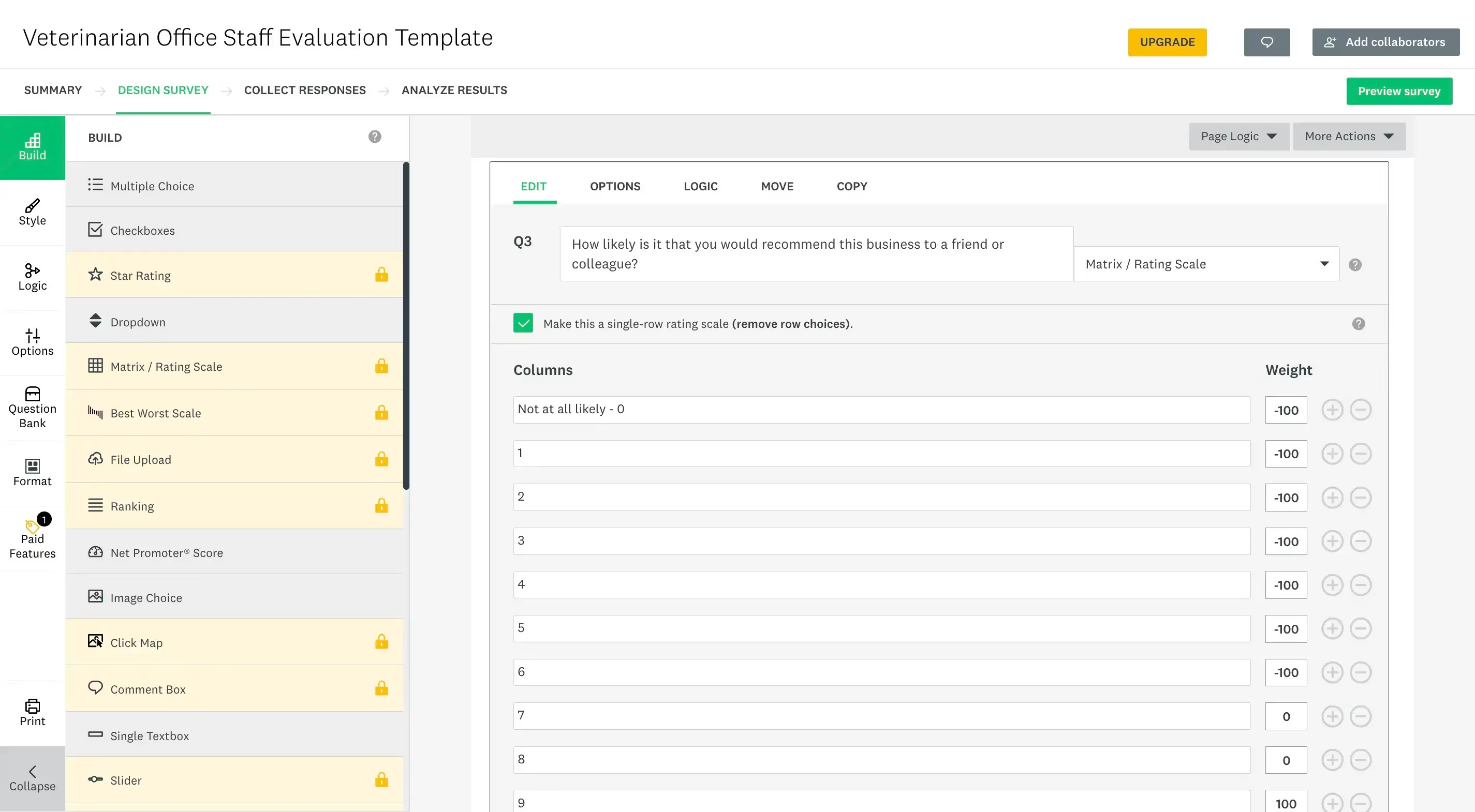
What’s more, with SurveyMonkey, minor things could become big blockers.
For example, you can’t add your questions all at once to scope your survey. You have to make sure each one is properly filled out before moving on to the next; otherwise, you might get an error.
We said this in our article comparing Typeform vs SurveyMonkey, but we’ll say it again. SurveyMonkey’s builder often feels like digging through WordPress settings.
For free plan users, a lot of the features and options, like the entire logic section, are unavailable. This can be both a blessing, making things simpler, or a curse, if you want to use advanced options.
On the brighter side, some of the interesting features are available for free, like turning your survey into a chat conversation. What’s also good to use is SurveyMonkey’s AI survey builder which may speed things up for you.
Design options
But don’t worry, you won’t be caught up in choice overload with the design options in either tool.
Speaking of SurveyMonkey’s free plan, you basically get 11 design templates to choose from, without the option to build your own custom theme. Essentially, leaving you to the graces of SurveyMonkey’s designers.
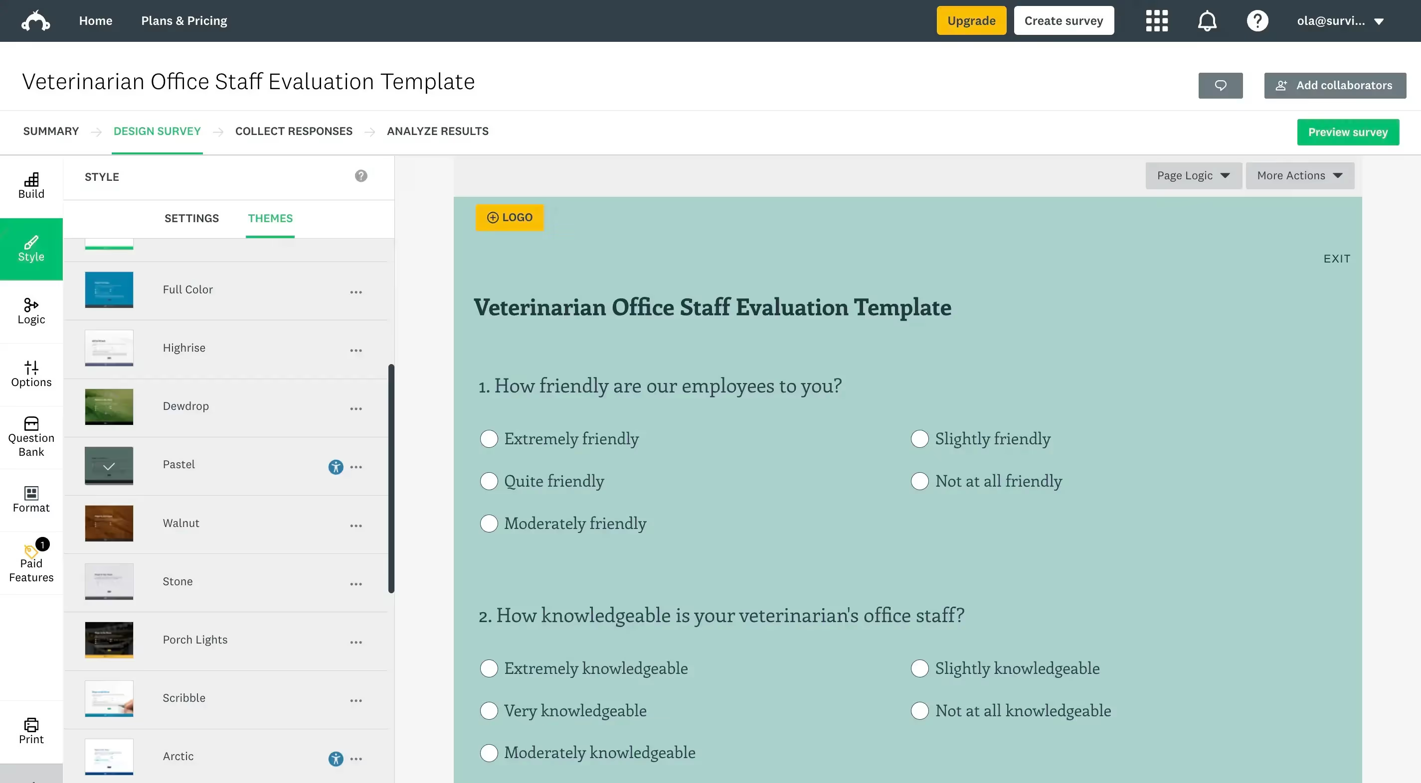
Any design options, like adding your own logo or changing the fonts, colors, or layout of the survey are locked behind the paid subscription.
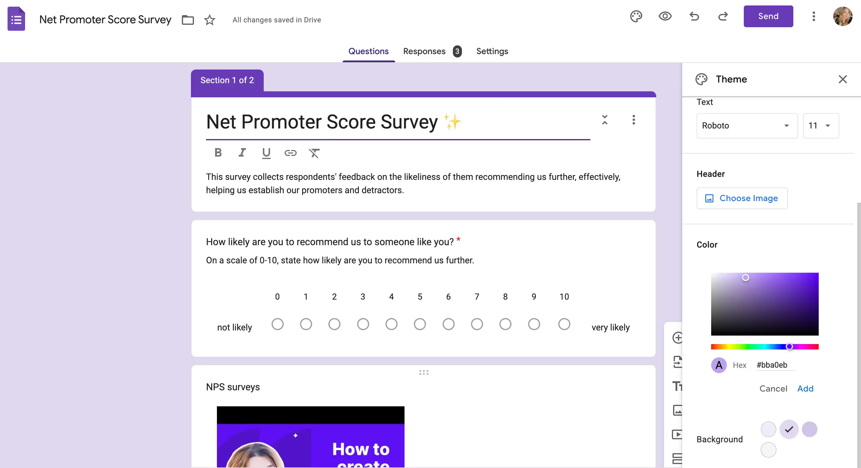
Google Forms yet again goes beyond what SurveyMonkey offers with:
- Custom background color selection—you can even go for a custom color,
- Adding a header image,
- Changing the fonts and font size of the questions and any text visible on the form.
Templates
Now, just because you can change the colors and fonts as per your wish, it doesn’t mean that Google Forms doesn’t come with any ready-made options.
In fact, Google Forms gives you 17 templates to choose from, divided into three categories: work, personal, and education.
The work forms are not that much focused on collecting feedback, though. They’re more administrative. One of the six templates in this category is a time-off request, for example. The personal forms range in topics, from party invitations to event registrations.
Educational form templates seem to be the most cohesive, targeting teachers, professors, and school administrators. Here, the five templates available are: a blank quiz, an exit ticket, an assessment, a worksheet, and a course evaluation form.
💡SurveyMonkey on the other hand offers a whole library of templates when compared with Google Forms. The templates are split into 22 categories. Some of which include HR, marketing, education, and health care.
One caveat, though, is the fact that some templates may contain premium features.
If you’re looking for free software, you won’t be able to fully enjoy some of them. Or you’d be forced to customize them, cutting out the paid features.
Analyzing responses
To analyze responses in Google Forms, you simply go to the survey that you want to check the results of, and switch the tab to “Responses”.
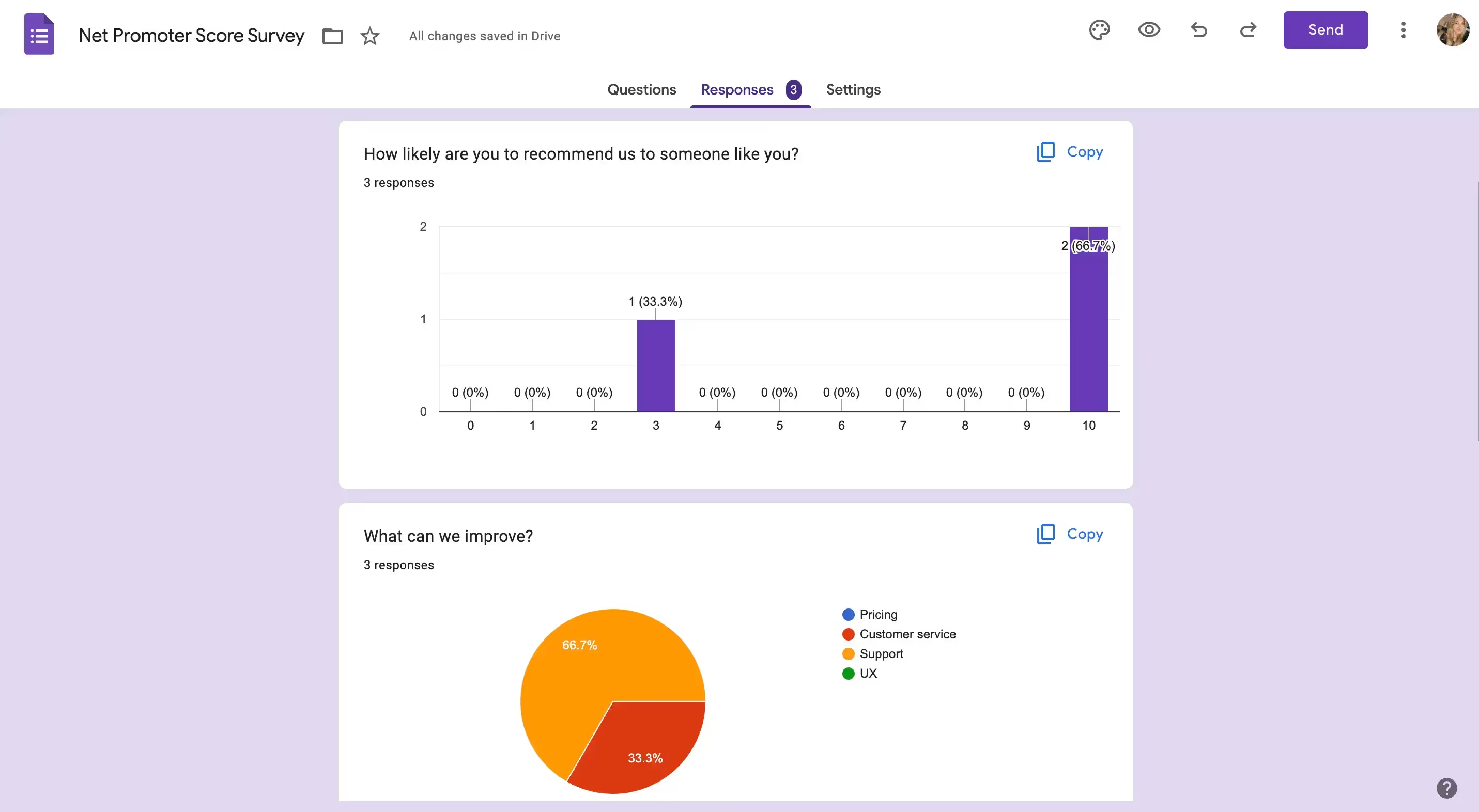
There, you’ll find a summary of all the responses neatly presented in the form of charts, whether bar or pie. But you also get to check each completed form and answers to individual questions.
To make your life even easier, Google Forms allows you to link the responses to Google Sheets, either by choosing an existing file or creating a new spreadsheet.
Overall, the responses are clean and easy to read. If we had to pick at something, it would be the fact that you can’t see which forms got responses and which ones didn’t when viewing all on the dashboard.
In turn, SurveyMonkey’s results are a little harder to figure out.
Going into analyzing results, first, you’ll see a chart-based summary of each answered question. Yet, although it seems similar to Google Forms, the graphs are not as neat.
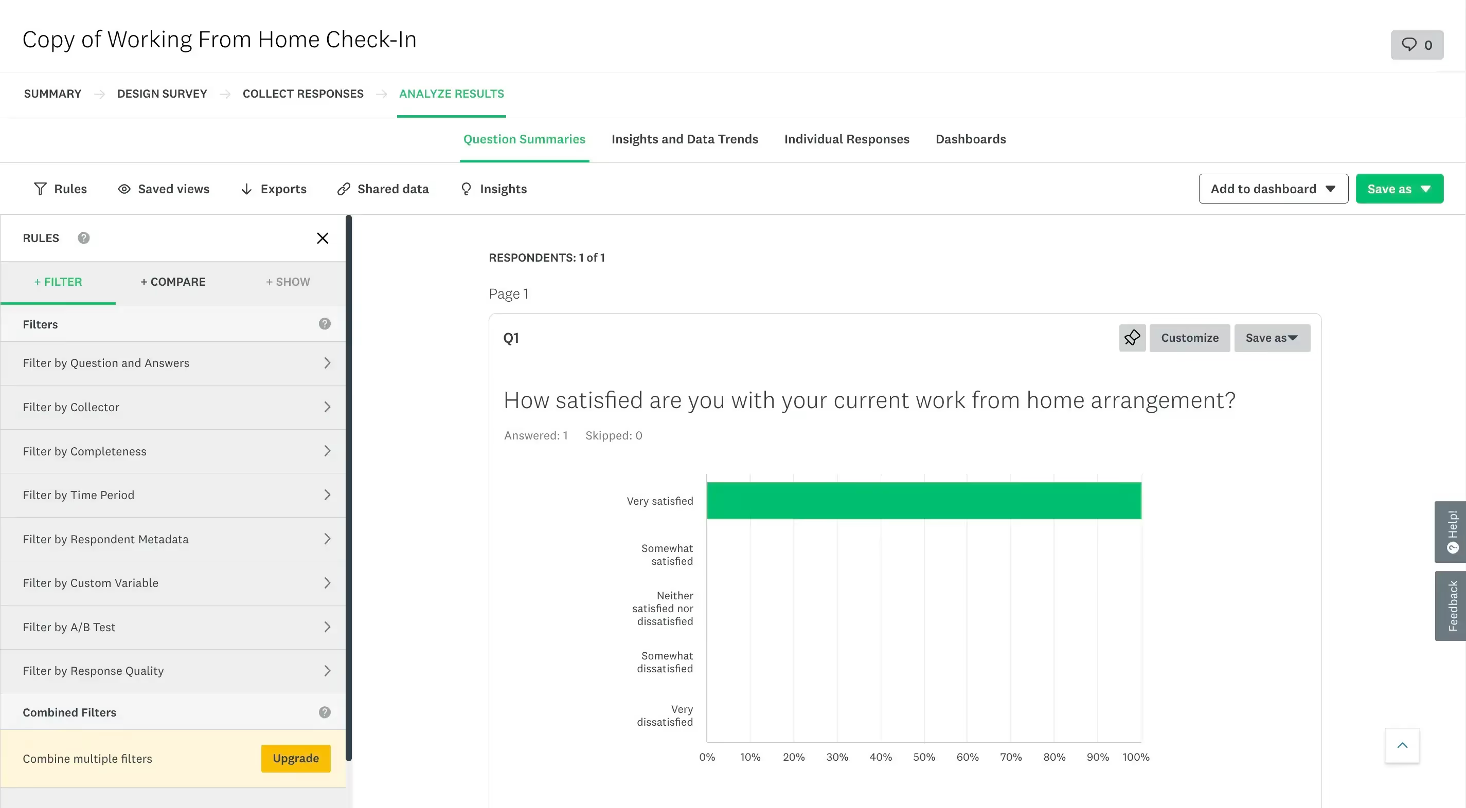
But besides just question summaries, you can switch the tab and dive into the insights and data trends SurveyMonkey identified, analyze individual responses, and even create your own dashboards, adding specific charts or responses to them.
What can significantly help with analyzing responses in SurveyMonkey are the additional options.
Like, rules.
Rules allow you to apply a variety of filters to the responses. For example, going by time period or the level of response completeness. But also comparing specified results, or showing only specific questions or survey pages.
Unfortunately, combining two or more rules and filters is not available for free. So, in order to check all angles, you’d have to spend quite a bit of time checking off each filter individually.
In the same realm, SurveyMonkey hides more features behind a paywall. Like AI responses analysis called Insights.
The Insights feature is currently composed of two main components:
- Sentiment analysis, which automatically categorizes text responses as positive, negative, or neutral.
- Response quality, which basically identifies low-quality responses by scanning them.
But going back to the dashboard, it’s easier to figure out which of your surveys even have answers since SurveyMonkey gives you the number of responses right under each survey.
What’s more, SurveyMonkey helps you out further by applying the right button under each survey, depending on the action needed.
You can hop right into:
- editing unfinished surveys,
- sending finished surveys,
- and analyzing results when responses have been submitted.
Let’s talk limits: free plans’ features & responses
Google Forms, as we mentioned before, is a completely free tool. The only requirement is having a Google account.
Therefore, you shouldn’t anticipate any limits on your journey with Google Forms— neither when it comes to the number of responses you can collect or questions you can add.
SurveyMonkey gives you a free plan and an array of paid subscriptions to purchase for additional features.
So, let’s take a closer look and compare what you can get for free with each tool, sort of summarizing what we already analyzed in-depth above.
What’s worth noting is the fact that SurveyMonkey limits the number of responses you can collect for free to 25 per survey, while Google Forms doesn’t have any limits.
SurveyMonkey’s unique points
But let’s now face the obvious fact that has to be stated to properly compare SurveyMonkey vs Google Forms.
Not every software platform out there is made to be used for free. And that’s certainly not the case with SurveyMonkey.
Their free plan basically serves as a way to get to know the tool and play around with the features. See if it fits your needs and your workflow.
It is purposefully heavily limited.
SurveyMonkey caters more to those who crave more advanced features, collect a lot of responses, wish to have a variety of embedding options, and want to analyze large amounts of data at once.
Saying that, we can now take a look at the unique parts of SurveyMonkey that are available only to paying customers, yet make the tool distinct.
Diverse ways of sharing the survey
Starting off with basics, sharing your survey.
Google Forms allows you to share your survey via email, by sharing a dedicated link, or by embedding an HTML code on your website.
Besides the fact that there aren’t many embedding options, we encountered one small error.
You get the option to shorten the URL of the survey link you’re sharing, but the shortened URL does not work if your respondents are currently not logged in and you require it.
If you want to avoid any roadblocks, you can disable the sign-in requirement in the settings. Or make sure to let your respondents know they have to be logged in for the survey to work. 😉
Google Forms stands out by allowing you to send your survey to respondents via email, a feature that SurveyMonkey locks behind a paywall.
And even though most are premium features, SurveyMonkey comes with more options for survey sharing:
- Sharing a link, [free]
- Embedding on a website, [free]
- Posting a link on social media, [free]
- Embedding in a mobile app, [paid]
- Adding data manually, [paid]
- Using the kiosk mode (on a tablet or mobile phone), [paid]
- Sending by email, [paid]
- Sending by text, [enterprise plan needed].
Integrations
Google Forms smoothly works with other Google apps. But SurveyMonkey comes with a whole army of integrations.
From CRMs, like Salesforce or monday.com, to Google tools, like Google Sheets or Google Drive, and marketing software, including Mailchimp and HubSpot.
Some of the integrations are native, others require using Zapier.
AI survey builder
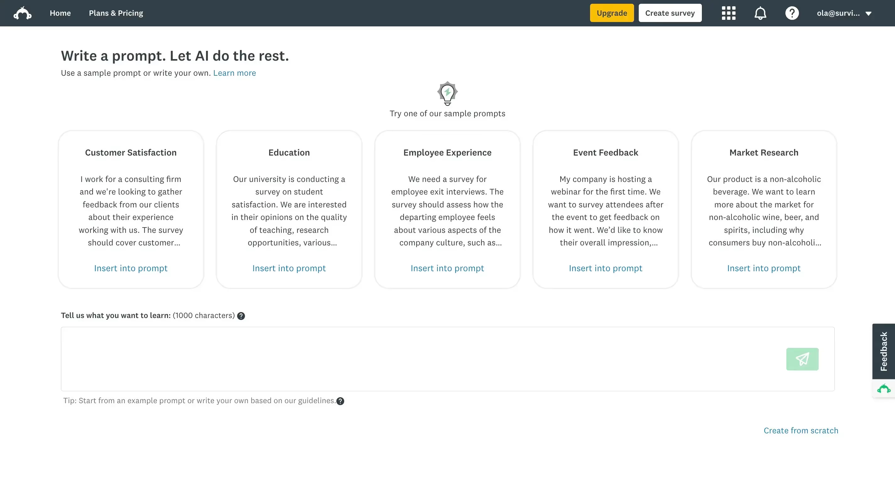
Unlike Google Forms, SurveyMonkey comes with an AI survey builder.
It’s a premium feature that basically generates the survey content for you after prompting.
AI data analysis
As mentioned before, another unique to SurveyMonkey feature is the AI data analysis, which analyzes the sentiment of the collected feedback and identifies low-quality answers.
We can’t test it out being on the free plan, but we’re sure it’s useful when analyzing large batches of data.
More than Google Forms, easier than SurveyMonkey: meet Survicate
After reading this comparison article, you may still find yourself in a conundrum.
Why?
Google Forms may be free and easy to use, but it’s just not enough to meet your needs. SurveyMonkey may have advanced features, but turns out to be expensive and outdated.
So you just choose nothing? Or sigh and redig the research rabbit hole?
Maybe you don’t have to take out that shovel just yet. 😉 We have one more piece of software up our sleeve.
Survicate is survey software that is just as powerful (if not more) than SurveyMonkey, but combines the ease of use of Google Forms, making it the perfect alternative to both tools analyzed above.
Here are a few reasons why Survicate may be just what you’re looking for.
User-friendly and modern
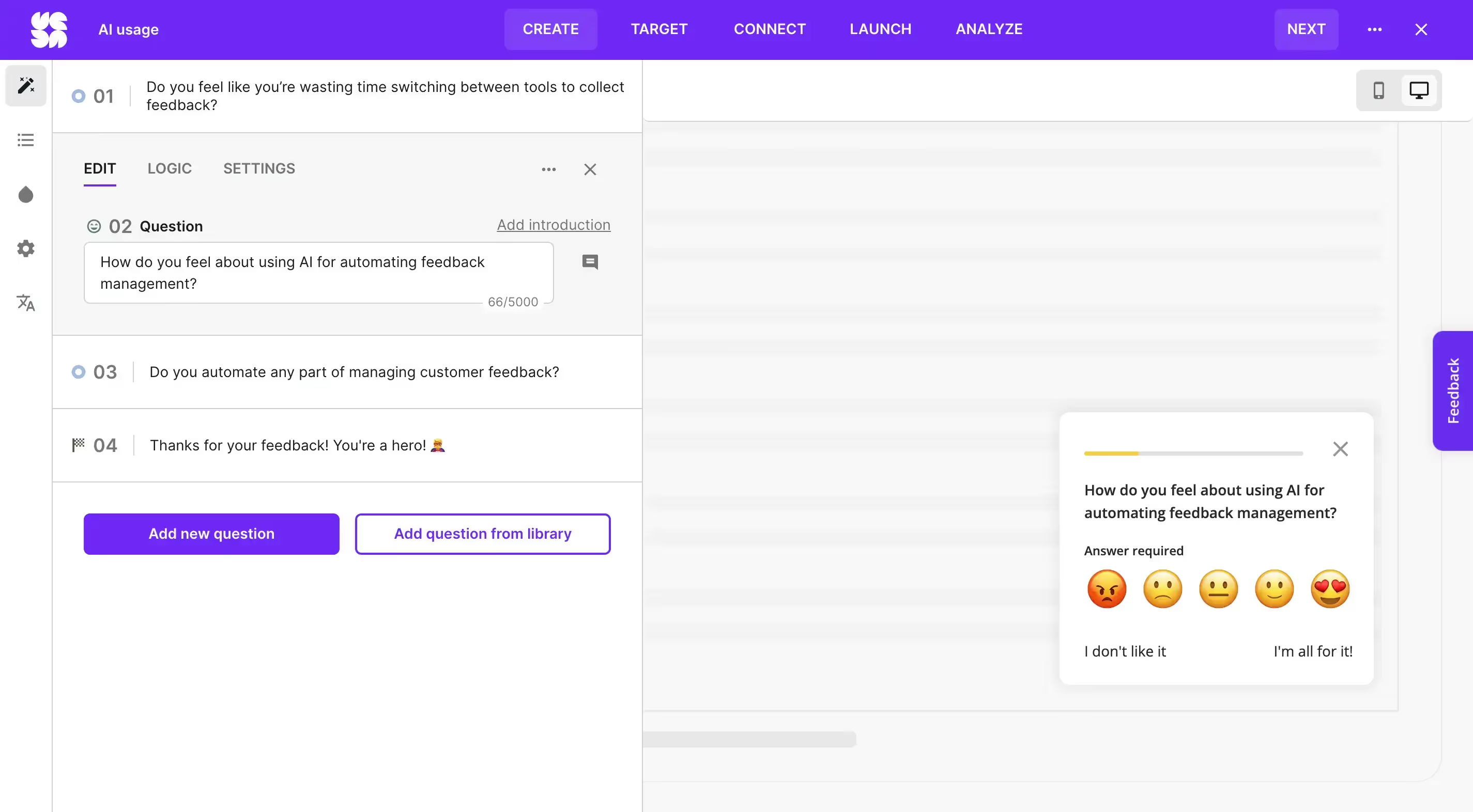
Directly connected with the ease of use and your experience using the app, but also with the first impressions of those completing your surveys—Survicate is an effortless software, and modern at that.
Signing up takes just a few clicks and only requires an email address, while creating and launching that first survey is just as simple.
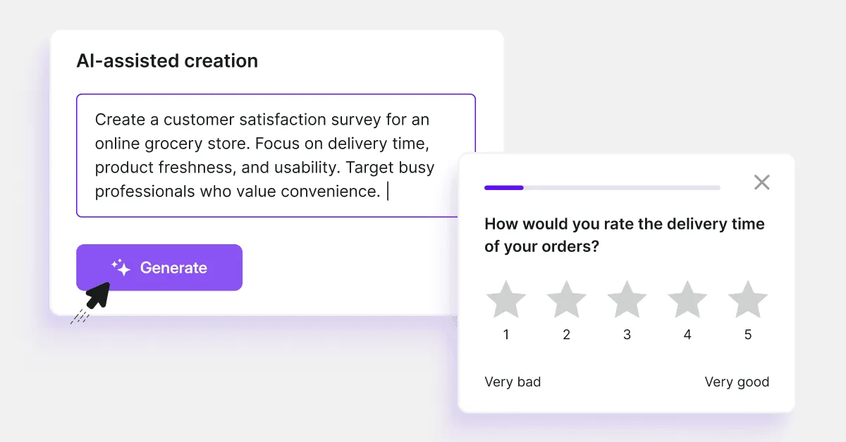
You can go for a myriad of professional and modern templates, use an AI survey builder (we see you SurveyMonkey 😉), start from scratch, use a question library, or import your questions.
Each option is super easy to use thanks to the modern interface.
💡Think of it as combining the easiness of Google Forms with the abundance of SurveyMonkey.
Extensive free plan
Those on a budget can take a breath of relief.
Survicate comes with a free plan that’s way less limited than SurveyMonkey’s one.
With the free plan, you can:
- Collect 25 responses per month
- Create surveys with AI or use pre-made templates
- Share surveys via email, link, or directly on your website
- Use survey logic to personalize the experience
- Access CX metrics, survey analytics, and overtime trend reports
- Integrate with CRM software
- Stay secure with GDPR compliance, ISO 27001, 2FA, and Google SSO
💡That way, you get more than with Google Forms, but still stay on budget. A win-win. 😉
And if you need something more advanced, like some of the features described below, check out full Survicate's pricing here.
Automation and AI-focused (no fluff)
As we briefly mentioned, Survicate gives you an AI survey builder to speed up the process of creating surveys and lets you head straight to collecting responses.
But the AI creator is not all there’s to Survicate’s AI capabilities.
There’s also Insights Hub and Research Assistant that surely will become your best and quickest data analysts.
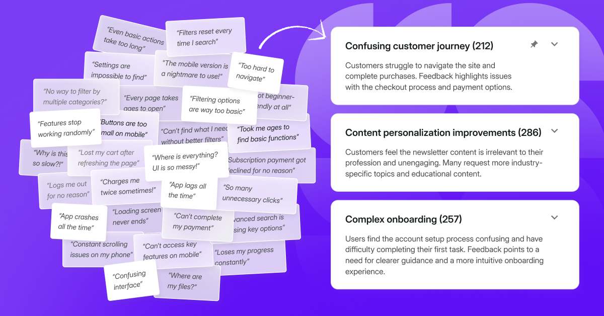
Survicate’s Insights Hub data analysis is similar to SurveyMonkey’s Insights feature, but better. It not only analyzes the sentiment of the collected feedback, but also automatically categorizes the data into topics.
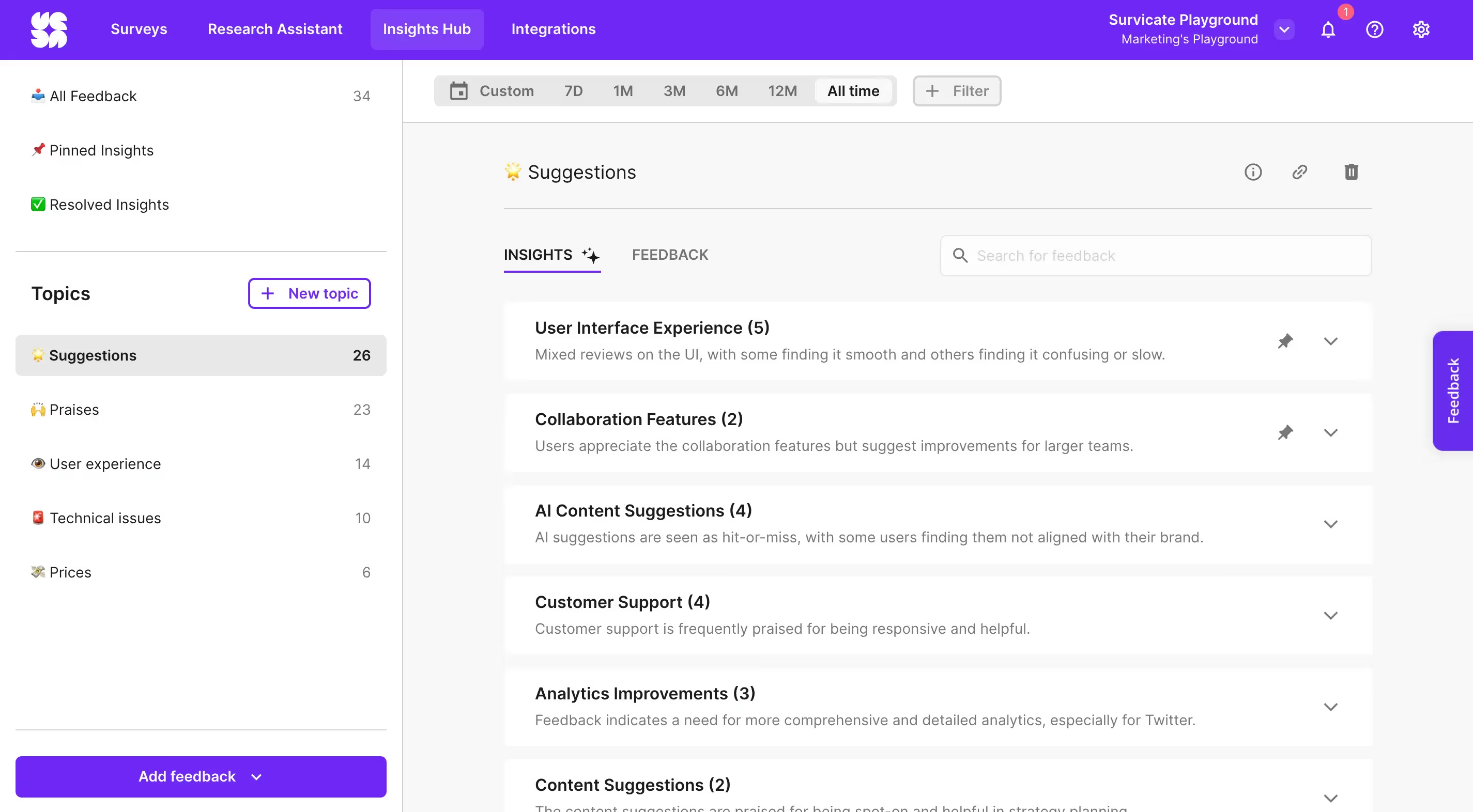
What’s more, you can also connect other sources of feedback into Survicate’s Insights Hub, and analyze all the data from it.
💡Think location-specific Google reviews, Intercom conversations, and even the dust-covered Google Sheets feedback files no one had the time to analyze.
To top it all off, you get a reliable ChatGPT-like feature called Research Assistant. Based on all the collected feedback, either through surveys or connected to Insights Hub sources, you can ask it questions to analyze combined data much quicker.
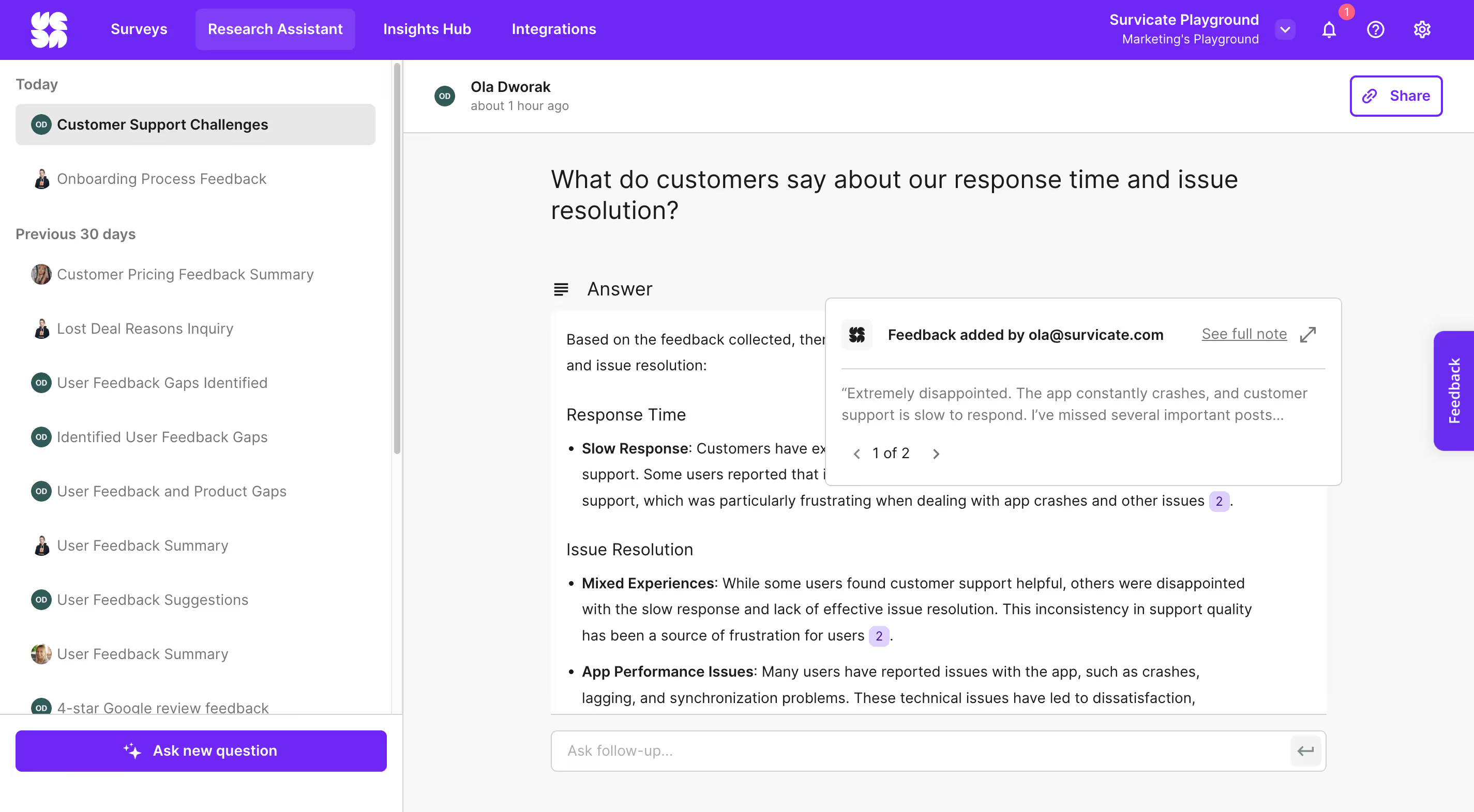
Ask questions like:
- What messaging resonates most with our customers based on recent feedback?
- How should we improve our features based on Google reviews?
- Are there any country-specific patterns in user responses?
Enjoy the instant results, always linked to the connected feedback source.
Suited for many use cases
Similarly to SurveyMonkey, Survicate’s surveys can be shared with clients in a myriad of ways, from simply sharing a link to fully embedding your survey in a product, mobile app, or your website.
But that’s not all.
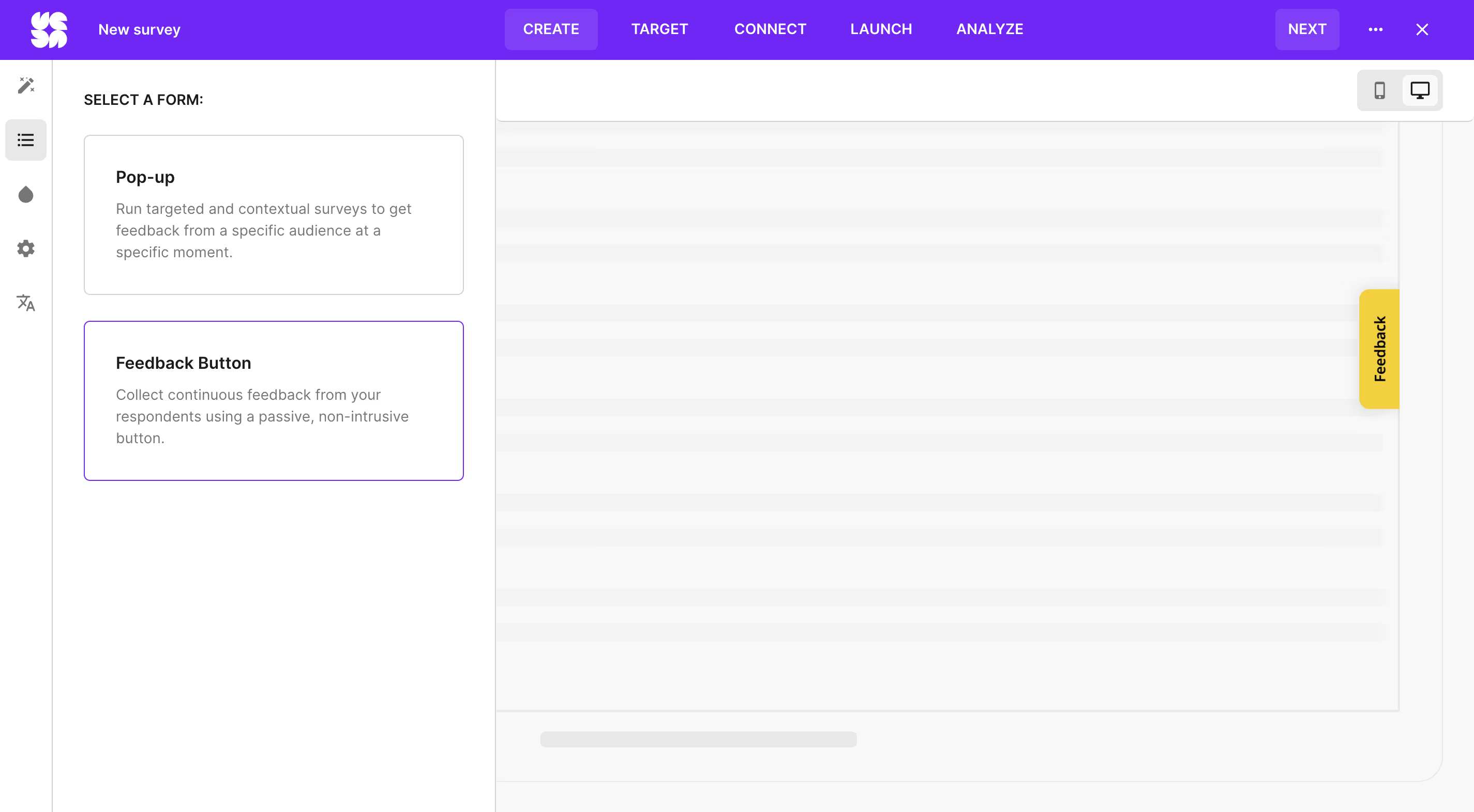
The surveys can take a bunch of forms, including non-interrupting feedback buttons, for continuous feedback collection.
To each their own: make the choice fit your needs
Summing it all up, we think three use cases emerge from analyzing these survey tools.
If you want to run simple surveys, don’t mind the fact that everyone will recognize the tool you’re using, and are heavily focused on budget—choose Google Forms.
If you want to use advanced features, don’t mind a steep learning curve, and can appreciate not-so-modern designs—choose SurveyMonkey. You’ll have plenty of options, like using the kiosk method for conducting surveys or purchasing a respondent base.
If you’re focused on a tight budget, and therefore can’t go for SurveyMonkey, yet Google Forms is not enough in terms of features—choose Survicate. It will give you the perfect combination of Google Forms’ ease of use with SurveyMonkey’s advanced features. You can go for a completely free plan or choose one of the affordable paid options.
Sign up for Survicate for free and see if it’s the survey tool you’re looking for.

Frequently asked questions: SurveyMonkey vs Google Forms
What is SurveyMonkey?
SurveyMonkey is a piece of software that helps users from various industries create and distribute surveys. Like other survey tools, SurveyMonkey offers standard question types, like NPS, Matrix, and CSAT, but it also comes with advanced features, including AI feedback analysis or kiosk survey distribution.
What is Google Forms?
Google Forms basically helps you create online forms, for free. Google Forms features are simple, yet enough for those just starting with collecting feedback or not needing any advanced surveys at all.
SurveyMonkey vs Google Forms: which is better?
When you compare Google Forms with SurveyMonkey, it’s clear that there is no better piece of software, it all depends on your needs. If you’re more focused on your budget and need very simple surveys—choose Google Forms. If you’re after advanced survey features, but can stand a steep learning curve—choose SurveyMonkey.
Is Survicate a better choice?
Survicate serves as the perfect SurveyMonkey and Google Forms alternative. That’s because it blends their best qualities together, the ease of use of Google Forms and the advanced features of SurveyMonkey. Add to that some more unique features, like Research Assistant, a completely modern look, affordable plans & pricing, and you’ll be all set. 🌸




.svg)

.svg)


