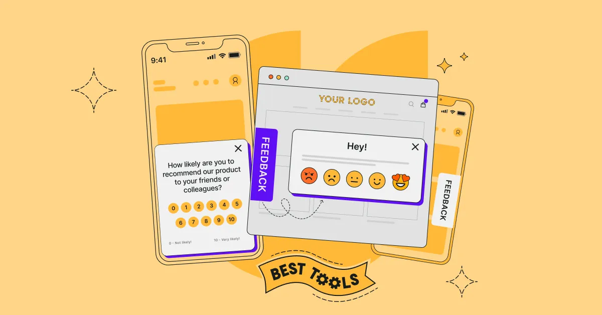
App UI design is an essential aspect of developing mobile applications, as it is the visual representation of an app that users interact with to perform specific tasks. The design of an app's user interface can significantly improve user experience and, ultimately, the success of an app.
A well-designed app UI can make a mobile app stand out from competitors as well as increase user retention and engagement. On the other hand, a poorly designed app UI can lead to user frustration, negative reviews, and high churn. As such, it is crucial to create an intuitive and visually appealing app UI that meets the needs and expectations of users.
This blog post explores the key principles and best practices of app UI design and provides tips for a successful mobile app UI.
Design Principles
When designing a mobile app, it is important to keep in mind the UI design principles. They make the app look good, easy to use, and intuitive to navigate. Let's dive into some of the key principles you should consider in your designs:
Consistency
Consistency is critical, so the users can quickly and easily understand how to use the mobile app. You can achieve it through the use of consistent icons, colors, fonts, and layouts. This helps users to develop mental models of how the app works, making it easier for them to navigate and use it.
Simplicity
Simplicity is key to good UI design. A simple and clean design helps users to focus on the content and tasks at hand. Don't clutter the UI with unnecessary elements that can confuse or overwhelm. A simple app design also makes it easier to create a responsive and accessible app.

Visibility
Visibility refers to the ability of users to see and understand the app's features and functions. You have to ensure that all important elements are visible and easy to find. To do this, you can make use of clear labels, icons, and visual cues. Visibility also helps users to understand the app's hierarchy and structure.
Feedback
Feedback is essential in UI design. It provides users with information about the actions they have taken and the results of those actions. It can be visual, auditory, or haptic.
- Visual: it includes animations, progress bars, and notifications.
- Auditory: it includes sounds and voice prompts.
- Haptic: it includes vibrations and other tactile sensations.
Tolerance
Tolerance refers to the app's ability to handle user errors and mistakes. It is important to design the mobile app in a way that is forgiving of user errors. Don't forget about undo and redo functions, confirmation dialogs, and error messages. With the right amount of tolerance, you'll reduce user frustration and make their user journey more pleasurable.
Reuse
This element helps users to reuse elements of the mobile app across different tasks and workflows. For example, using consistent UI elements, such as buttons, icons, and menus. The reuse principle builds a sense of familiarity with the app, making it easier to use over time.
In conclusion, design principles are essential to achieve a great mobile app UI. Implementing them makes your mobile app easy to use and accessible.
User Interface Elements
When it comes to mobile app design, user interface elements are the building blocks to create a compelling experience. These elements can be broadly categorized into four types: Input Controls, Navigational and Informational Components, and Containers.
Input Controls
They allow users to interact with the mobile app and provide input. Buttons, text fields, checkboxes, radio buttons, sliders, and switches—all of them are examples of input controls. While designing a mobile app, remember that these controls need to be easy to use and understand. Moreover, they have to be consistent with the app's overall design language.
Navigational Components
They are the UI elements that help users move between different screens and sections of the mobile app. These include menus, tabs, navigation bars, and breadcrumbs. When designing a mobile app, you need to ensure that they are intuitive while simultaneously providing a clear hierarchy of information.
Informational Components
Labels, badges, progress bars, and tooltips–with them, users get information about the mobile app's content and functionalities. Remember, they have to provide relevant and useful information simply and easily.
Containers
Containers are the UI elements that hold other UI elements and group them together, like cards, lists, tables, and grids. One of the main requirements for this category is that it helps organize the app's content in a logical and intuitive way.
User interface elements are the foundation of app UI design. You need to carefully consider each element and how they work together to create a seamless and intuitive UX. By using a good combination, you unlock a mobile app that is both visually appealing and easy to use.
Layout and Composition
So, you're on track to designing a successful mobile app—well, you cannot forget about layout and composition. These elements can make or break an app's overall UX.
In this section, we'll explore the key aspects of layout and composition, along with ideas on how you can use them in your mobile app UI design.
Grid Systems
Grid systems are a fundamental part of mobile app design. They provide a framework for organizing content and designing a cohesive visual structure. A grid system helps you to maintain consistency and balance throughout the mobile app's layout.
There are different types of grid systems, such as column grids and modular grids. The first ones are based on a set number of columns, while the latter are based on a set module size. Whichever type of grid system you go for, it should be flexible enough to accommodate different screen sizes and resolutions of phones and other mobile devices.
Spacing and Alignment
Spacing and alignment are also important factors in mobile app UI design. Proper spacing ensures that content is easy to read and navigate, while alignment is responsible for a sense of order and balance inside the mobile app.
When it comes to spacing, you should consider the amount of white space between elements, as well as the spacing within elements such as text and images. Alignment should be consistent throughout the mobile app, with elements lining up along a common axis.
Visual Hierarchy
Visual hierarchy describes the way in which app elements are arranged to guide attention.
There are many techniques to establish a visual hierarchy, such as size, color, and contrast. The most important elements should be the largest and most prominent, while the others should be smaller and less conspicuous.
You will not go far with your mobile app without a well-thought layout and composition. By using grid systems, spacing and alignment, and visual hierarchy, designers can create a visually appealing and user-friendly app that meets the needs of its target audience.
Color and Typography
Color Theory
Color plays a crucial role in building a friendly UI. In choosing the right color palette for your mobile app, it is essential to consider color theory, which involves understanding the relationships between colors and how they interact with each other.
You have to take into consideration color harmony, in other words, the right combination of colors.
- Complementary colors are opposite each other on the color wheel and create a vibrant contrast.
- Analogous colors are adjacent to each other and create a harmonious and calming effect.
- Monochromatic colors are variations of a single hue and create a subtle and sophisticated look.
You also have to understand the emotional and psychological effects that colors may evoke. For example, people associate red with passion and excitement, while blue—with a sense of calmness and trust. Making use of color psychology can help choose the right colors to convey the intended message and evoke the desired emotions to the users of your mobile app.
Typography Basics
The right typography can enhance the mobile app UX and UI. It involves the selection of fonts, sizes, and spacing to create a readable UI for mobile devices.
When selecting fonts, it is important to consider readability and legibility. Sans-serif fonts are often used for digital interfaces because they are easy to read on screens. Serif fonts can be used for headings and titles to create a more sophisticated look. You cannot forget about font size and spacing to ensure that the text is easy to read.
In addition to font selection, typography also involves the use of hierarchy and contrast. Hierarchy refers to the organization of text, where headings and subheadings are used to create a clear structure. Contrast involves the use of different font sizes, weights, and colors to create visual interest and highlight important information.
Overall, color and typography are essential elements in app UI design. By understanding color theory and typography basics, you move toward visually appealing and user-friendly mobile interfaces that enhance the UX of your app.
User Interaction
Touch Gestures
With the widespread use of mobile devices such as smartphones and tablets, touch gestures have become an essential part of mobile app design. Users expect to be able to interact with mobile apps by swiping, tapping, pinching, and dragging. It is important to ensure that these gestures are implemented correctly and consistently throughout the app.
One way to ensure consistency is to use standard gestures that users are already familiar with, such as swiping left or right to navigate between screens. However, it is also important to consider the context in which the gesture is used. For example, a swipe left gesture might mean "delete" in one context but "archive" in another.
It's also important the app provides visual feedback when a gesture is performed. It can be animations, sound effects, or haptic reactions. Visual feedback helps users to understand that their gesture has been recognized by the mobile app and that an action is being performed.
Prototyping and Wireframing
Wireframe Creation
Designing an initial prototype, or wireframing, involves creating a visual representation of the mobile app's layout, structure, and functionality. You can do it using simple shapes and lines, as the main goal of such prototypes is to establish a clear hierarchy of information and user flow.
There are various tools available for wireframing, ranging from the old good pen and paper to digital apps such as Sketch, Figma, or Adobe XD. The choice depends purely on your preference and the complexity of the mobile app.
When designing wireframes, keep in mind the mobile app's purpose and target audience. This basic prototype should have a clear focus on the core features and functionalities.
Interactive Prototypes
Interactive prototypes are an advanced form of wireframes that allow you to test the mobile app's functionality and UX. Interactive prototypes simulate the app's behavior, allowing designers to identify and fix usability issues before development.
To build interactive prototypes, you can use tools such as InVision, Axure, or Proto.io.
Interactive prototypes gel to assess the overall progress of your mobile app design project, as they test the usability and functionality. They also help to share the app design with stakeholders and app developers, reducing the risk of misinterpretation.
In conclusion, wireframing and prototyping are essential steps in the app design process. They help establish a clear hierarchy and flow of information, test the mobile app's functionality and UX, and communicate the design to stakeholders and app developers.
Usability Testing
Undoubtedly, it is a crucial part of any mobile app design project. By testing it, you can identify and fix any issues that may impact the UX. The following subsections will discuss the two main aspects of usability testing: Test Planning and User Feedback Analysis.
Test Planning
Before conducting tests, it is essential to plan the tests carefully. This involves identifying the target audience, creating test scenarios, and selecting appropriate testing methods.
One effective way to plan tests is to create a test plan document. This document should include details about the testing process, such as the testing methods, the tasks to be completed, and the metrics to be measured.
It is also important to recruit participants who represent the target audience. This will ensure that the results of the testing accurately reflect the needs and preferences of the app's intended users.
User Feedback Analysis
Once the usability testing is complete, designers must analyze the user feedback to identify any issues that need to be addressed. This involves collecting and organizing data from the testing sessions, such as user comments and task completion times.
One way to analyze user feedback is to create a report. This report should summarize the findings, including any issues that were identified and recommendations for addressing them.
By carefully analyzing insights, designers can make informed decisions about how to improve the app's usability. This can lead to a more satisfying UX and increased user engagement.
Accessibility Standards
Mobile app design must adhere to accessibility standards to ensure that everyone, including those with disabilities, can use the app.
Some of the key accessibility standards for app design include:
- Color Contrast: The color contrast between text and background must be high enough to ensure that people with visual impairments can read the text.
- Font Size: The font size must be large enough to ensure that people with visual impairments can read the text.
- Text Alternatives: All images and non-text elements must have text alternatives so that people with visual impairments can understand the content.
- Keyboard Accessibility: The app must be fully navigable using a keyboard, as some people with physical disabilities may not be able to use a mouse or touch screen.
- Audio and Video Captions: Audio and video content must have captions or transcripts so that people with hearing impairments can understand the content.
- Simplified Navigation: The app must have clear and simple navigation to make it easier for people with cognitive disabilities to use.
By adhering to accessibility standards, mobile app UI design teams can make sure that their mobile apps are usable by everyone, regardless of their abilities. This not only benefits people with disabilities but also improves the overall UX for everyone.
UI design for mobile apps
UI design is a crucial aspect of developing successful mobile applications. A well-designed app UI can make a significant impact on UX, engagement, and retention. By following key design principles such as consistency, simplicity, visibility, tolerance, and reuse, UI professionals can create intuitive and visually appealing apps. By considering all these factors, designers can create mobile apps with a visually appealing, user-friendly, and enjoyable interface.
If you'd like to learn whether your mobile app design works well for your audience, you can conduct user research with our surveys. Start today with a 10-day free trial with all Business Plan features included.


.svg)

.svg)


