Design That Engages
The end of the year is a good opportunity to take stock. And it’s been quite a year for me at Survicate.
I joined Survicate over a year ago as a Web and Brand Designer. The core of my role was to develop a new visual language that engages and creates new value through fresher brand communication.
And I did just that. Survicate's rebranding had its grand launch in July this year—specifically, around the 20th, which was quite funny because it also happens to be my birthday.
I decided to honor Survicate’s already existing potential with the new brand identity. I wanted it to be bold and versatile but modest at the same time, based on simple geometric shapes, sans-serif typography, primary colors, and balanced space. I wanted to connect two worlds—the world of art and the world of business. It’s because the two need the same qualities to succeed: curiosity and creativity, unconventionality, and questioning the status quo.
The goal of the new brand identity was simple: to engage the user and help them understand and communicate with the brand better.
I felt that the previous version of visual identification had to give way to a more robust, self-confident brand expression. The old logotype contained many details that did not scale well and were unreadable in certain situations—both in the formal and symbolic sense.
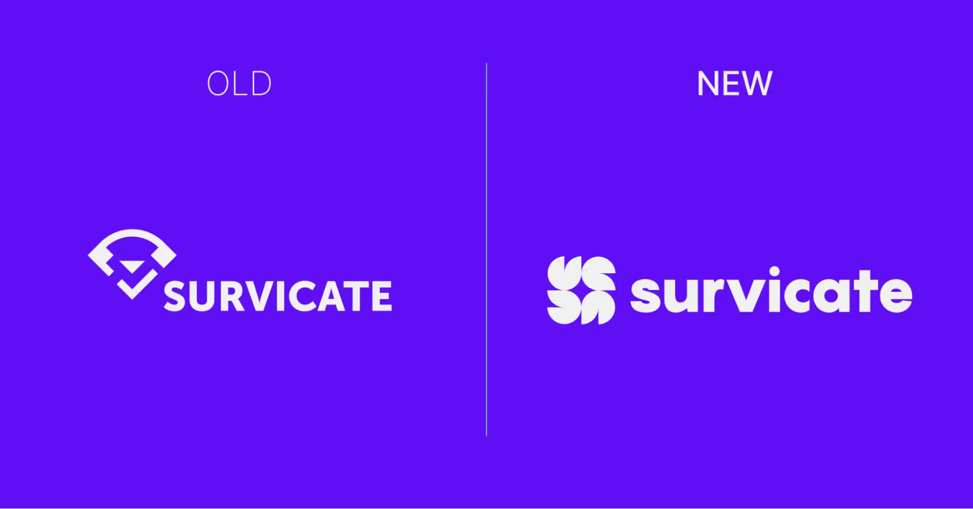
I decided the new logotype needed a dominant element that attracted attention.
My concept of the icon uses different graphic forms than the previous one. The only thing I kept intact was the reference to the company’s name and its association with curiosity. I let them inspire the creation of the new logotype.
Let's Start With the Icon
Expressing the changes
The icon was the starting point for rebranding Survicate.
I wanted to express Survicate’s new spirit and refreshed core values.
This called for a bold design—with the same timeless, modernist features as the Bauhaus school: simple forms, primary or bright colors, design as both science and art.
I feel I achieved it with Survicate’s new icon. The sign uses minimalistic, synthesized forms as a strong, bold graphic mark.
Reshaping the “S” glyph
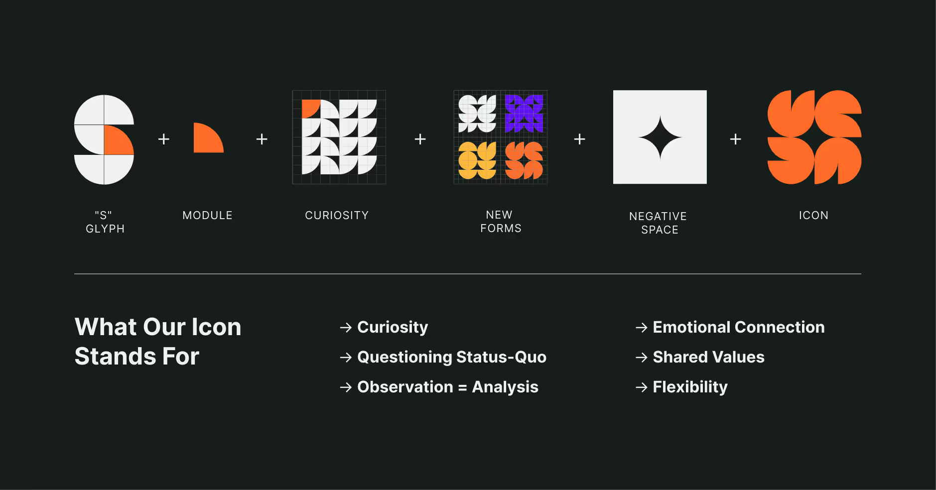
I singled out a repetitive module that created a brand new shape by dissecting the old form or the glyph known as the letter S. The only way I could create something fresh was through deconstruction.
New mantra: dare to ask, dare to imagine
The creative pattern that stirred my imagination the most was the kaleidoscopic symmetrical pattern, which uses simple forms, mirror reflections, and a not-so-obvious grid.
But I was also inspired by different grids found in popular analog games like ships or chess. They led me to create a square-based logo icon.
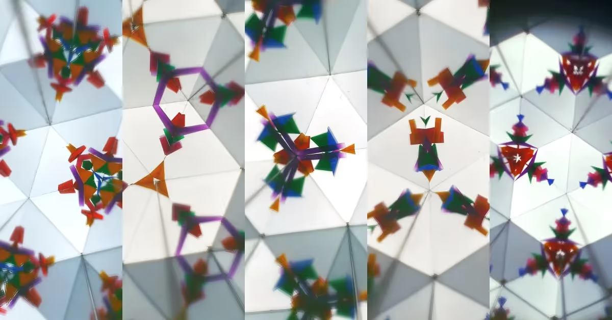
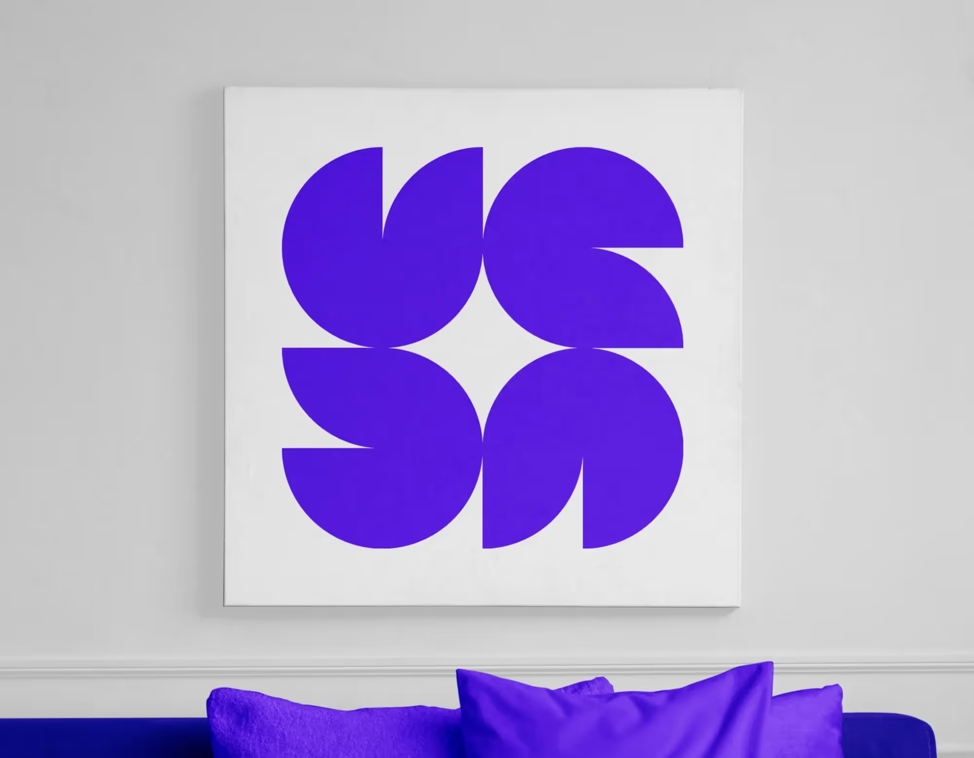
The basis of the pattern is one element that's multiplied and rotated around its axis. A new form was born in the “negative space" between the elements—the shape of a four-pointed star.
The narrative layer
The new icon has a bold expression that corresponds with Survicate’s values. Each of its parts represents a different functionality—derived from a single pattern, but flexible and allowing for new and improved solutions.
Every element of the icon relates to the image of Survicate, including the “empty” space. In Buddhism, the "space between" symbolizes possibility, not the "lack" of things characteristic to the Western concept of "emptiness." So our "emptiness" (negative space) allowed us to find a new form.
The four-pointed star at the center of our icon emerges from the coexistence of the main figures and symbolizes Survicate's core value of curiosity and endless possibilities.
Typography That Works
Another essential element of Survicate’s rebranding and new visual brand identity is typography. Typography should form a good duo with the icon. As in life, the partners should share the same core values.
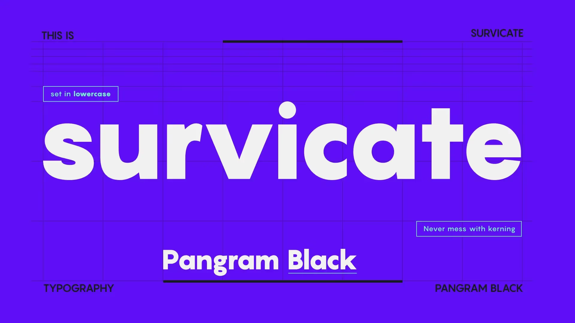
The ideal candidate turned out to be the Pangram font. It completes the icon with the simplicity of its geometric, modernist design.
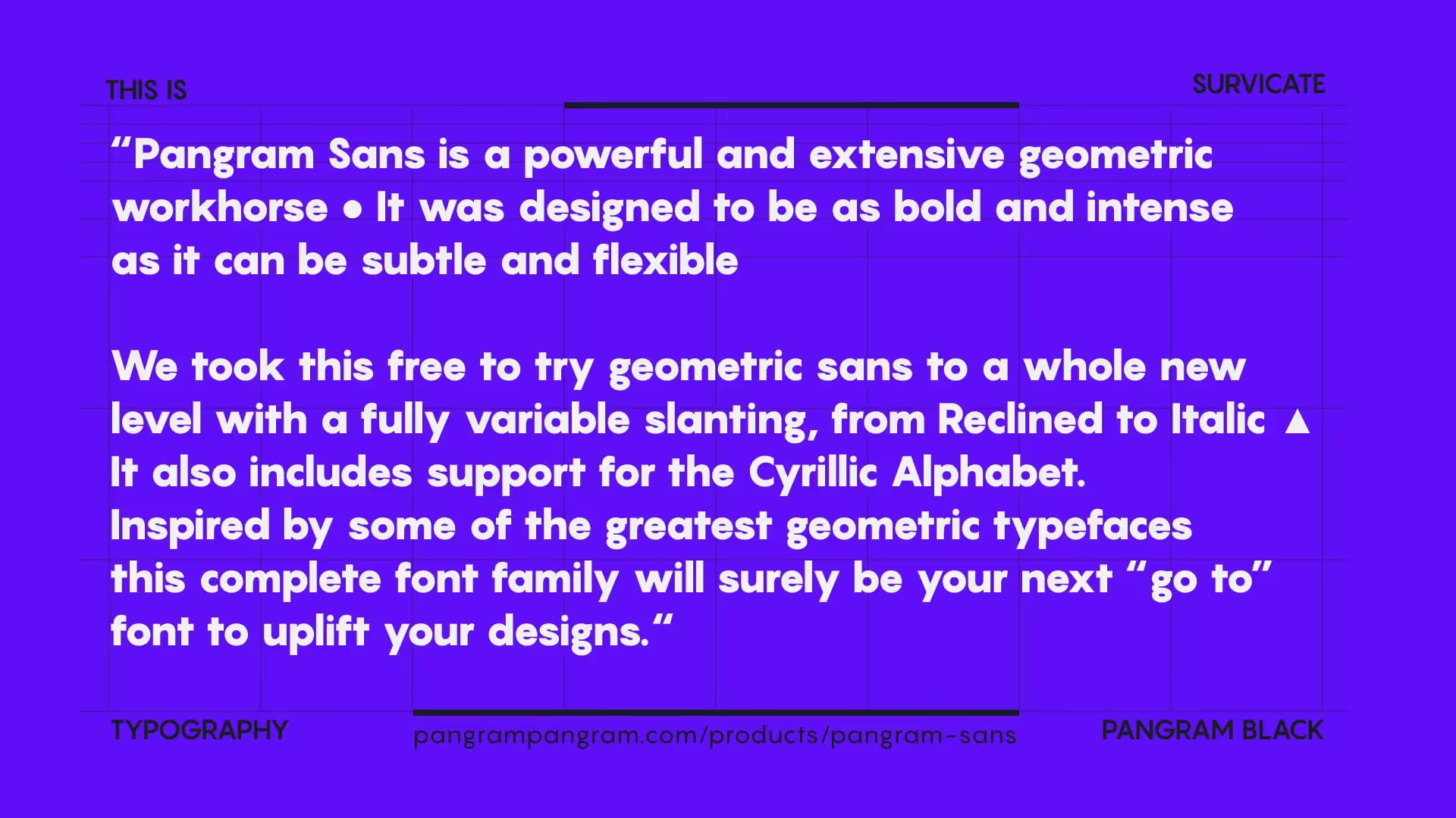
Brutalism and the joyful geometry
When I saw the Pangram font for the first time, it made me think of the stunning visual identity of the Barbican Centre in London.
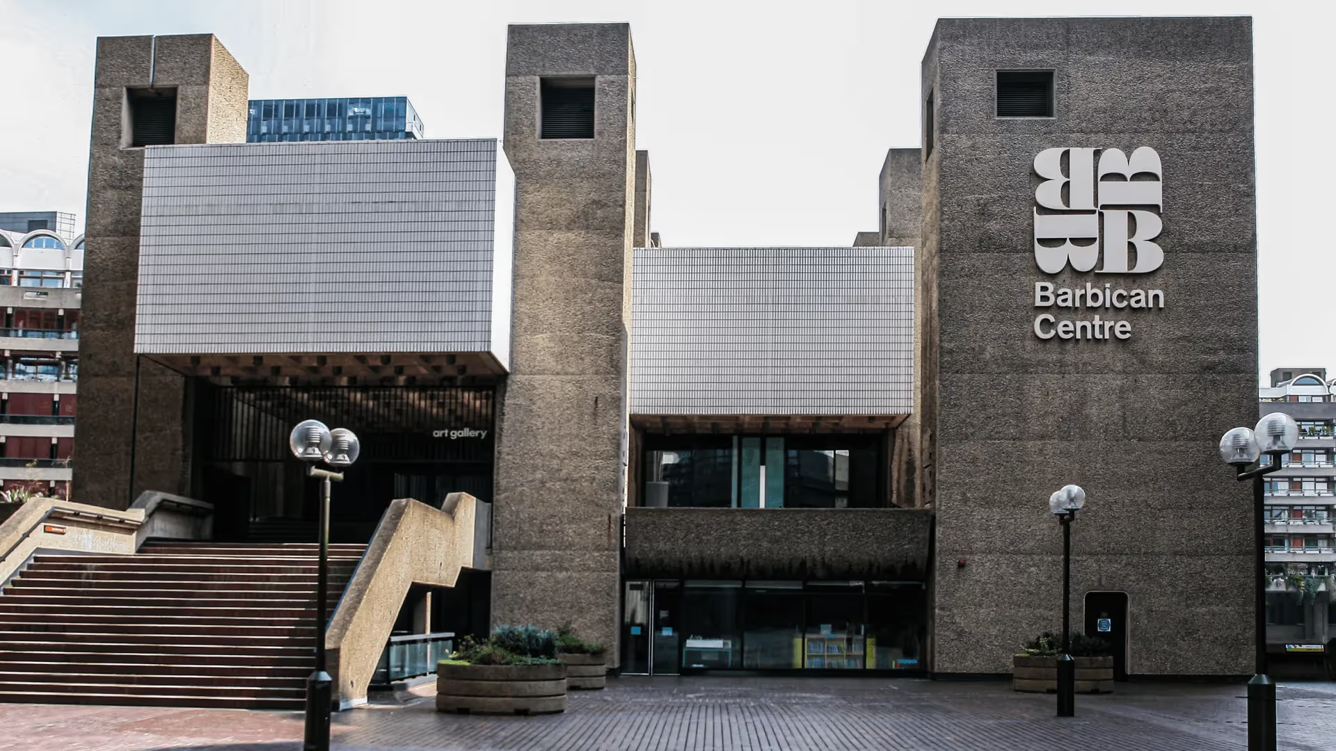
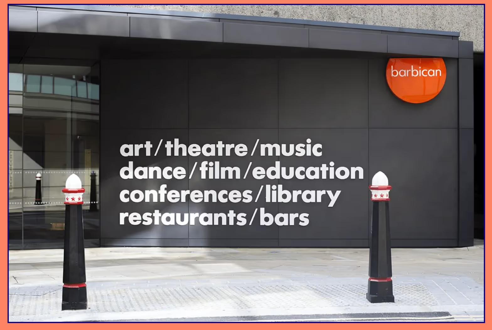
The brutalist style of the building’s architecture and its visual identity are based on simple but expressive forms. They are strongly characteristic.
Pangram is the perfect font for our logotype. Its geometric structure harmonizes perfectly with the geometric design of the icon. It’s minimalist and stylistically reminiscent of timeless modernism. The wordmark is set in lowercase of the “Black” weight of Pangram typeface to improve its legibility and to make it more casual and conversational, yet innovative and playful.
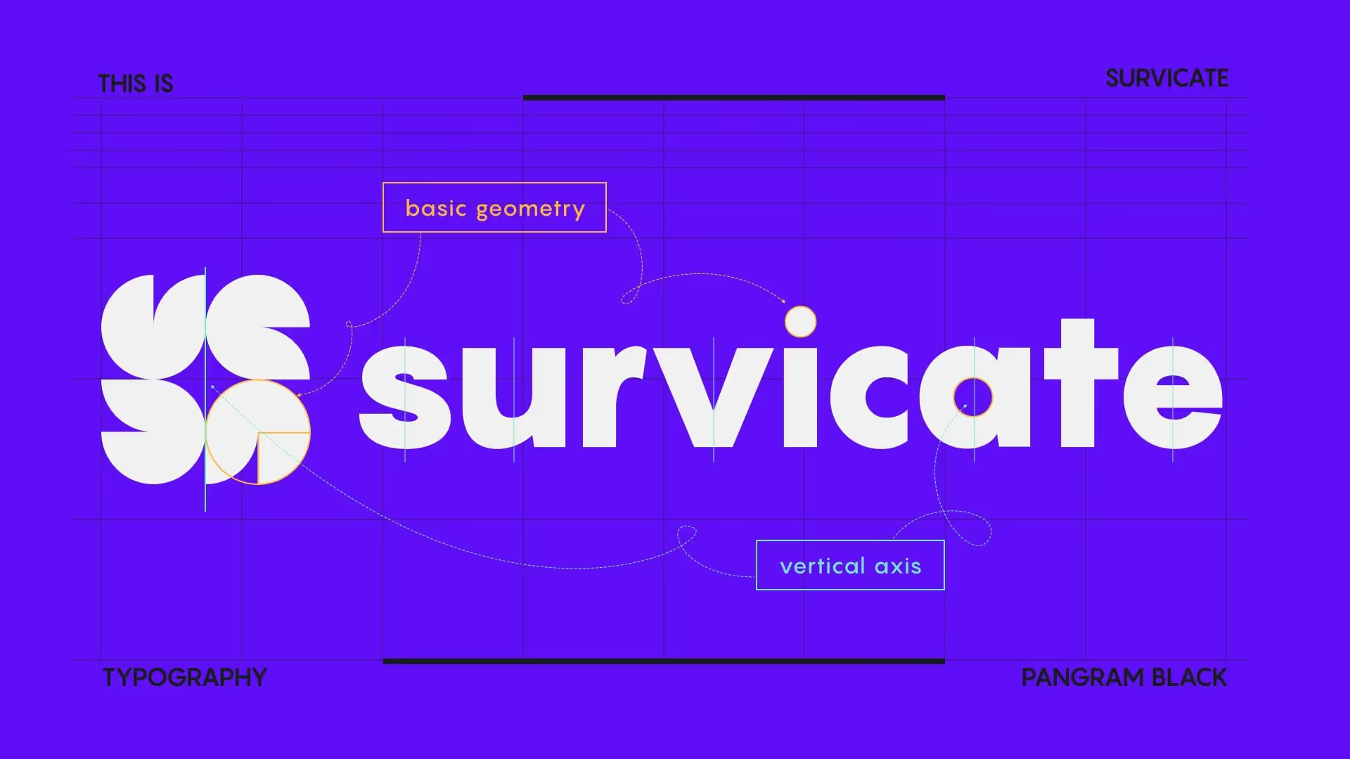
In the end, all the elements of the logo correspond with what Survicate represents. The values such as openness, curiosity, emotional connection with customers, authenticity, and daring to follow one's path are reflected in the brand tagline: “Dare to ask."
Simplicity, power of expression, and the joy of being who you are Survicate’s superpowers.
Colors That Connect With Emotions
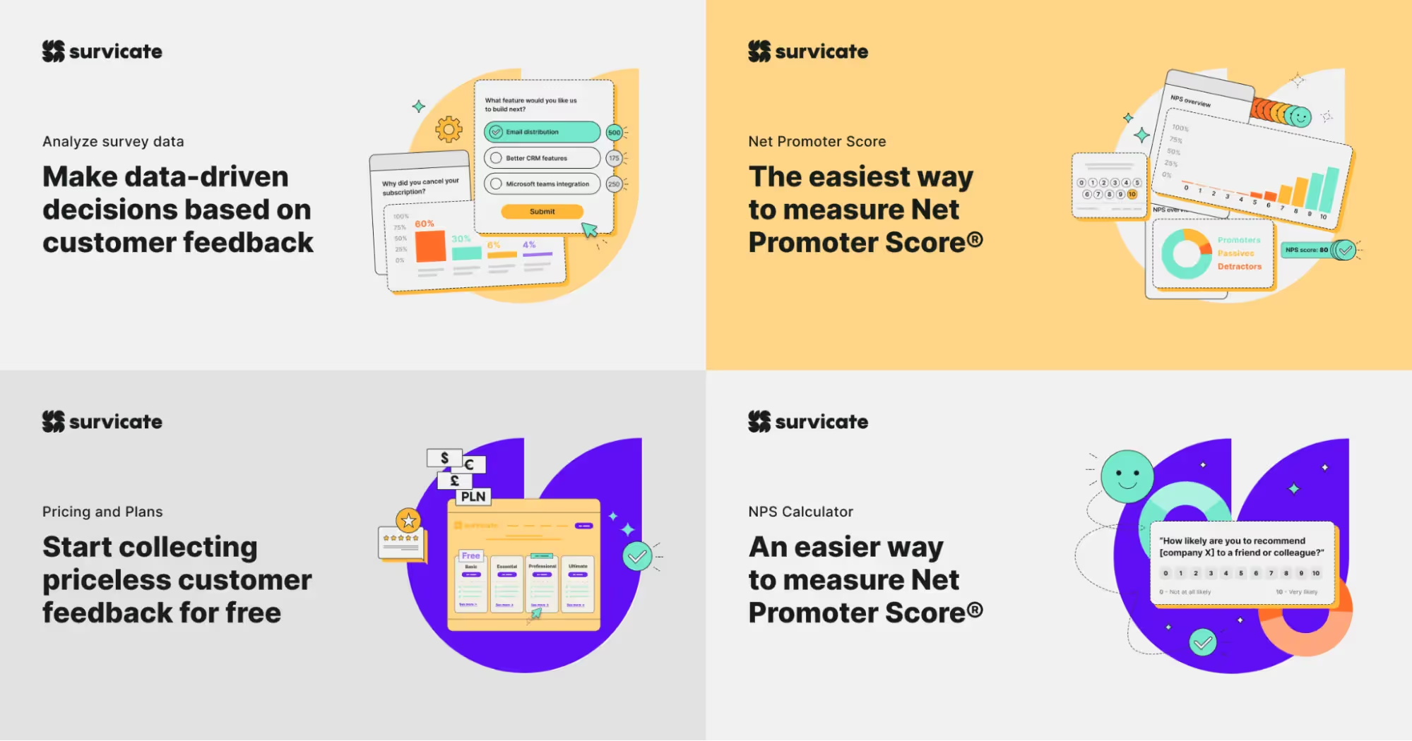
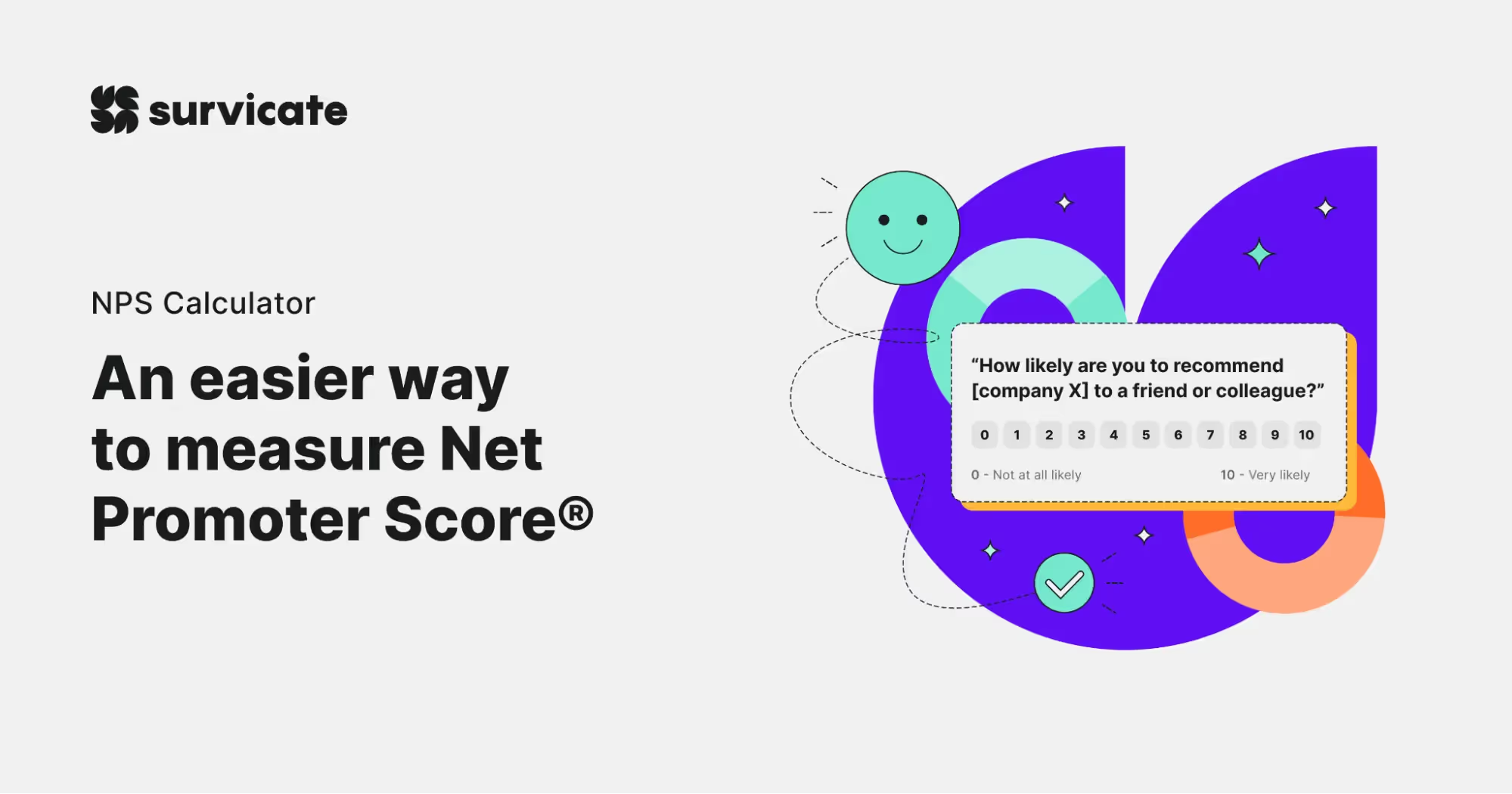
Strong, dynamic colors and the contrast between them is another vital element of Survicate’s new brand.
The contrast between colors can be compared to a conversation.
It can either bore us, have no impact, or energize us—ignite a spark of understanding, arouse curiosity, and convey authentic values.
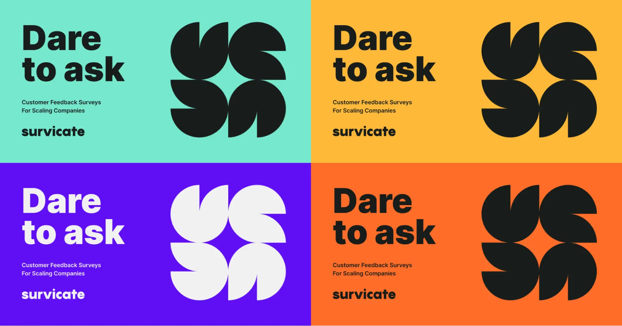
I chose two bold and contrasting colors to play the leading role in Survicate’s brand design and two other colors for support.
The main colors appear in the essential communication elements, while the other two serve as a backdrop or dominate small components, such as illustrations.
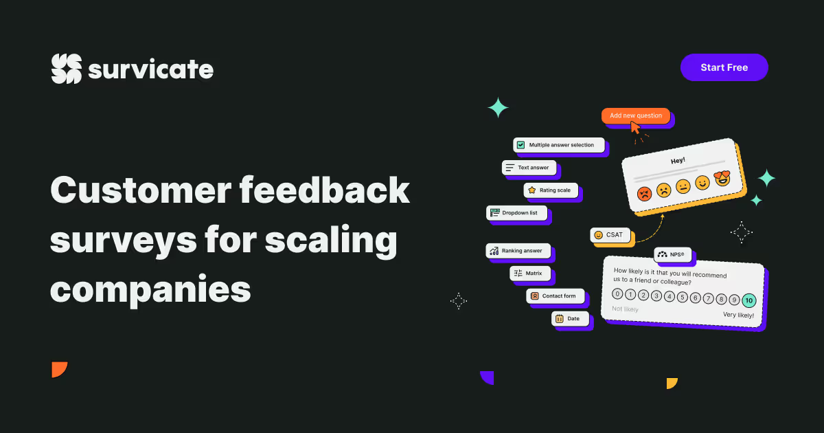
For Survicate, the two strongest colors are violet and orange. The contrast between them is intense, which gives their conversation a spark. Both play an essential role in the interactive elements, such as call-to-action buttons.
The other two colors are yellow and bright green (minty green), and they gracefully act as backgrounds or illustration elements.
Another influential duo that I intentionally present as a separate category is black and white. Black is for typography, and white is for the background—or vice versa. The space surrounding the black and colored elements allows them to resonate.
Space Is All You Need
Layout as a cosmic area
You don't have to be an astronaut to feel that space plays an important role. Like planets and stars surrounded by outer space, all graphic elements in a layout need space. This allows them to shine, be visible and readable.
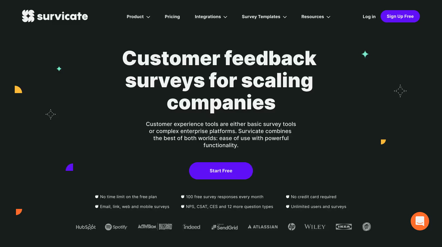
Each design system is based on dependencies, so it’s crucial to figure out which element should shine the brightest and which should only reflect light. A visual hierarchy becomes essential.
Hierarchy matters
A well-designed layout represents a clear visual hierarchy of all graphic components—a balance between positive and negative space.
The positive space often includes typography, illustrations (or photography), shapes—all the displayed content.
The negative space (also called "white space”) is represented in the background.
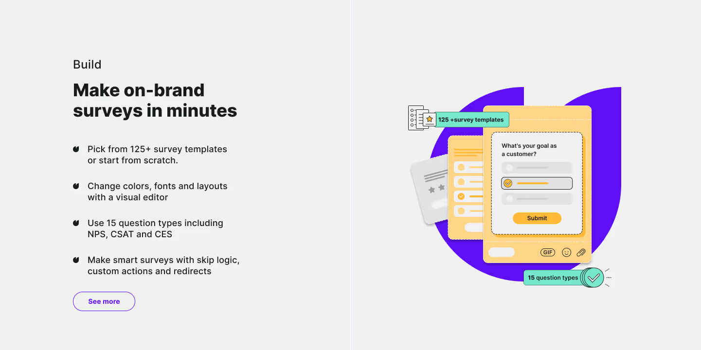
A balanced visual hierarchy equals a clear structure of the layout composition. It needs to be easily reproducible or scalable, especially for web pages, apps, or publications. The crucial role of the developed visual hierarchy and the visual system is to facilitate responsiveness and design implementation across other devices.
This is vital to the clarity and good reception of the webpage.
It’s all about illusion
When creating our webpage, I had two main design theories in mind.
Apart from the mathematical principles of the pixel-perfect grid system, I also relied on the principles of visual perception, which you can find in the Gestalt theory about the psychology of visual perception.
It often happens that two mathematically aligned elements don’t appear aligned to us. We need optical illusion to make them appear the way we want.
One of the most important rules of the Gestalt theory that helps in "quick scanning" of the webpage content is the principle of proximity or similarity. If multiple elements are close to one another, our eye classifies them as one category.
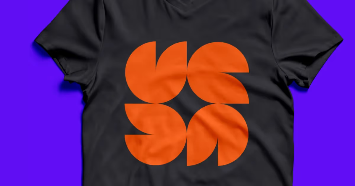
And the rule that I used in the design of our icon is the figure-ground (positive-negative space) principle. The four orange elements are the positive space, and the star formed by the coexistence of these forms is the negative space.
Summary
Survicate’s rebranding and new visual communication went through various stages.
The first step was creating an icon that would communicate the strengths of Survicate, scale easily, and remain timelessly simple yet expressive.
I knew it must be a shape that wouldn’t limit us nor relate to anything specific. I wanted our logo to be a flexible pattern that could take new forms. It was a good starting point for finding the company's bold voice.
Awareness of your own and your company's potential is the stepping stone when embarking on a new journey. With that potential at the forefront of your mind, you will be able to take further steps towards creating new values and further improvement.
To create the new visual identification, I reached outside the world of business, SaaS, startups, enterprises, corporations, and outside the world of web design and brand identity itself.
I took inspiration from art and design based on conceptualism, minimalism, grid systems, and vibrant, intense colors.
I kept in mind the crucial principles of responsive, scalable design based on visual systems, information architecture, and the psychology of visual perception.
Even though we’re talking about the digital world, all these principles have been mostly worked out before in analog designs.
I wanted to create a brand identity that would enrich the business world with experimentation and playfulness known from modernist and abstract art, where colors and shapes are mediums of expression of emotions.
Why emotions in the automated world of SaaS and B2B? Because at the end of the day, it’s all about human beings. Let's connect the two worlds!

.avif)


.svg)

.svg)


