We have a Slack channel called #survey-examples here at Survicate, and it's mostly cursed.
It started as a place to drop the occasional "look at this nonsense" screenshot or look at what cool companies use for running their surveys.
A year in, it's a permanent archive of surveys that went wrong in the wild.
So we’re here to share!
Here are 10 bad survey examples from our wall of shame split into three categories: looks wrong, asks wrong, and lands wrong.
For each one, we'll show the bad version, and then what the same survey looks like rebuilt in Survicate.
Fair warning: the roast is warm. We're not coming for the brands. We're coming for the questionable decisions every one of us has made when it comes to surveys.
Category One: Asks wrong
A good-looking survey is a good start, but it's just a start.
A survey can land on the screen branded and balanced and still ask the respondent something it shouldn't have asked at all.
A scale built wrong for the metric. A question that already contains its own answer. A question whose answer is sitting in the brand's database while it gets sent anyway.
1. Claude Design (Google Forms)

This survey is from the Claude Design team at Anthropic. Yes, the company behind Claude we all love. We'll let that sit for a second.
You can tell they tried. The page is salmon-peach, Anthropic's signature color. The header says "Claude Design feedback." Someone thought about it. But the survey itself wasn't built for the respondent.
Because it's not where the user is.
The biggest problem isn't visual. It's that the feedback flow takes the user out of the product. Click a feedback link, get a new tab, fill in a form, submit. The product they were trying to give feedback about is now behind them, two tabs away. Whatever bug, friction, or confusion they wanted to flag is now something they have to remember and describe instead of show.
Feedback should happen where the experience happens.
In-product, in the same tab, with the relevant context already attached.
One question for everything.
The first real question is "What type of feedback do you have?" with four options: Bug report, Feature suggestion, Product feedback, Something you're confused about. Then a single open-text field: "What's your feedback?"
Four very different feedback types, one open-text field collecting all of them.
A bug report needs different information than a feature suggestion. A "confused about" answer needs different follow-ups than a feature request.
Mashing them into the same field means every response gets the same handling, and analysis afterward is a tagging exercise rather than a routing one.
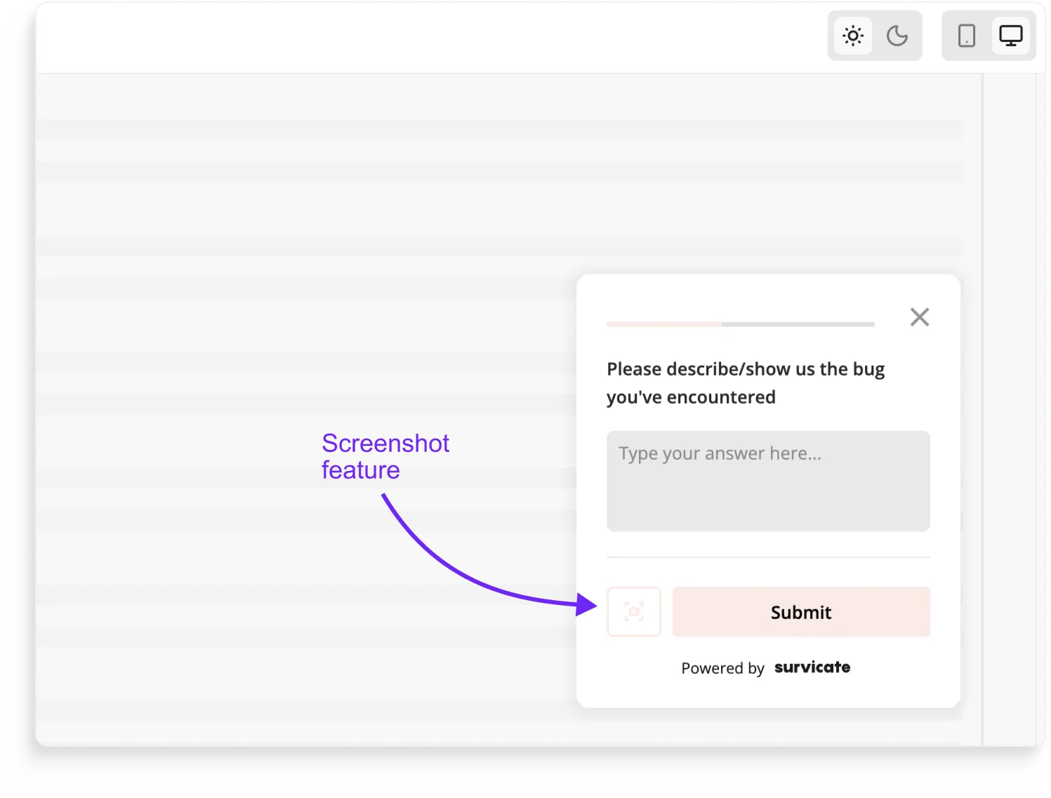
Asking for a file link instead of capturing the screenshot.
The third question asks the respondent to "share a link to your file. This will help us debug." That's a small UX tax that adds up: the user has to leave the form, find their file, upload it somewhere they can link to, and paste the link back into the form.
For a bug report specifically, the right pattern is letting the respondent take a screenshot inside the survey itself, in one click, no detour.
We added this to Survicate precisely because feedback you have to work for is feedback you don't get.
Then there's the cosmetic stuff.
The form inside the salmon-peach wrapper is still grey radio buttons in Roboto, because Google Forms only lets you theme the page background.
The respondent's browser locale leaks into the UI: "Your answer," "Submit," and "Clear form" all render in Polish (yes, the respondent here was me, in Warsaw).
Google Forms is a fine internal tool. Or fine as a tool for students. For customer feedback in a real product, it's the wrong shape.
How would we design this survey in Survicate?
The Survicate rebuild starts by changing where the survey lives:
- In-product, not in a new tab. The survey opens as a sticky Feedback Button or a triggered widget directly inside Claude Design. The respondent gives feedback about a thing while looking at the thing.
- One path per feedback type. "What type of feedback do you have?" → Bug report goes to a bug-report flow (steps to reproduce, screenshot capture, expected vs actual). Feature suggestion goes to a suggestion flow (what are you trying to do, what would help). Confusion goes to a "what were you trying to do?" flow. Each path is short, each path collects what's actually useful.
- Screenshot capture inside the survey. Bug reports get a one-click screenshot tool. No links, no detours, no asking users to upload things to other places. The image goes straight to the dev team with the rest of the response.
- On-brand throughout, not just the background. Anthropic salmon as the actual form styling, buttons, radio markers, hover states. Whole-survey translation if locale matters.
- The system UI ("Your answer," "Submit") stays in the survey's language regardless of the respondent's browser.
- Although whole survey translations are possible.
Then it does the part Google Forms can't do at all: route the feedback where it needs to go.
A Survicate-Linear or a Survicate-Jira integration creates the tickets automatically.
Whenever a bug report gets submitted, a ticket opens in Linear, assigned to the right team, with the user's feedback, the screenshot, and any session metadata attached. The dev team sees the bug the same hour it was reported. No spreadsheet middleman.
On the analysis side, the feedback feeds straight into our AI research repository.
Hundreds of "Something you're confused about" responses don't get read one at a time, they get grouped, patterned, and surfaced. The team finds out what users are stuck on without having to read everything users sent.
2. Gartner Peer Reviews (Hotjar)
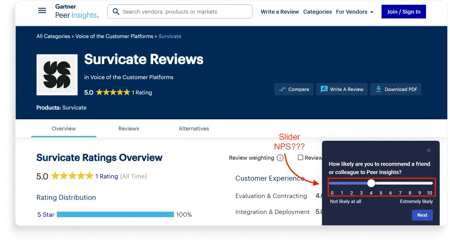
Gartner Peer Insights wants to know how likely you are to recommend them. They're asking with a slider. The slider has tick marks from 0 to 10, so the math probably still works.
And to be fair, sliders aren't always worse than buttons. Researchers at the University of Barcelona ran one of the most rigorous tests on this. They compared slider and radio-button scales on the Norwegian Citizen Panel and found measurement quality is roughly the same either way. For a general satisfaction question, slider or button, fine.
But NPS isn't a general satisfaction question. NPS is a metric with a very specific construction. The original 2003 HBR paper defined three buckets: detractors (0-6), passives (7-8), promoters (9-10).
The score is the percentage of promoters minus the percentage of detractors. The entire structure depends on distinct buckets with hard cutoffs.
The respondent's job isn't to express a feeling, it's to pick a number. Sliders make that harder.
Using a slider can also break the comparability and benchmarking your NPS scores with others who 99% of the time use radio buttons instead.
There's a second, smaller bias on top. Stanford research on what they call the "kinesthetic properties" of response scales found that dragging a slider pulls responses toward the scale's starting point, because attention attaches to the options the cursor passes through.
The slider on Peer Insights starts at the midpoint, which means the bias pushes responses toward the middle. Buttons start unselected, which forces an actual choice.
We have to give it to Gartner that the survey colors and branding here are on point. Spoiler: the other Gartner survey we'll see in the next category doesn't quite hit the same mark.
How would we design that survey in Survicate?
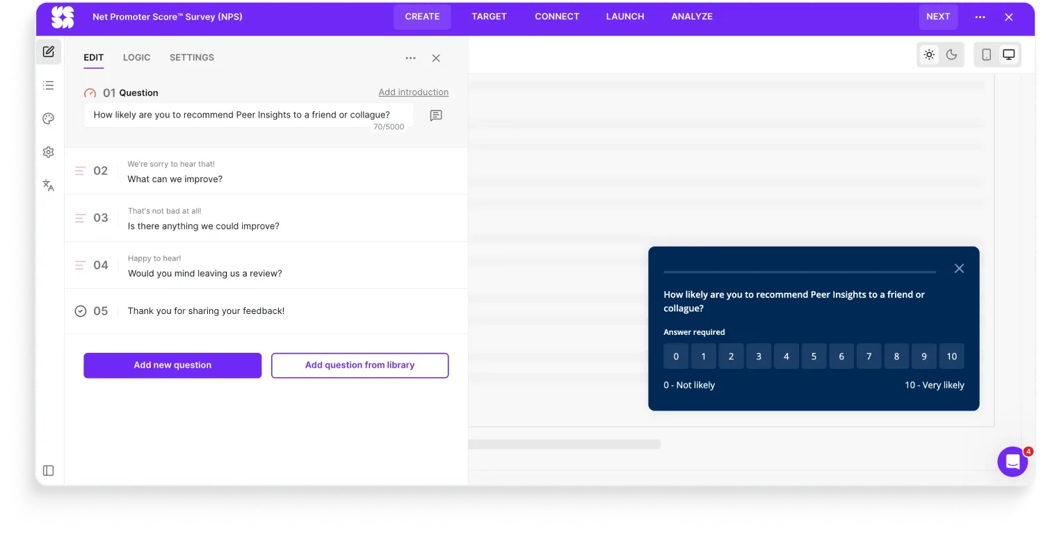
The Survicate rebuild is unglamorous on purpose:
- Tappable buttons 0-10, the way respondents expect.
- Labels at both ends ("Not likely at all" / "Extremely likely") to anchor the scale.
- Still on-brand styling so it looks like Peer Insights, not like a Survicate template.
NPS works because it's standardized.
Every team that uses it should be comparing apples to apples. The moment you change the interaction, you're collecting your own metric and calling it NPS.
3. Google Docs (Google’s own tool)
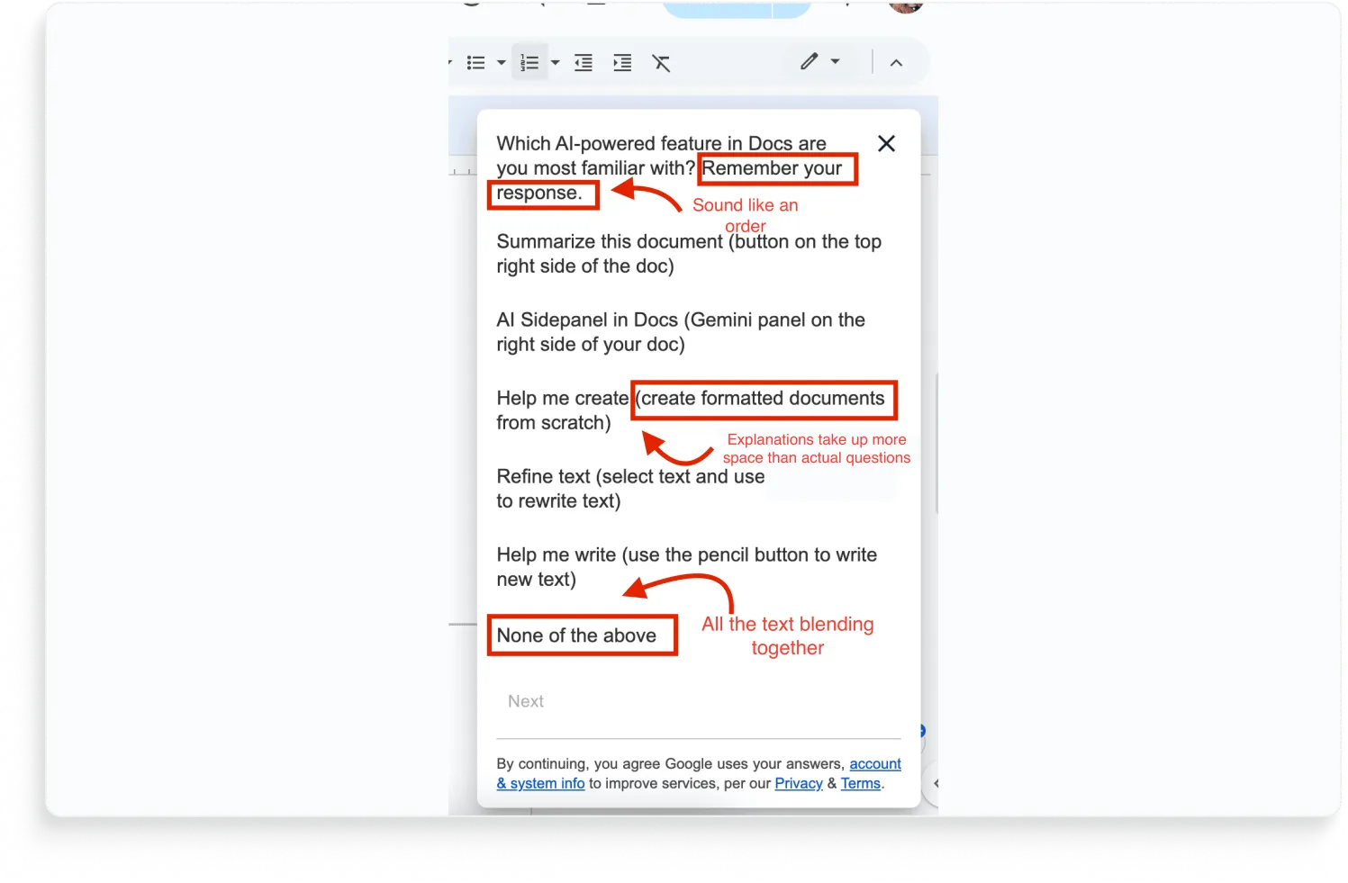
"Which AI-powered feature in Docs are you most familiar with? Remember your response."
Remember your response? Yes boss, on it.
That's the first thing that stops you on this survey.
It's a Google Docs modal asking users about Google's own AI features, and it opens with what reads less like a survey instruction and more like a command from a manager who's about to follow up.
The "Remember your response" line is the funny problem. The leading parentheticals are the real one.
Every single answer option comes with a clarification that's longer than the option itself:
- Summarize this document (button on the top right side of the doc)
- AI Sidepanel in Docs (Gemini panel on the right side of your doc)
- Help me create (create formatted documents from scratch)
- Refine text (select text and use refine button to rewrite text)
- Help me write (use the pencil button to write new text)
The parentheticals exist because Google's research team correctly anticipated that users wouldn't recognize the feature names.
So they added the descriptions.
Which means every option now contains both the questions (do you recognize this?) and a hint (here's where to find it). Lots of text, which according to Google you should stop to read AND remember your response.
The respondent reads "Refine text (select text and use the refine button)" and thinks "oh right, I've used that button," even if they've never connected the button to the name "Refine text" before. The survey just taught them the answer.
The whole point of the question was to measure feature awareness.
By over-clarifying, Google traded the signal for participant comfort. The data they get back tells them which features users recognize with the hint included, which isn't the question they asked.
A few more smaller things, while we're here:
- "None of the above" is the most important answer Google could collect: users who don't use any of these features are the ones Google's AI strategy needs to understand. There's no follow-up to ask why.
- The text is pretty dang hard to read too. All the options and the abundance of text just ends up blending together into a word salad you’re going to close off.
- The data-use opt-in is in the footer. The respondent has already started filling out the survey by the time they read it.
- And the obvious one: Google sees every click, hover, dismiss, and ignore on every AI feature in Docs. They could answer most of this question from their own telemetry without asking anyone.
How would we design this survey in Survicate?
The Survicate rebuild starts by cutting the parentheticals and changing the question:
- Replace "Which AI feature are you most familiar with?" with a two-step ask: first, "Have you used any of Docs' AI features?" (yes/no), then "Which of these have you tried?" (multi-select, no parentheticals). That separates recognition from usage.
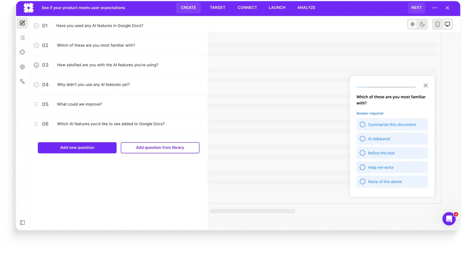
- For the second question, list the features by their actual UI labels only. If the respondent doesn't recognize "Refine text," that's the answer Google needs.
- Add a follow-up on "None of the above" that asks why, at minimum: "haven't noticed them" / "tried them and stopped" / "not interested" / "other." That's the data that actually shapes the product.
- If Google has the product analytics info, we’d even rather ask for the experience with the specific features instead after a user uses them by setting up triggering events. Like, user used AI refine feature, ask for their satisfaction with the feature on a scale from 1-5 and ask follow-up questions in an open-text manner.
- Drop the "Remember your response."
- Make the survey visually clearer and on-brand for Google.
The biggest thing, as you'll also see with Spotify in the next category, is that the survey should be asking the things the product usage data can't answer.
The good surveys ask the things data can't to combine product data with the intent signals behind them.
4. Uber for Business (Qualtrics)
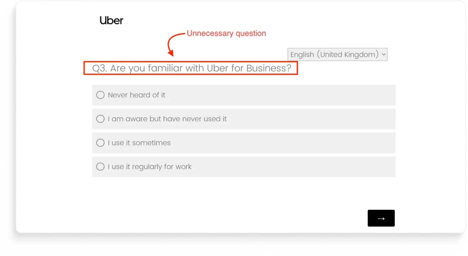
This survey was sent from the Uber for Business email address to an active Uber for Business account holder (us, lol).
And one of the questions hit with: "Are you familiar with Uber for Business?"
Our initial reaction was something we can’t quote directly so we’ll translate to the polite version: they have the data. They have the account. They have the email match.
So they are literally talking to a logged-in user about the product the user is logged into… yet they still ask if we recognize said product?
How would we design this survey in Survicate?
First, we’d drop the “Are you familiar with Uber Business” question if the survey is being sent to Uber Business users.
Second, we’d ask about said user’s satisfaction with Uber Business, and dig deeper depending on the respondent’s answer.
You get the drill, ask super satisfied users for a review, ask unhappy users more questions about their experience, and adding an automation to reach out to the unsatisfied ones via Intercom to offer more support.
For this specific survey, since it’s an email one, we’d also embed the first question directly into the email to make the chances of getting the responses higher (it’s more frictionless this way). The original survey didn’t, of course.
And we’d definitely update the branding on this one as well since it’s pretty bland and doesn’t really fit Uber.
Category two: Looks wrong
A bad-looking survey isn't just cosmetic. Every second the respondent spends confused is data you've already lost.
5. Spotify (Qualtrics)
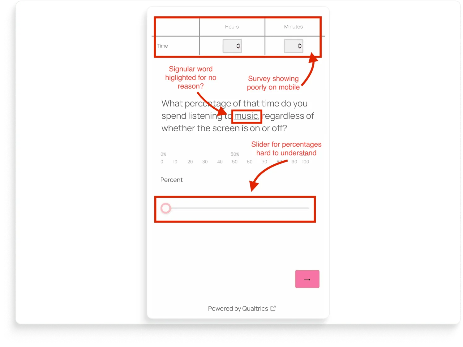
Let’s start with the survey layout.
Spotify is asking: "What percentage of that time do you spend listening to music, regardless of whether the screen is on or off?"
But it may be difficult to answer because of a few things.
For one, the time-input table at the top spills past the edge of the screen.
Below the question is a percentage scale labeled twice: once at 0 / 50 / 100, then again at 0-10-20-...-100 underneath.
Then a slider that visually doesn't snap to either set of labels, so the respondent has no idea whether they're answering in 5s, 10s, or pixel-perfect drag positions.
And it's so off-brand for Spotify. No logo, no Spotify green, no branded font, nothing to help the user even recognize who's asking. 🤷🏼♀️
Now the bigger question: why is Spotify asking users to guess their own listening behavior on a slider with percentages? Spotify generates that data so well they turn it into a marketing event every December.
Wrapped exists.
Spotify knows exactly how many minutes each user listened, which songs, which artists, which device, with the screen on or off.
How would we design that survey in Survicate?
The Survicate rebuild fixes the boring stuff first.
It’s now on-brand with the Spotify logo, Spotify green.
Mobile-first by default, showing directly in the app, with nothing overflowing.
Tappable buttons instead of a freehand slider.
The "highlight" on the noun is gone because there's no theme inheritance to accidentally apply.
Then the part that actually improves the data: the survey only asks the questions it needs, and gets more specific from there with AI-generated follow-ups tailored to each answer.
So instead of guessing their Spotify usage for no reason, the respondent gives a real answer on their experience with the app.
6. Gartner Peer Insights (Hotjar)
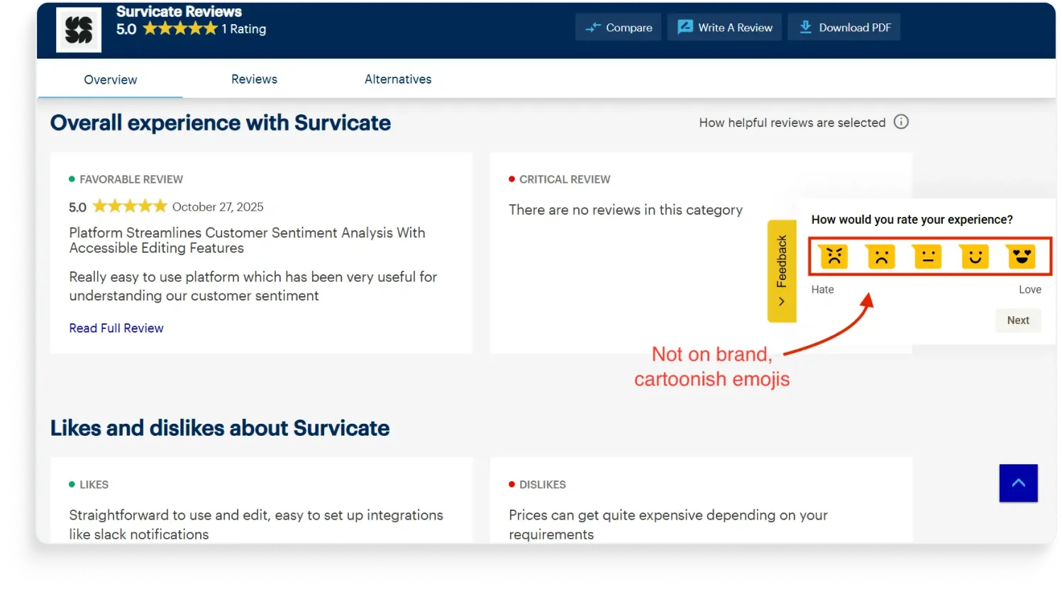
Remember the Gartner Peer Insights slider NPS from the "asks wrong" section? Same site, same brand, same tool. Different survey. This one is a yellow side tab with five emoji faces ranging from "Hate" to "Love."
And somehow they look nothing like each other.
The team running Peer Insights treated Hotjar like a Swiss Army knife and shipped two surveys with completely different design defaults.
Our first problem with it: Hotjar isn't really a survey tool.
It's a session recording and heatmap tool with surveys bolted on. The bolt-on origin shows up in this side-tab widget especially, which uses Hotjar's signature yellow and emoji-driven default styling.
So it looks like Hotjar, not like Peer Insights.
Second problem: the inconsistency. Whoever built the second survey didn't open the first one. Or did, and didn't care. Either way, the respondent gets a jarring mismatch.
Third problem: the emoji scale itself is a tonal mismatch as well, especially since they’re cartoonish like that.
How would we design this survey in Survicate?
The Survicate rebuild fixes the consistency problem first:
- Matched to Peer Insights' dark blue, same font, same visual weight as the slider NPS rebuild from entry 2, so respondents can tell both surveys are from the same brand.
- Put the survey on a sticky Feedback Button to make it always-on and available.
- Add a scale that fits the context: 1-5 or thumbs up/down for a quick reaction widget. If emojis would be used, we’d choose less animated ones instead. We’ve recently added a scale style selector for different emojis too.
- Add in branching logic to automatically ask satisfied users to leave a review and ask dissatisfied users for additional feedback on what to improve.
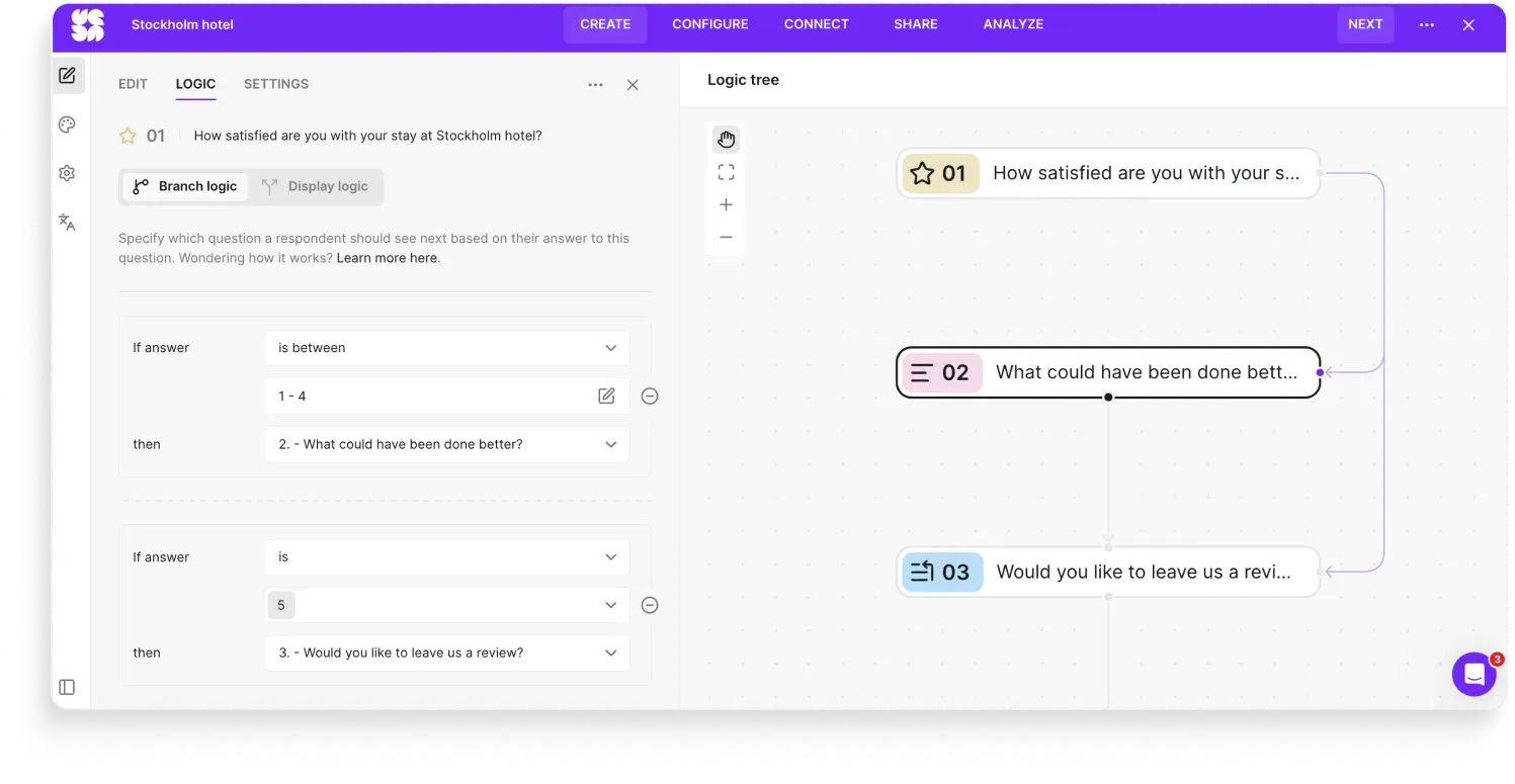
7. Stockholm hotel (ReviewPro)
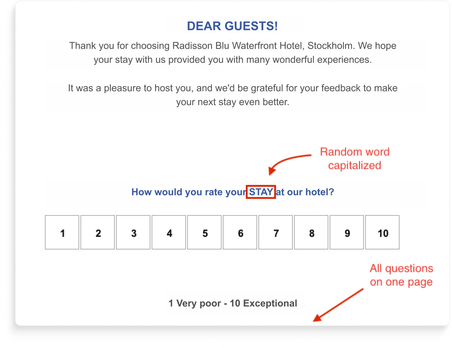
This one's a study on what one-page surveys cost you.
Although not visible on the screenshot above, with this survey, every question visible from the start with no progress indicator, and the transitions between questions felt like the page was fighting itself.
Hospitality has the highest stakes here.
Post-stay surveys feed reputation scores that drive bookings on Booking, Expedia, and the hotel's own site.
ReviewPro, which was used here, is a category-specific tool built for exactly this use case, which makes the execution more frustrating, not less.
How would we design that survey in Survicate?
The Survicate rebuild is mostly about getting out of the respondent's way:
- One question per screen, with a progress bar at the top and branching logic that only shows what's relevant. If a guest rates their stay 5/5, they go straight to "would you like to leave us a review?" Skip the rest. If they rate it 1-4, they get the "what could we have done better?" follow-up. Nobody sees a wall of questions they don't need to answer, and everyone can see how close they are to done.
- Sent via email, with the first question embedded in the email body. The guest taps a rating right there. No link-out, no clicking through to a separate site, no waiting for a page to load. The first action is the answer.
- On-brand with the hotel's colors beyond just customizing the text. No Hotjar yellow, no Qualtrics defaults, no random capitalized words.
- A 1-5 scale for satisfaction, not 1-10. Five options are easier to scan and faster to pick from on mobile, which is where most post-stay surveys get opened. Hotels don't need the granularity of an NPS scale for this kind of question.
- An AI-generated follow-up on "what could we have done better?" Instead of a single open-text field that gets a one-line answer, the survey reads the first response and asks a tailored follow-up. "The lobby workers weren't super helpful" gets "can you tell us more about when in the stay this happened?" The hotel gets specifics it can actually act on, instead of "service was okay."
The whole survey is shorter than the original ReviewPro version, asks less of the guest, and gets more specific answers. Which is the trade you want with post-stay surveys: respect the guest's time, get sharper data, feed the reputation score with feedback that's actually useful.
Category three: Lands wrong
Sometimes the design holds, and the question is fine, but the survey still goes sideways.
Because how a survey arrives matters as much as what it asks.
Perhaps it arrives as a link the respondent has to click to even see the first question. Maybe it arrives twice in the same visit because two teams are running parallel programs. Or it arrives by handing the respondent off to a different domain just as they'd built up the trust to answer.
All lead to losing their respondents in transit.
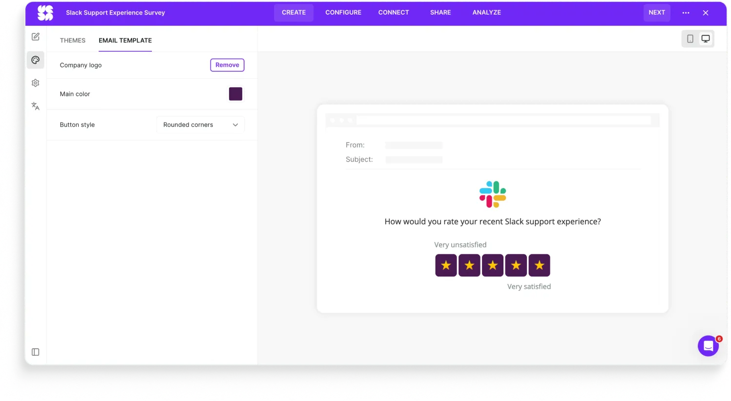
8. Slack (Qualtrics)

Slack sent users a Qualtrics survey via email. Standard so far.
The problem is that they sent a link to the survey instead of embedding the first question in the email itself. And it’s even worse that the link is not hidden behind a pretty button. It’s just as God himself created it: the bare URL.
Obviously, every extra click hurts the response rate. It's a product survey to Slack's own users, who live in email. Shipping with a link-out instead of an embedded first question leaves data on the table.
How would we design that survey in Survicate?
The Survicate version is the same email, but the first question is inline.
The respondent chooses an answer, and that's the first action they take. The rest of the survey opens with the first answer already captured. Even if they bail after question one, you've got something.
We also did:
- Branching logic on the agree/disagree question. Detractors get a follow-up asking what made it hard. Satisfied respondents go straight to the thank-you screen. Same survey, two paths.
- AI follow-up on the open text. "I had to wait 10 minutes" gets a tailored probe instead of a dead-end field.
- On-brand styling. Slack purple, Slack logo, Slack blue.
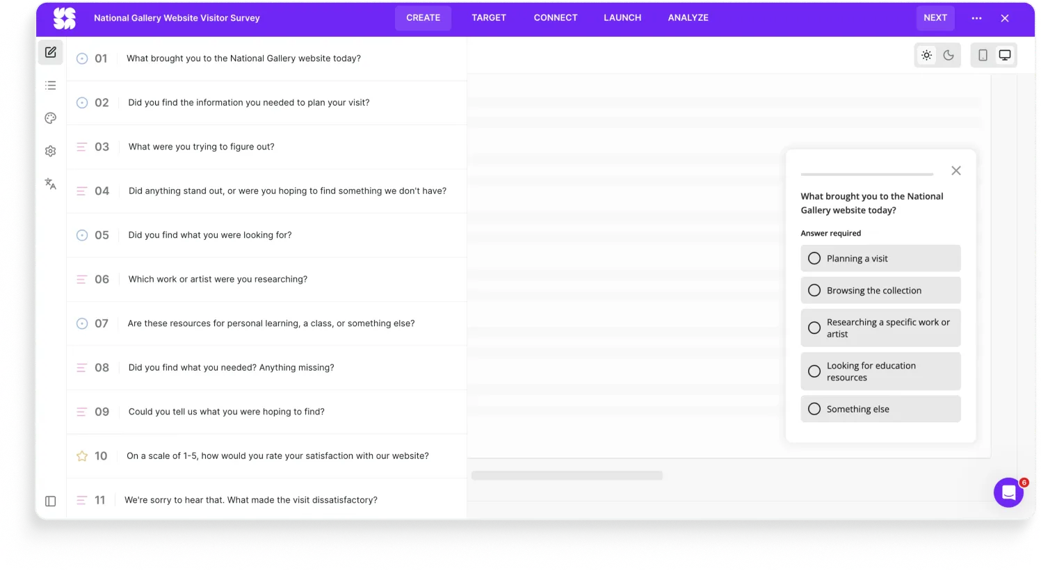
9. National Gallery of Art (Mouseflow + SurveyMonkey)
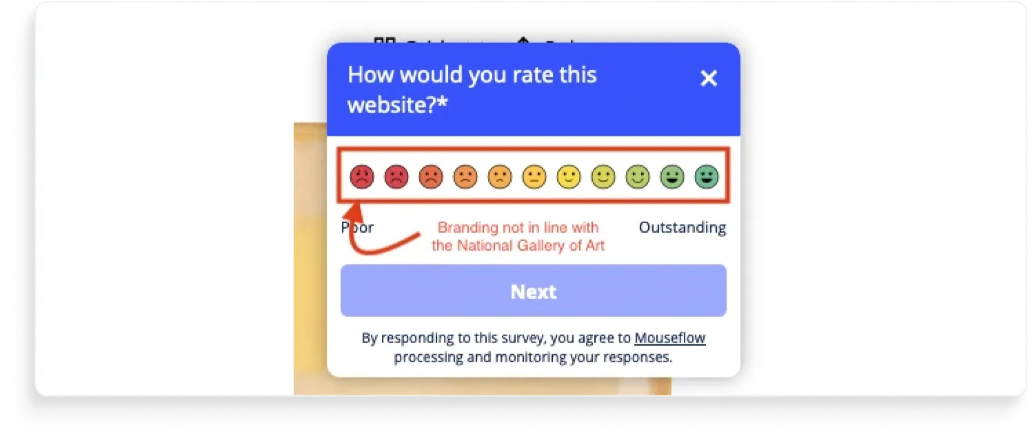
The National Gallery of Art's website asks for feedback. You give it. Then it asks again.
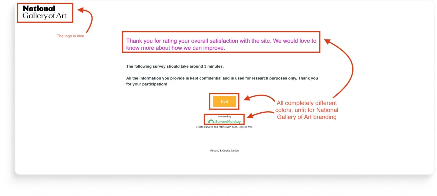
A respondent who finishes the first survey gets a second optional survey served up on the same visit. Same site, same session, presumably the same person whose attention is now being asked for twice in a row.
The polite version of this is "thank you for your feedback, here's a follow-up." The actual version is "we have two surveys, both are firing, nobody's coordinating."
This is over-surveying, and it's the most common feedback program failure we see that nobody talks about.
(For the record: we noticed this one was actually two different tools running on the same page because we looked at the code. No real visitor is doing that. The point isn't which tools the National Gallery is using. The point is the visitor sees two surveys back to back, which also look very different to each other.)
How would we design this survey in Survicate?
The Survicate rebuild isn't really about replacing the two surveys with one nicer survey. It's about replacing the two programs with one program:
- Frequency caps at the program level, not the survey level. A respondent who answered any feedback survey in the last 30 days doesn't see another one. The cap doesn't care which team owns the survey.
- One survey asks about both the reason for the visit and the satisfaction following the visit. The survey includes heavy branching logic to only show relevant questions to each visitor.
- The survey the user sees is consistent in branding and elegant (not run with two different tools).
A bigger truth here, which applies to a lot of brands beyond the National Gallery: most "we need better surveys" problems are actually "we need fewer surveys, owned by one team, with rules about who gets asked what and when."
10. HomeExchange (Typeform)
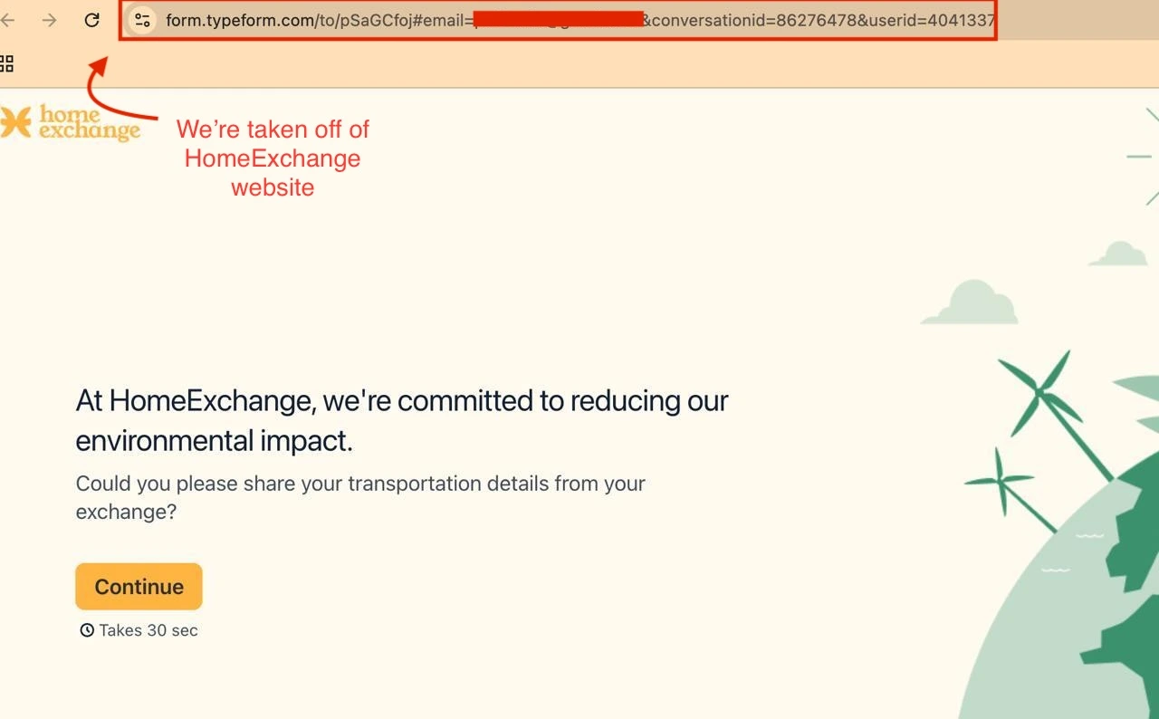
The HomeExchange survey link takes the respondent to a Typeform page.
The form itself is branded: HomeExchange colors, HomeExchange logo, the visual experience holds together. But the URL bar tells a different story. You started on homeexchange.com, you're now on typeform.com.
For most brands, that's a small thing. For a peer-to-peer home-swap service, it's not. HomeExchange is a trust product.
A URL that doesn't match the brand creates a small but real moment of hesitation: am I on the right site, or did I just click something I shouldn't have?
How would we design this survey in Survicate?
The Survicate version would load in-page on homeexchange.com:
- Same brand, same colors, same as HomeExchange already had it
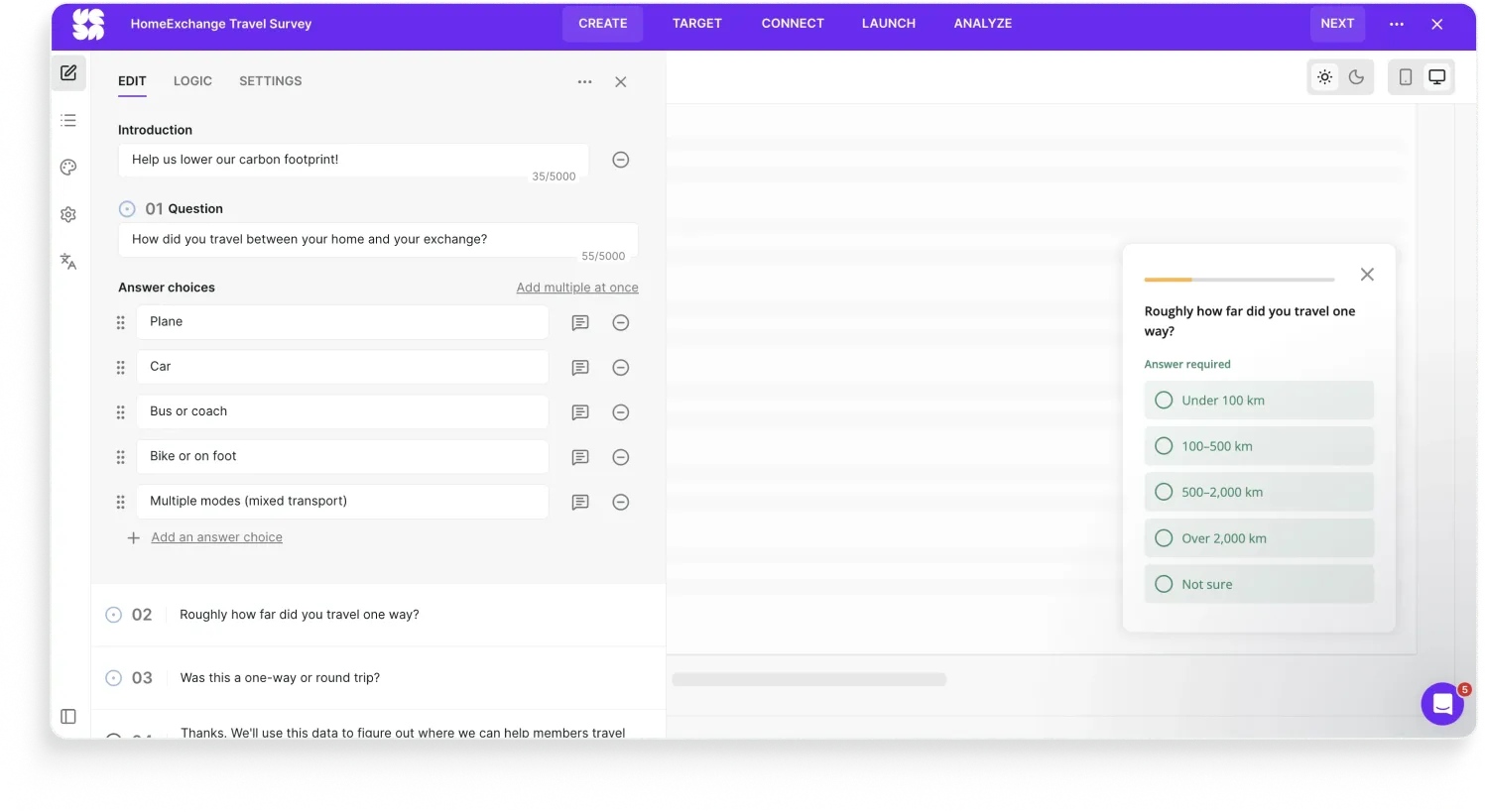
- URL stays on homeexchange.com throughout, because the survey runs on the site, not next to it.
- No third-party domain to second-guess, no break in the trust chain the brand has spent years building.
The survey should live on the brand's domain by default, especially for brands whose entire business model runs on trust.
What do these bad survey examples have in common?
The actual survey is the last 10% of the work.
The first 90% is asking the right person, in the right place, with the data you already have, in a way that takes 30 seconds. Every one of the surveys above broke at least one of those four.
If your tool is fighting you on any of them, the data on the other side is already compromised.
You don't need a bigger survey program. You need a tool that gets out of your way.
Want to build your surveys with Survicate?
Build fully on-brand, powerful surveys with Survicate.
And if you've spotted a bad survey in the wild, send it to us. 😉 We’re always down to analyze surveys and suggest improvements.
FAQ
What's the most common mistake in survey design?
Not designing for mobile. The vast majority of surveys today are opened on a phone, but most are still configured on desktop and shipped without anyone testing the mobile view. Open every survey on a phone before launch. Half the issues will be visible in 30 seconds.
How often should we survey our customers?
Less often than most brands think. Frequency caps at the program level (not the survey level) matter more than the cadence of any single survey. A respondent who answered any feedback survey in the last 30 days probably shouldn't see another one, regardless of which team is running it. Over-surveying is the failure mode that kills feedback programs.
Is Google Forms ever appropriate for customer feedback?
For internal use, yes. For students or one-off internal RSVPs, fine. For customer feedback at a real company, no. Google Forms doesn't let you brand the form itself (only the page background), can't handle dynamic content properly, doesn't integrate with the tools your team actually uses to act on feedback, and signals "this isn't important" to the respondent the second they open it. It also won’t help you much with analyzing or acting on the collected feedback.
How do we evaluate a customer feedback tool?
Four things, in this order:
- Does it carry your brand all the way down to the survey?
- Does it let you ask the right person in the right place without making them click out?
- Does it use the data you already have?
- Does it connect to the rest of your stack (your dev tools, your analytics, your CRM) so feedback turns into action?
If a tool is fighting you on any of these four, it's not the right tool.
What makes a survey good?
A good survey looks like the brand sending it, renders on mobile, uses conventional scales, doesn't ask what the brand already knows, reaches the respondent without friction, respects frequency caps, and actually routes the data somewhere useful afterward.


.webp)

.svg)

.svg)