


What if your CES isn't actually stuck, and it’s just your survey setup that is holding it back?
Most online CES benchmarks are misleading. They usually point back to a single Gartner study from over 15 years ago or recycled data passed between vendors. These aggregated numbers miss the critical context that shapes your actual performance. Your score is more than ‘just’ a reflection of customer effort. It's heavily influenced by the measurement method itself, from survey length and scale type to format and industry dynamics.
In this report, we break down real performance data from 644 surveys across 220 companies to show you how setup choices impact your metrics and where your numbers truly stand.
Methodology
This report is based on 644 CES surveys from 220 companies, collected in 2024 and 2025 from Survicate’s paying customers.
We included both years to give the CES benchmarks a larger dataset, since CES is less common than metrics such as CSAT and NPS.
Here’s what we included and how we calculated the benchmarks:
- We chose 20 responses as the minimum for a survey to qualify. We also tested higher thresholds, up to 100 responses. The median CES stayed between 74.1% and 74.6%, with almost no change in the median response rate. Since higher thresholds reduced the dataset without materially changing the results, we used 20 responses as the cutoff.
- Each category in the analysis needed at least 30 surveys to qualify for this analysis. For industry comparisons, we also required at least 8 unique companies.
- We use medians and percentiles rather than averages. This keeps a small number of unusually high or low results from having too much influence on the benchmark.
- We calculate CES as Low-effort responses ÷ total responses × 100. We included only CES questions with a clear, positive scale direction, where higher scores mean less effort and a better experience. The vast majority of CES questions in our dataset used this direction, so we excluded negatively phrased questions and any questions where the scale direction was unclear. This keeps the benchmarks consistent: higher score → easier experience → better.
- Response rate is based on low-effort responses as well. The formula we use here is: Low-effort responses ÷ total views × 100.
- We used AI to identify questions that measure Customer Effort Score, then checked a sample of the results manually. We included questions about the ease or difficulty of completing a task, interaction, process, or finding information. We excluded questions about NPS, CSAT, usefulness, helpfulness, effectiveness, value, importance, purchase intent, and the respondent’s own knowledge.
- In the response rate breakdown, we excluded page/shareable link surveys. A page survey has its own web page and can be linked from social channels or embedded in email, so views arrive through third parties that can't be measured accurately. Also, the audience that follows a link to a standalone survey has already opted in, which pushes response rates up and would drag the median with them.
Key findings
- The overall median CES is 74.4%, but scale matters
The median CES across the dataset is 74.4%, but that number is essentially a benchmark for five-point scales, which account for 83.5% of surveys. Seven-point scales make up just 11.0%, so comparing scores across scale types can quickly become misleading.
- Most CES surveys use visual scales
Shapes and smileys account for 64.0% of all CES surveys, compared with 27.6% for numerical scales. This shows that it's more than a design choice. The way you display the scale is part of the measurement setup.
- Shorter surveys don’t automatically get better completion
Survey length alone doesn't explain completion rates. Surveys with 1-3 questions have the highest median completion rate at 83.2%, but the 11-20 question group also reaches 80.4%. The most common 4-10 question range has the lowest median at 74.6%.
- Survey format can move CES by more than 8 percentage points
Page surveys have a median CES of 80.1%, compared with 74.6% for mobile and 71.6% for widgets. Completion follows the same pattern, with pages at 84.5%, mobile at 75.6%, and widgets at 73.0%.
- CES varies more by industry than completion does
The median CES spans 29.5 percentage points across industries, from 59.3% in Education to 88.8% in Fintech. Completion rates are much closer together, with only a 7.7-point median spread across the same industries.
- B2C companies run more CES surveys, but completion is almost identical
B2C and B2B each account for 110 companies in the dataset, but B2C companies contributed 383 surveys versus 261 for B2B. Despite that difference, median completion rates are almost identical: 77.1% for B2C and 77.6% for B2B.
- Company size doesn’t show a clear CES pattern
There’s no consistent increase or decrease in CES as companies get larger. Median scores range from 72.0% to 77.4%, while companies with 1,000+ employees account for 30.6% of all surveys despite representing 20.0% of companies in the dataset.
The average CES score is 74.4%
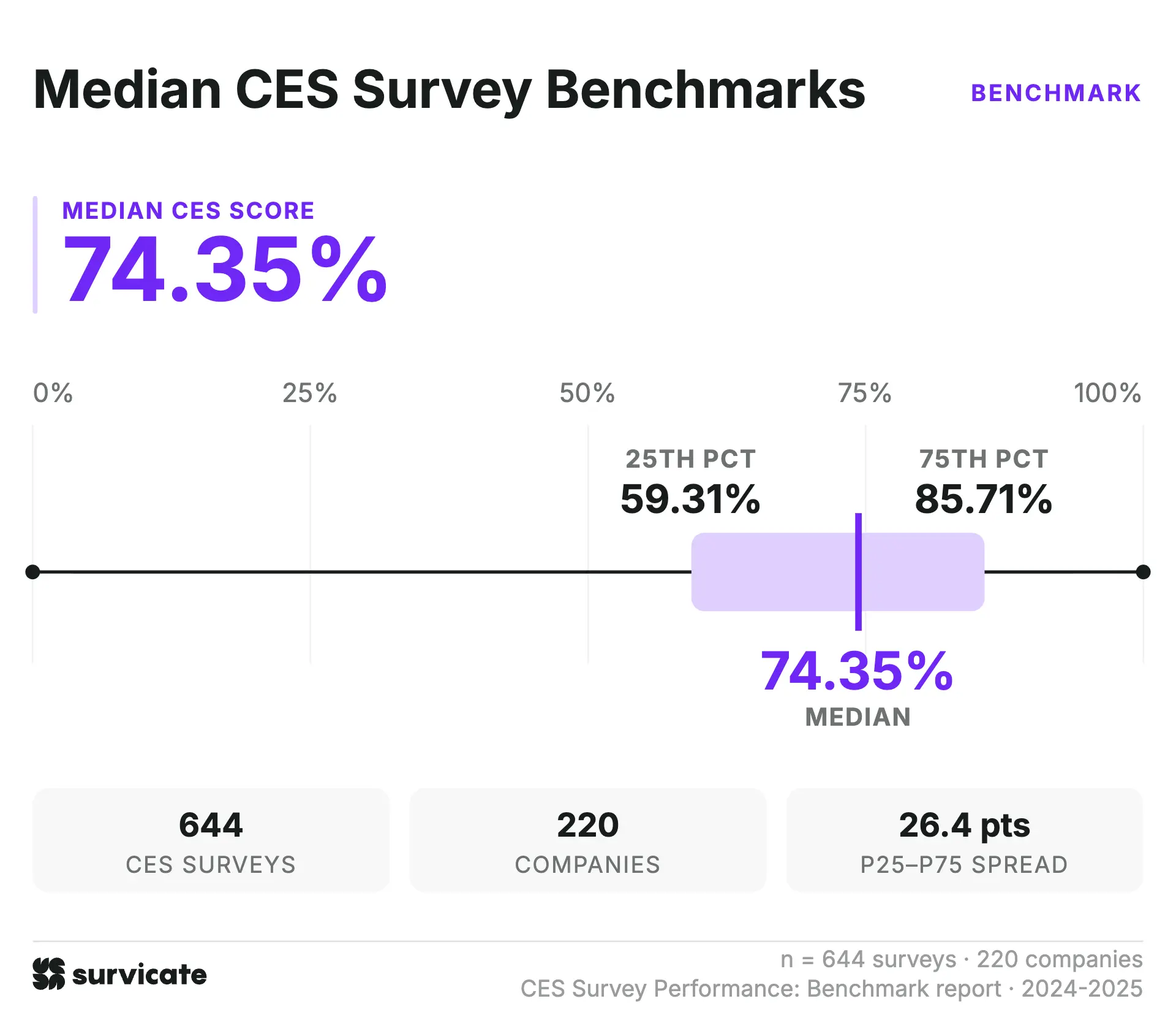
The median CES score across the full dataset is 74.4%. This is the general middle point across all 644 CES surveys, i.e., half of the surveys recorded a higher score, while the other half fell below it.
The median completion rate is 77.4%. This represents the typical share of respondents who finished a CES survey after they started it. We report completion separately from response rate because the two metrics describe different stages of the survey experience.
For surveys with measurable view counts, the median response rate is 12.0%. This calculation excludes page surveys, as their view data follows a different methodology and isn't directly comparable with other survey formats.
CES benchmarks by scale – 5 point wins significantly, leaving 7 points far behind
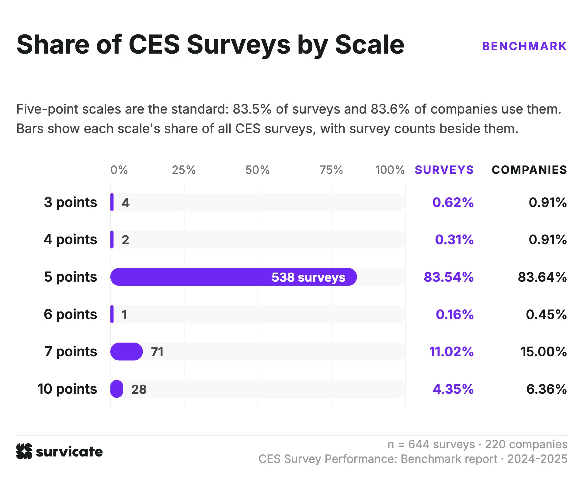
The textbook seven-point CES scale might dominate academic literature on survey methodology, but real-world setup tells a very different story. In practice, the five-point scale is the clear winner across the board.
Five-point setups account for 83.5% of all surveys analyzed and are used by 83.6% of companies in the dataset. By contrast, the seven-point format, which is frequently presented as the theoretically preferred option, shows up in just 11.0% of surveys and 15.0% of companies. Everything else forms a long, thin tail. Ten-point scales make up 4.3% of total surveys, while three-, four-, and six-point versions combined account for less than 2.0%.
This concentration means the overall 74.4% median CES score acts, in practice, as a benchmark for five-point scales. The low sample volume across three-, four-, six-, and ten-point scales makes cross-scale comparisons unreliable beyond the five- and seven-point formats.
Company-level adoption adds up to 107.3%. What this tells us is that some organizations run more than one scale internally. That said, mixing scale lengths across teams or changing survey setups over time can make tracking progress and comparing results internally less straightforward.
Why most scales aren’t comparable against one another
Looking at how different scales measure low effort reveals why comparing scores across scale types isn't an apples-to-apples comparison.
Odd-numbered scales tend to produce lower positive scores because the neutral midpoint gets excluded from the low-effort calculation. Even-numbered scales don't have a midpoint to remove, which means the exact same customer sentiment can bring noticeably different results depending only on the scale format you choose.
The five- and seven-point scales come closest in structural alignment, with their defined low-effort thresholds differing by just 2.9 percentage points. They are also the only two options in the dataset with sample sizes large enough to meet the 30-survey threshold for statistical relevance.
Because five-point setups account for 83.5% of all analyzed surveys, the overall 74.4% median CES benchmark is essentially a five-point benchmark. If you use a seven-point scale, comparing your score directly against that headline figure won't give you a meaningful baseline.
Almost two-thirds of CES surveys use a visual scale
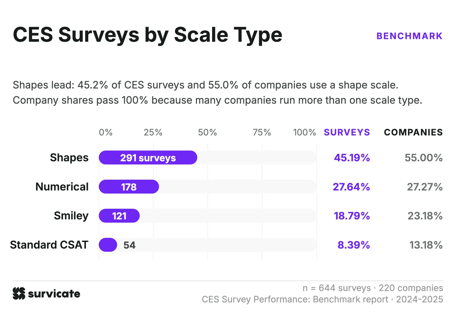
Visual elements dominate how CES surveys are delivered in practice. When we combine shapes (45.2%) and smileys (18.8%), we’ll discover that visual scales make up 64.0% of all surveys in the dataset. Standard CSAT formats account for another 8.4%, while purely numerical scales represent just 27.6%.
The company-level adoption sums to 118.7%, which shows that many organizations mix scale display types across different touchpoints within the same account.
This design choice directly impacts how you collect and interpret feedback. When you present respondents with shapes or smileys, they never actually see a numerical value. Visual scales can blur what you’re actually measuring.
A row of faces or other icons may cause respondends to react to the emotional tone of the icon rather than how much effort the experience required. That makes the score less specific to customer effort and potentially more sensitive to a respondent’s mood or how their day is going.
4-10 question surveys achieve the lowest completion rates
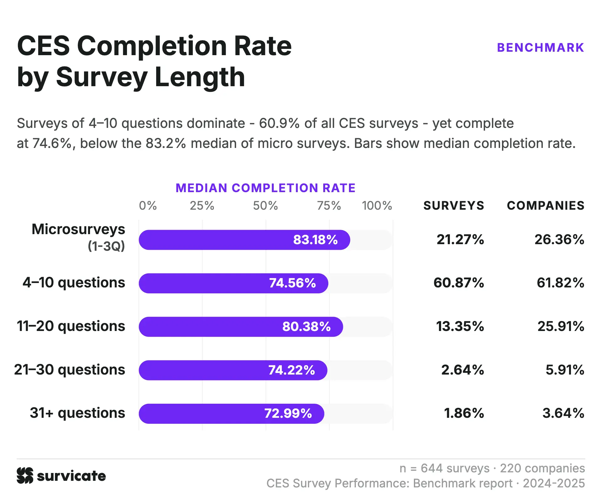
Completion rates by survey length challenge the common assumption that shorter surveys automatically win out.
The 4-10 question range represents the single most common setup, accounting for 60.9% of surveys and 61.8% of companies. However, this bucket shows a median completion rate of 74.6% and drops to a 64.5% 25th percentile (the weakest floor in the entire dataset).
By contrast, surveys in the 11-20 question bracket outperform the 4-10 group, reaching an 80.4% median completion rate. Micro-surveys (1-3 questions) hold the highest median at 83.2%, but longer formats hold up surprisingly well across the board.
These patterns suggest that survey length isn't the main driver of completion. Factors like placement, trigger timing, and audience targeting often play a far larger role in keeping respondents engaged. We explore this trend further in our guide on how many questions a survey should have.
Also, keep in mind that this dataset includes surveys built with conditional skip logic. A survey listed with 15 questions might only show 3 or 4 to a specific respondent based on their initial answers, which helps longer surveys maintain strong completion rates without overwhelming users.
CES survey by format – companies choose widgets twice as frequently as pages
Widgets account for over half of all surveys in the dataset at 54.4%, while page surveys make up 27.7% and mobile surveys represent 18.0%. Page surveys and widgets share nearly identical adoption rates, with each tool appearing in roughly 48% of company stacks. The real divergence shows up in volume. Companies using widgets deploy an average of 3.3 surveys each, while page survey users average just 1.7.
Survey volume alone can’t tell us exactly what drives that choice, but one possibility is that widgets are easier to deploy across different touchpoints, making it practical to run more of them. Another is that companies may see stronger engagement or completion rates with widgets and choose to use them more often. These are potential explanations, rather than conclusions we can draw from the data.
Page surveys have the highest median CES across formats
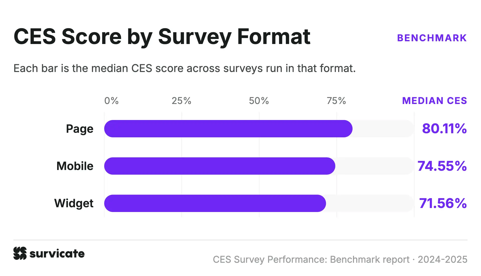
Page surveys may have been the runner-up in terms of share, but they're a clear winner when it comes to median CES.
They have a median CES of 80.11%, compared with 74.6% for mobile surveys and 71.6% for widgets. That’s an 8.5 percentage-point difference between page surveys and widgets.
The gap holds across the CES distribution, too. Page surveys range from 64.8% at the 25th percentile to 88.9% at the 75th percentile. For widgets, the corresponding range is 57.6% to 83.0%, while mobile surveys fall between the two.
Page-based CES surveys see the highest completion rates
Page surveys also lead in the completion rate category, across the 25th, 50th, and 75th percentile. They secure a median completion rate of 84.6%, compared with 75.6% for mobile surveys and 73.0% for widgets. That puts the median completion rate for page surveys over 11 percentage points above widgets. CES surveys on pages also have the highest 25th and 75th percentile completion rates, at 75.8% and 91.8%, respectively.
The median response rate for mobile surveys is 3.4x higher than for widgets
Mobile surveys have a median response rate of 25.4%, compared with 7.4% for widgets. Notice that the table below doesn’t feature page surveys, and that’s a conscious choice on our end. We’ve excluded this CES survey format from this particular breakdown, because we can’t verify views for surveys distributed via third-party channels like social media channels and emails.
Both of the formats that we share below have a wide response rate range. For mobile surveys, the middle 50% falls between 15.7% and 40.9%, while widget response rates range from 2.9% to 19.3%. That’s a 2.6x spread for mobile and a 6.6x spread for widgets between the 25th and 75th percentiles.
This variation means that the format alone doesn’t tell you what response rate to expect. Comparing your response rate with the benchmark for a similar format gives you more useful context than looking at the overall median.
CES popularity by industry – Media and Digital Marketplaces run the highest number of surveys per company
To keep industry comparisons statistically meaningful, we made a few adjustments across the raw data.
We merged educational institutions and e-learning providers into a single Education category, and we combined retail and wholesale into Retail/Wholesale due to smaller company counts in each isolated group. We also excluded healthcare entirely from the industry breakdown because its organization-level sample was too small to support reliable conclusions.
This leaves us with nine distinct categories. SaaS and Retail/Wholesale account for nearly half of the entire dataset combined (43.9% of surveys). On the smaller end, Manufacturing (14 companies), Education (11), and Fintech (11) pass our minimum threshold of eight companies required for inclusion, but we recommend reading these figures as directional.
Deployment habits also vary significantly by sector. Media stands out as the most concentrated vertical in our dataset, generating 11.9% of all surveys from just 7.9% of companies, averaging 4.4 surveys per account, compared to 3.1 in SaaS and 1.8 in Manufacturing.
CES score by industry – fintech and manufacturing note the highest medians
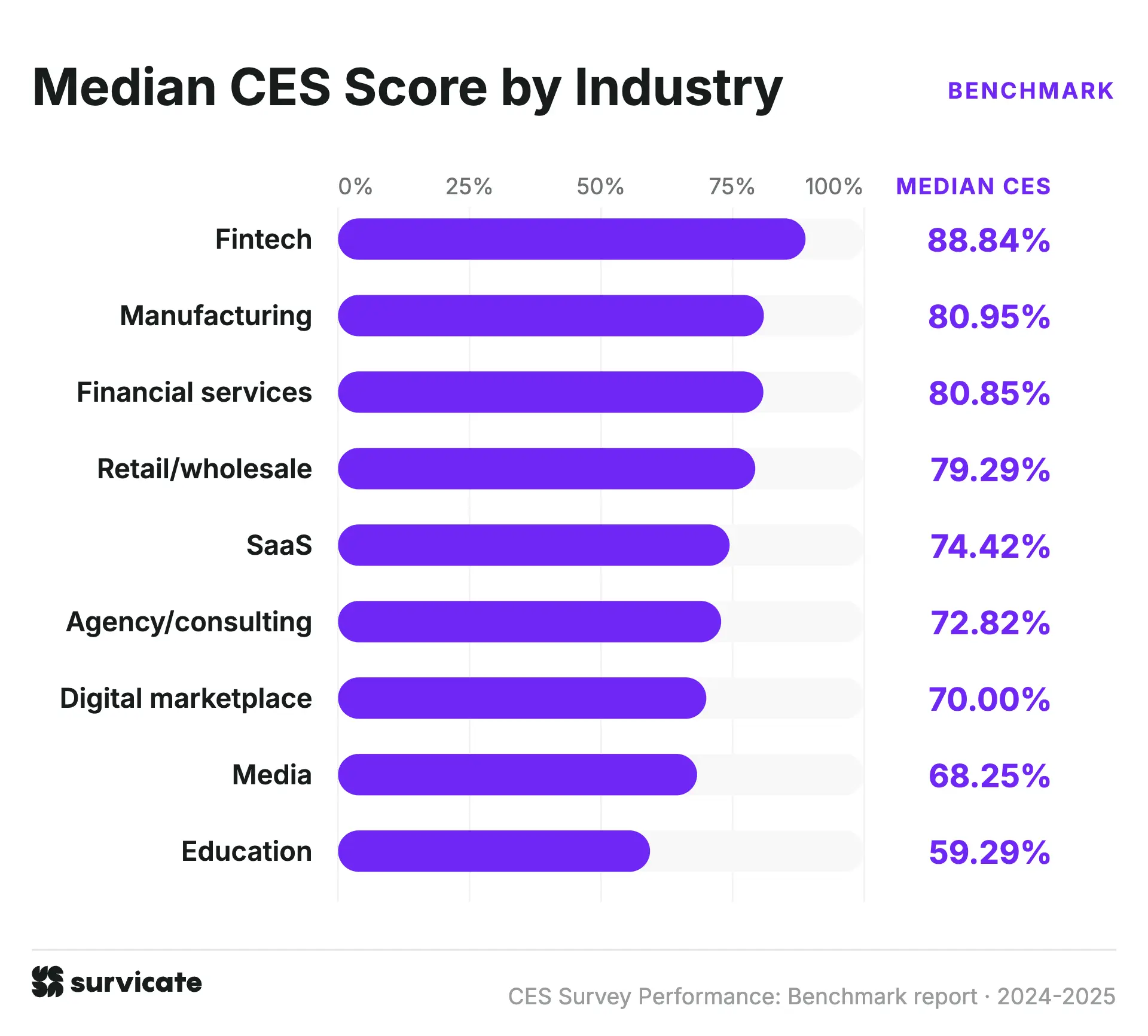
Customer Effort Scores span a 29.5 percentage point gap across sectors, ranging from Fintech at 88.8% down to Education at 59.3%. However, both extremes rest on smaller company bases in our dataset.
Financial Services (80.9%) and Manufacturing (81.0%) both show solid scores, backed by slightly larger sample sizes. But if you want the most reliable numbers to compare against, go with Retail/Wholesale (79.3%) and SaaS (74.4%). They give you the biggest volume of surveys and companies by far.
At the bottom of the table, Media and Education don't just post lower medians. Their scores are all over the place. Most industries stay within a 20 percentage point spread, but Media jumps across 43.5pp and Education across 38.8pp. A 68.3% median for Media doesn't tell you much when scores swing wildly from 35.4% at the lower end to 78.8% at the top.
Completion rate barely varies across industries, with just a 7.7-point spread
Completion rates stay within a relatively narrow range across the nine industries in the dataset. The median spans just 7.7 percentage points, from 72.1% to 79.8%.
The middle 50% of completion rates also overlap considerably across most industries. The 75th percentile ranges from 79.7% to 88.2%, while the 25th percentile ranges from 59.5% to 71.1%.
As we can see, the industry-level differences are much smaller for completion rate than for CES, where the median spread reaches 29.5 percentage points.
CES benchmarks by business model – B2C companies run way more surveys
Coincidentally, the dataset includes an equal number of B2C and B2B companies, with 110 companies in each group. The number of surveys differs, though. B2C companies account for 383 surveys (59.5%), compared with 261 (40.5%) for B2B.
On average, B2C companies contributed 3.5 surveys per company, compared with 2.4 for B2B companies. That means the B2C group has 47% more surveys despite having the same number of companies.
Median CES scores have modest differences between B2B and B2C
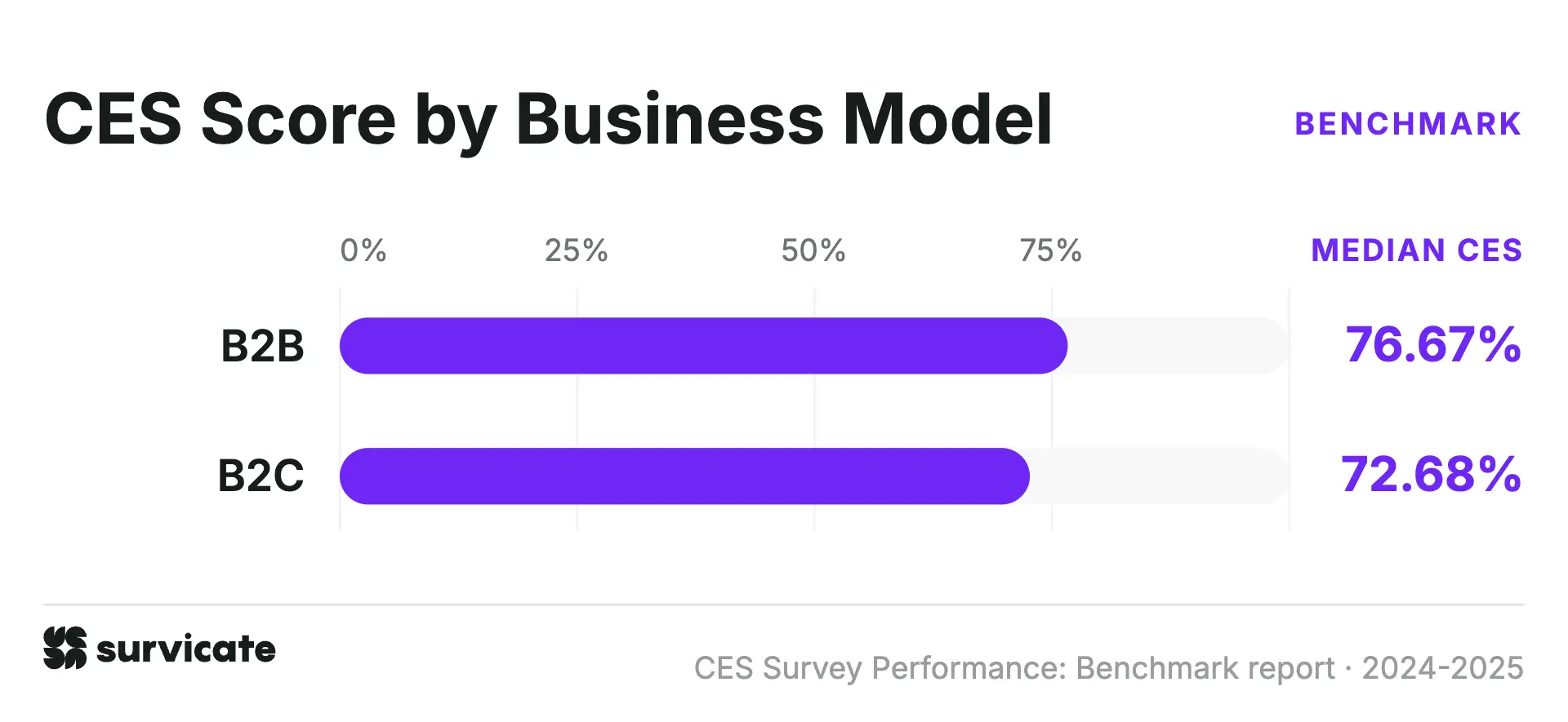
The median CES score is 76.7% for B2B and 72.7% for B2C, a difference of four percentage points.
We can see that the gap is larger at the lower end of the distribution – the 25th percentile is 64.3% for B2B and 56.2% for B2C, which is already an 8.1 percentage-point difference. At the 75th percentile, the scores are much closer, at 86.4% and 85.0% respectively.
Median completion is virtually identical for both business models
Completion rates show an even smaller difference than CES scores. The median is 77.6% for B2B and 77.1% for B2C, just 0.5 percentage points apart. The 25th percentiles are also almost identical at 66.45% and 66.50%, while the 75th percentiles stand at 87.8% and 86.4%.
CES varies across company sizes, with no clear upward or downward trend
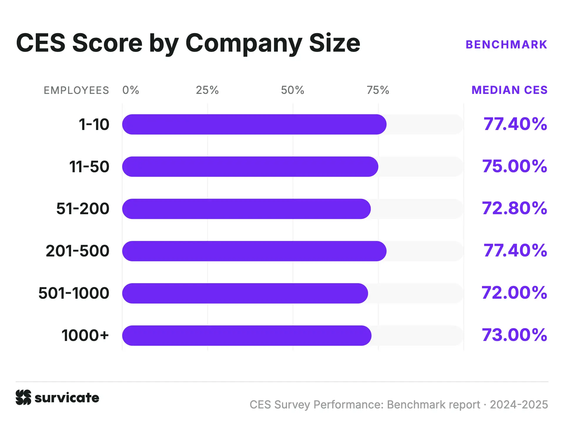
The dataset includes companies of very different sizes, and they don't all contribute the same number of surveys. Companies with 1,000+ employees account for 30.6% of all surveys, even though they make up just 20% of the companies in the dataset. Companies with 51-200 employees are the largest group by company count, at 27.7%, but contribute an average of 2 surveys per company.
The CES scores also don't follow a clear size-based pattern. The 201-500 employee group has a median CES of 77.4%, matching the 1-10 group. At the other end, the 501-1,000 group records 72.0%, while the 1,000+ group reaches 73.0%. The 51-200 group is slightly lower at 72.8%.
The lower end of the distributions shows a similar pattern. The 25th percentile is 54.2% for companies with 1,000+ employees and 56.0% for those with 501-1,000 employees, compared with 68.5% for the 1-10 group.
Note: It’s worth mentioning that the median CES is much more flatlined across companies than the median CSAT score. The latter remains similar for companies of up to 1,000 team members, but there is a sharp decline past the 1,000 mark. We cover this in our dedicated CSAT survey benchmark report.
What’s a good CES benchmark, then?
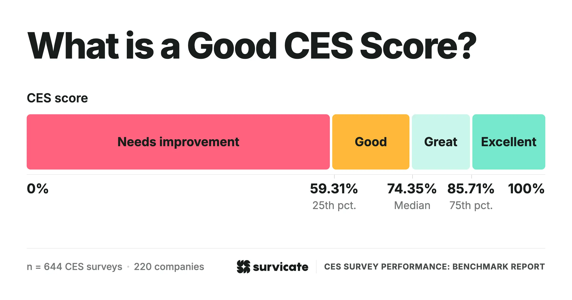
If you want a number to start with, 74.4% is a useful benchmark. That’s the overall median CES in our dataset, so it gives you a rough idea of where the middle of the market sits.
But I wouldn’t treat 74.4% as a target. There’s no universal “good” CES score because the number depends on your scale, survey format, industry, and the customer touchpoint you’re measuring. If any of those factors differ, the score can move even if the experience itself hasn’t changed.
External benchmarks are most useful when the setup is close to yours. If you’re comparing a post-support CES on a 5-point scale with a transactional survey on a different scale, the number won’t tell you much.
Your own historical trend is just as important. Keep the measurement setup consistent, track how your CES changes over time, and use external benchmarks to put those changes into context. This gives you both a view of how your own customer experience is evolving and how your scores compare with other companies using a similar setup.
FAQs
What is considered a good customer effort score?
A good Customer Effort Score (CES) depends heavily on the scale you choose, but top-performing teams consistently clear a 74.4% low-effort benchmark across our dataset.
On a standard 5-point scale, a score of 4.0 or higher (or 5.5+ on a 7-point scale) reflects a smooth, low-effort experience. If you convert your scores into an overall percentage of positive, low-effort responses, hitting 74.35% puts you right at the global median. While scores above 83% to 90% land you squarely in top-quartile performance depending on your survey format and industry.
How do you measure Customer Effort Score?
Measuring Customer Effort Score starts with a simple, direct question asked right after an interaction: "How easy was it to handle your request today?" Customers answer using a response scale. Most commonly a 5-point scale (used by 83.5% of surveys in our dataset) or a 7-point scale, ranging from "Very difficult" to "Very easy."
To calculate your overall CES, divide the total number of low-effort responses (ratings of 4 or 5 on a 5-point scale) by the total number of survey responses, then multiply by 100 to get a percentage.
What does the CES score measure?
Customer Effort Score (CES) measures how much effort a customer has to put in to resolve an issue, complete a task, or finish a transaction with a company. Instead of asking how happy or satisfied someone feels, it focuses strictly on friction, i.e., how smooth and easy the interaction was for the person on the other end.
In practice, CES tracks whether an experience was effortless or frustrating. High effort drives customer churn, so tracking CES helps identify where processes, tools, or self-service channels slow people down or create unnecessary steps.
Is a higher or lower CES better?
Higher is better with a positively phrased question. "How easy was it to handle your request today?" means a 5 on a 5-point scale signals low effort. CES differs from CSAT here, because a CES question can also be phrased negatively. For example, "How much effort did you personally have to put in?" is a question, where a higher rating in the answer means more effort and a worse experience.
The overwhelming majority of CES questions in our dataset were phrased positively, and we excluded the negatively phrased ones from the analysis. Every score in this report therefore runs the same direction as CSAT (higher = easier = better). If you're comparing your own score against these benchmarks, make sure to check the wording of your question first.
How often should a CES survey be used?
There’s no magic number of times to run a CES survey. The best time to ask is close to the interaction you want to measure. CES works best when you ask about a specific task, so triggering a survey after a resolved support ticket, completed checkout, or another key interaction usually makes more sense than sending one on a fixed quarterly schedule.
You can also pair event-triggered surveys with regular ones. Triggers only reach people who complete the action, so you’ll miss customers who abandon the task partway through. Adding more touchpoints gives you a broader view of the experience, but it can also bring your overall CES down because you’re measuring more of the journey, not just the parts that went smoothly.
Is CES better than CSAT or NPS?
CES, CSAT, and NPS answer different questions, but CES and CSAT tend to give you more actionable, concrete insights compared to NPS. CES and CSAT both measure a specific interaction that has already happened, so you can connect the score to a particular touchpoint and identify where the experience needs attention. CES tells you how easy the experience was, while CSAT tells you how satisfied the customer was. NPS looks at something broader, i.e., how likely someone is to recommend your company. This makes it more useful for tracking the overall customer relationship, but the score alone tells you less about what happened during a specific interaction or what you can change.
CES also has a narrower use case than CSAT. You need a specific task or interaction to measure effort, so it won’t replace CSAT for overall satisfaction or NPS for the broader customer relationship. Many teams use these metrics together rather than choose one metric for everything.